


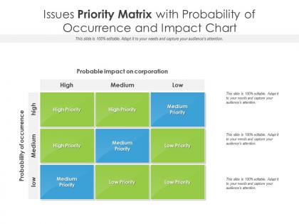
Issues priority matrix with probability of occurrence and impact chart




Try Before you Buy Download Free Sample Product
 Impress Your
 Audience
 100%
100% Editable
 Save Hours
 of Time


Our Issues Priority Matrix With Probability Of Occurrence And Impact Chart are topically designed to provide an attractive backdrop to any subject. Use them to look like a presentation pro.
People who downloaded this PowerPoint presentation also viewed the following :
Issues priority matrix with probability of occurrence and impact chart with all 2 slides:
Use our Issues Priority Matrix With Probability Of Occurrence And Impact Chart to effectively help you save your valuable time. They are readymade to fit into any presentation structure.
FAQs for Issues priority matrix with probability of occurrence
Okay so an Issue Prioritization Matrix is basically this grid where you plot out all your problems based on two things - like how urgent they are vs. how much impact they'll have. Super helpful when everything feels like a fire drill. You get four boxes: stuff to do immediately, things to schedule for later, tasks you can hand off to someone else, and honestly? Things you can just ignore. I know that last one sounds weird but trust me, some issues really aren't worth your time. Just dump all your problems on paper first, then score each one consistently. You'll actually be shocked how obvious your real priorities become once you see them laid out like this.
Focus on impact first - like how many people this actually affects. Then urgency, obviously. Most teams throw in effort required and whether it fits your current goals. Honestly, I've watched teams overcomplicate this with crazy scoring systems that nobody uses after week two. Risk level matters too - what happens if you just ignore it? Dependencies are worth tracking if you've got work that blocks other stuff. But really, you just want something that helps you decide what to do next without spending an hour debating priorities. Start basic with those four things, then add whatever makes sense for your team's chaos.
First thing - get everyone to agree on your scoring criteria before you start. Impact, urgency, effort needed, whatever makes sense. Have people score stuff separately at first, then meet up to hash out the big disagreements. Otherwise groupthink takes over and you're screwed. Make sure everyone's using the same definitions for high/medium/low too. I've seen teams waste hours because one person's "medium" is another's "high." Write down why you prioritized things the way you did - future you will thank you when similar issues come up. And honestly? Review this thing regularly. Priorities shift constantly, so your matrix needs to shift with them.
Honestly, the biggest mistake is making everything "high impact, high urgency" - that just kills the whole point. Get your stakeholders involved too, because what feels urgent to you might be totally irrelevant to actual users. I've watched teams argue about scores for hours instead of just deciding and moving on (so annoying). Document your reasoning so you remember later why you scored things that way. Oh, and keep your criteria consistent across everything. Don't treat it like it's set in stone though - you'll get new info that changes priorities.
So the Issue Prioritization Matrix plots problems by impact vs effort - totally different from SWOT's strengths/weaknesses thing or how Eisenhower does urgent vs important tasks. SWOT's more for big picture strategic stuff. Eisenhower rocks for daily to-dos. But when you're juggling a million problems and need to figure out which ones to tackle first? That's where this matrix shines. The visual aspect is clutch too - makes it way easier when you're trying to get stakeholders on the same page. I'd definitely reach for this one when you need team buy-in on what issues to prioritize next quarter.
Honestly, this thing saves your butt when you've got a million fires burning and zero clue where to start. Perfect for when your whole team thinks their pet project is THE most urgent thing ever - we've all been there, right? Crisis mode, product launches, tight budgets... basically any time you're getting pressured to fix everything at once. Instead of just winging it based on what feels right, you actually have solid reasoning behind your choices. Just list out all your problems first. Then map them by impact vs how much work they'll take. Super simple but works.
Honestly, just use whatever tool your team's already comfortable with - even a decent Excel template beats those sticky note disasters. You can automate the scoring and get real-time updates when priorities shift (which happens like every other day, right?). Airtable's pretty solid, or there are specialized tools that pull data from multiple sources so you're not constantly updating stuff manually. The visual dashboards actually make sense to stakeholders, plus you get alerts when urgent issues pop up. Oh, and you can track how accurate your prioritization gets over time, which is kinda nice for proving you're not just winging it.
So data analysis is basically what saves you from making terrible priority calls based on hunches. Pull real metrics - customer complaints, revenue impact, how much effort stuff actually takes. Map those numbers to your matrix criteria. Trust me, I've learned this the hard way after prioritizing "urgent" features that turned out to affect like three users. Short sentences work great for this. The patterns in your data will show you what's genuinely breaking vs. what just feels important because someone complained loudly. Figure out what data you can actually access first, then work backwards from there.
Just swap out the generic "impact vs effort" stuff for what actually matters in your field. Healthcare teams might use "patient safety vs implementation time" instead. Manufacturing? Maybe "production disruption vs cost to fix." Honestly, I've watched teams overthink this way too much - don't get stuck picking the "perfect" criteria. Find 2-3 factors that your stakeholders genuinely use when making tough calls. Start basic and tweak it based on what people actually argue about in meetings. The matrix only works if it reflects how decisions really get made in your industry.
I'd check it monthly if things move fast, quarterly if not. Go through each issue again - has the impact changed? Different urgency now? Honestly, I've watched teams completely ignore their matrices for months and then wonder why nothing makes sense anymore. Toss out the stuff that's been resolved, add whatever new fires have popped up. Oh, and loop in your stakeholders again since they might see things differently now. Definitely set a calendar reminder or you'll forget. Trust me on that one.
So basically, you plot your problems on a chart - impact vs how much effort they'll take. Game changer, honestly. High impact but easy to fix? Do those first. Low impact but tons of work? Yeah, those can wait. It stops you from wasting money on stuff that doesn't actually matter (been there, learned that lesson the hard way). Instead of just fighting whatever fire is loudest, you'll actually see which problems are worth your time. Map out what you're dealing with this week. Bet something obvious will jump out at you.
Be super clear about how you scored everything - walk them through a few examples showing impact vs effort. A simple 2x2 grid honestly works way better than some fancy spreadsheet nobody will open. Don't just share the ranked list though. Explain WHY you put certain things at the top, that's what gets people on board. I'd do a quick team walkthrough instead of dumping it in Slack - there's always gonna be questions about placement. Oh, and treat it like a living doc you revisit with the team regularly, not something set in stone.
Yeah, these matrices are actually pretty useful for personal stuff too! Just make a simple 2x2 grid - impact vs effort. I've been doing this for home projects and side work recently. Honestly, the visual thing really clicks when you're drowning in tasks and don't know where to start. You'll spot those quick wins that give you momentum right away. Plus you can finally see which things are just eating up time without getting you anywhere. I was skeptical at first, but it brings way more clarity than I expected. Worth trying next time you're feeling scattered.
Having diverse people on your team totally improves your Issue Prioritization Matrix. You'll spot blind spots that similar people would miss - like when engineering thinks something's a "quick fix" but customer service knows it'll create chaos. Different backgrounds mean better risk assessment honestly. My last team had this happen where we almost missed a huge compliance issue until someone from legal spoke up. Sure, reaching consensus takes forever with more voices, but the scoring ends up way more accurate. Just make sure you're actually getting input from everyone who matters before you lock in those priorities. Worth the extra time.
Oh for sure! Microsoft actually did this during their Windows Vista mess - they plotted bugs by severity vs impact so they knew what fires to put out first. Toyota does something similar with their production issues, ranking by frequency and how much it screws things up. Even Spotify uses priority grids for deciding which features to build based on user value vs how much work it'll take. Pretty smart if you ask me. You should totally try it - just draw a simple grid with impact on one side, effort on the other, and plot your problems. You'll instantly see what's worth tackling.
-
Topic best represented with attractive design.
-
I discovered this website through a google search, the services matched my needs perfectly and the pricing was very reasonable. I was thrilled with the product and the customer service. I will definitely use their slides again for my presentations and recommend them to other colleagues.
-
Perfect template with attractive color combination.