


Problem solutions presentation template
Our Problem Solutions Presentation Template contain the ideal concoction. A fabulous blend of color and content.
Our Problem Solutions Presentation Template contain the ideal concoction. A fabulous blend of color and content.


-

- Google Slides is a new FREE Presentation software from Google.
- All our content is 100% compatible with Google Slides.
- Just download our designs, and upload them to Google Slides and they will work automatically.
- Amaze your audience with SlideTeam and Google Slides.
-

Want Changes to This PPT Slide? Check out our Presentation Design Services
-

- WideScreen Aspect ratio is becoming a very popular format. When you download this product, the downloaded ZIP will contain this product in both standard and widescreen format.
-
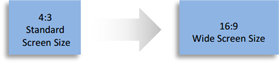
- Some older products that we have may only be in standard format, but they can easily be converted to widescreen.
- To do this, please open the SlideTeam product in Powerpoint, and go to
- Design ( On the top bar) -> Page Setup -> and select "On-screen Show (16:9)” in the drop down for "Slides Sized for".
- The slide or theme will change to widescreen, and all graphics will adjust automatically. You can similarly convert our content to any other desired screen aspect ratio.
Compatible With Google Slides

Get This In WideScreen
You must be logged in to download this presentation.


Do you want to remove this product from your favourites?
PowerPoint presentation slides
Presenting problem solutions presentation template. This is a problem solutions presentation template. This is a two stage process. The stages in this process are problem solution, current state future state, before after, challenges solutions, compare, comparison.

People who downloaded this PowerPoint presentation also viewed the following :
Problem solutions presentation template with all 6 slides:
Avoid complications with our Problem Solutions Presentation Template.They enable you to head away from hassles.
-
So glad you guys provided the free ppt templates.
-
Helpful product design for delivering presentation.
-
Unique design & color.
