


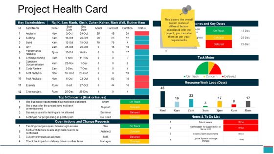
Project health card ppt example file




Try Before you Buy Download Free Sample Product
 Impress Your
 Audience
 100%
100% Editable
 Save Hours
 of Time


When you use our awesome Project Health Card Ppt Example File you are leveraging the benefit of the many years of hard core experience of our dynamic team. Our graphics and slides combine exclusive designs with superb images to deliver quality so superior for a stunning presentation.
People who downloaded this PowerPoint presentation also viewed the following :
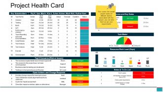
Project health card ppt example file with all 5 slides:
Our Project Health Card Ppt Example File discourage haste. Your every effort will be beneficial.

FAQs for Project health card
Honestly, start with the classics - budget variance, schedule stuff, scope creep, and quality metrics like defect rates. Resource utilization is huge too, plus risk status (that one's saved my butt so many times). Pick metrics that actually match your project though, not just whatever sounds impressive. I'm a big fan of those red/green dashboards - makes it super obvious when something's going wrong. Oh, and don't go crazy with too many at first. Stick to maybe 5-6 core ones, then you can always add more later if you need project-specific tracking.
Look, a Project Health Card is basically like having everyone look at the same scoreboard instead of arguing about the score. Red/yellow/green status at a glance - your execs love that stuff because they don't have time for 20-page reports. It stops those awkward moments where someone's like "wait, aren't we ahead of schedule?" when you're actually three weeks behind. Forces you to call out problems early too, which honestly sucks but saves your butt later. I'd throw it into your weekly updates. Way less confusion, and stakeholders actually know what's happening for once.
Oh, Project Health Cards are lifesavers! They give you this quick visual of where everything stands - budget, timeline, resources, all that fun stuff. Think traffic light colors but for your project's sanity. Red means "panic mode," green is "we're good." Weekly check-ins with these things will catch problems when they're still manageable instead of waiting until everything's on fire. Plus stakeholders actually *get* it without you having to explain spreadsheet hell for 30 minutes. Honestly wish I'd used them earlier in my career - would've saved me so many late nights scrambling to fix what could've been prevented.
Honestly, I'd say weekly works best - or whenever something big changes. Pick a day that makes sense for your team and just stick with it. Maybe review it during standups if you have those? Fast projects might need bi-weekly updates though. Set a calendar reminder or you'll totally forget (trust me on this one). I get that it feels like busy work sometimes, but your stakeholders actually need to know what's happening. The whole point is staying consistent with whatever schedule you pick.
Honestly, that health card thing is a lifesaver. Shows you exactly where your money and people are going vs where they're supposed to be. I check mine every week now because it catches problems super early - like when someone's about to get totally swamped or you're blowing through budget way too fast. Resource usage, burn rates, capacity issues - it's all right there. Makes it way easier to move people around or adjust funding before everything falls apart. Trust me, beats those awkward "um, why are we three weeks behind?" conversations.
Project Health Cards are perfect for sprint dashboards - they show velocity, burndown, capacity, and blockers all in one spot. Way better than digging through Jira hell trying to figure out what's actually happening. Share it during standups so stakeholders get the full picture without drowning in details. I'd set up auto-updates though, otherwise you'll forget to refresh it and end up with stale data. It's basically like vital signs for your project. Works great for retros too since everyone can see the same metrics instead of arguing about different numbers.
Traffic light colors work great - red, yellow, green makes sense to everyone immediately. Bold headers help people scan quickly, and honestly most stakeholders are just gonna skim anyway so don't overthink it. Progress bars beat walls of text every time. Make your important numbers pop with bigger fonts or colors. Someone should get your project's status in like 10 seconds max. Oh and don't cram everything together - white space actually makes stuff way easier to read. Consistent icons throughout keep it looking professional without being boring.
Honestly, those health cards are great for morale. Your team gets to actually see progress happening, which builds real momentum. Plus everyone knows what metrics matter - and trust me, nobody wants to be the one who tanks the score! I've watched teams get surprisingly competitive about keeping those numbers green. The best part? You can use them in your regular meetings to call out wins and catch issues before they blow up. Just make sure everyone gets what the indicators actually mean - oh, and the transparency thing really works. When people can see what's working and what's not, they buy in way more.
So for Project Health Cards, I'd probably go with PowerBI or Tableau if you want something really solid with great visuals. Excel works fine too - honestly sometimes keeping it basic is the way to go. Monday.com, Asana, or Jira can pull health cards straight from your project data automatically, which is pretty neat. Smartsheet's a good middle option since it feels like Excel but has way better dashboard stuff. Oh, and I'd definitely start with whatever your team's already using for tracking projects, then just build the health view on top of that. Makes life easier.
Honestly, Project Health Cards are like having a dashboard for your project's vital signs. You get real-time updates on timeline, budget, resources - all that stuff. When things start going sideways, you'll see it immediately instead of being blindsided later. Way better than digging through endless status emails or jumping between different apps. I'd set up weekly team check-ins to go through it together. Red flags become obvious fast - maybe tasks are piling up or someone's drowning in work. Catch the yellow warnings early and you won't have to deal with full-blown disasters.
Look, first thing - match your metrics to what actually matters for each project. Marketing campaigns need totally different KPIs than technical builds or process stuff. Frequency matters too. Weekly check-ins work for some projects, monthly for others. I've watched so many teams just copy the same template everywhere (drives me nuts honestly). Then they wonder why their reports suck. Track the right risks for YOUR situation. Customize what stakeholders see based on who's reading it. Seriously, spend 10 minutes tweaking upfront instead of forcing some generic template that doesn't fit.
So basically take all that red and yellow stuff from your health cards and turn it into your actual priorities for next time. Don't just shove the reports in a folder like everyone else does - that drives me nuts! Make real action items from the big issues you spotted. Then when you're planning, build in extra time for those problem areas. Oh and definitely add backup plans for the stuff that keeps breaking. The trick is being systematic about it instead of crossing your fingers and hoping you'll magically remember everything later. Trust me, you won't.
Honestly, it's just a visual way to show project status without boring everyone with spreadsheets. Red/yellow/green for budget, timeline, risks - you know the drill. People actually pay attention because they can see what's going wrong at a glance. Plus it gets stakeholders asking the right questions instead of random stuff. I update mine weekly (sometimes I forget but whatever). The transparency thing really works though - when everyone sees the same info, they trust you more and stop second-guessing every decision. Way better than those endless status meetings nobody wants to sit through anyway.
Honestly, the hardest part is getting people to actually be honest on these things - nobody wants to be the person flagging problems. Make it super clear you're looking for solutions, not someone to blame. Keep questions simple and concrete too, because asking stuff like "how's morale?" just gets you weird non-answers. Teams will also try to game it and mark everything green when it's clearly not. I've seen that happen so many times. Spot-check their responses against real project data and have those one-on-ones where you can dig into anything that seems off.
So basically every industry tweaks their Project Health Cards differently. Construction goes hard on safety metrics and compliance stuff. Tech teams? They're all about sprint velocity and whether the code doesn't suck. Healthcare is obsessed with patient safety (which makes total sense). Financial companies throw in risk scores and audit prep - honestly such a pain but they have to. Manufacturing tracks equipment downtime and quality metrics that most other places couldn't care less about. You just gotta figure out what actually matters in your field and build those into your template.
-
Great experience, I would definitely use your services further.
-
Nice and innovative design.