


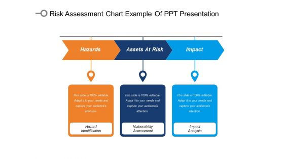
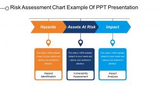
Risk assessment chart example of ppt presentation




Try Before you Buy Download Free Sample Product
 Impress Your
 Audience
 100%
100% Editable
 Save Hours
 of Time


Our Risk Assessment Chart Example Of Ppt Presentation are focused like a searchlight beam. They highlight your ideas for your target audience.
People who downloaded this PowerPoint presentation also viewed the following :
Risk assessment chart example of ppt presentation with all 5 slides:
Enhance your leverage with our Risk Assessment Chart Example Of Ppt Presentation. They make for an excellent fulcrum.
FAQs for Risk assessment chart example
So you need four main things: figure out what risks you're dealing with, rate how likely they are to happen, decide how bad the damage would be, and plan what you'll do about them. I'd add a scoring system so you can focus on the worst ones first - trust me, without this you'll stress about everything equally. Oh, and assign someone to own each risk or it'll just sit there. Keep it dead simple though, because if it's complicated nobody will bother updating it. That's honestly the biggest mistake I see people make.
So basically, grab your team and brainstorm every risk you can think of, then plot them on a chart with probability vs impact. Super helpful for seeing the big picture without getting lost in endless spreadsheets. The stuff in the top-right corner? That's your "oh crap" zone - tackle those first. Everything else can just sit there being monitored for now. I actually love these charts because you can show stakeholders what's going on without their eyes glazing over. Plus you'll update it as the project moves along and new risks pop up. Trust me, it beats trying to keep track of everything in your head.
So you'll need probability on one axis, impact on the other. Pretty straightforward stuff. Color-code it too - green, yellow, red so the bad stuff jumps out at you right away. Most folks go with either 3x3 or 5x5 grids, but honestly? Start with 3x3. It's way less overwhelming and works for most situations anyway. The key thing is defining what your terms actually mean. Like what's "rare" vs "likely" or "minor" vs "major" in your specific context - otherwise everyone's gonna interpret it differently and you'll have a mess on your hands. You can always make it more complex later if you need to.
Ok so you basically plot everything on your chart using those probability/impact scores. Higher scores = higher priority, obviously. I'd hit the red zone stuff first since that's your "oh crap" category needing immediate attention. Quick wins are where I always start though - high impact but easier to actually fix before you get into the messy complicated risks. Work down through the medium ones next, especially anything that could blow up fast. Don't sleep on those low-probability disasters either. Yeah they're rare, but they'll absolutely wreck your project if they hit. Make a numbered list and get owners assigned to each one.
Honestly, heat maps are your best friend for risk stuff - the color coding makes it super obvious what needs fixing right away. Matrix charts work the same way. I'm weirdly into bubble charts though because you can show three things at once (probability, impact, timeline). Traffic light dashboards are perfect when you're presenting to executives who just want the red/yellow/green snapshot. Bar charts are solid for comparing risks between departments or over time. Oh, and always think about what decision your audience actually needs to make first. Then pick whatever format makes those key points impossible to miss.
Look at past data and current trends to figure out how likely each risk actually is. Then think about impact - what's the real damage if this hits? Both money and how much it screws up operations. I'd go with a 1-5 scale for both, though some people just do high/medium/low. Whatever works. The main thing is staying consistent so you can actually compare risks against each other. Oh and definitely talk to the people dealing with this stuff every day - they'll give you way better estimates than anyone sitting in meetings all the time.
Honestly, the worst thing you can do is write super vague stuff like "operational problems might happen." Get specific! What exact operational problem? Also watch out for recency bias - just because your server crashed last week doesn't mean it's suddenly a huge risk. You'll want other people involved too, not just your own perspective. Keep the scoring simple or people won't use it. And here's the thing everyone forgets - you can't just make it once and call it done. Stuff changes constantly, so set up regular check-ins to keep it current.
At minimum, update it once a year. But honestly that's kinda lazy. Anytime you change processes, get new equipment, or hire people - revisit the whole thing. I've watched teams just file these away and never look again. Huge mistake. Had an incident or close call? That's your cue to dig back in. Here's what works: quarterly quick reviews (like 20 minutes max), then do the full deep dive annually. Or whenever something big shifts in your operation. Don't be the person who pulls out a 3-year-old risk chart during an audit.
Okay so you definitely need stakeholders for your risk assessment - they're the only ones who actually know what's going on day-to-day. Pull people from different departments early on. Finance will catch budget stuff you'd miss, operations knows which equipment is about to die, HR sees the people drama coming. I learned this the hard way once when I skipped talking to the field team and completely missed a huge safety risk. More voices here actually helps instead of making it chaotic. Get them involved in the interviews and make sure they're cool with how you rank everything at the end. Start by figuring out who cares most about each risk area.
Honestly, ditch those static spreadsheets - they're such a pain to update. Real-time software is where it's at. You'll get automatic risk score updates, alerts when things go sideways, and dashboards that don't make your team want to cry. Heat maps are clutch for showing stakeholders what's actually happening at a glance. Some tools even use AI to catch patterns you'd totally miss (which is kinda scary but also helpful). My advice? Figure out what manual stuff is killing your time first. Then find tools that handle those exact headaches. Way more efficient than trying to fix everything at once.
Honestly? Healthcare, finance, manufacturing, and construction get the biggest bang for their buck with custom risk charts. Generic stuff just doesn't work when you're dealing with safety protocols and potential disasters. Oil & gas is probably the best example - one screw-up and things go boom, literally. But here's the thing: if your risks are actually different from standard industry ones, then yeah, spend the money on customization. Construction sites have totally different hazards than hospitals, right? The real question is whether your specific processes create unique risks. If they do, custom charts will save you major headaches later. Trust me on this one.
Ok so qualitative risks use categories like "High/Medium/Low" or color coding - red, yellow, green stuff. Quantitative shows actual numbers though - dollar amounts, percentages, probability scores. Think of it as qualitative = "this feels risky" vs quantitative = "this costs $50K with 15% chance of happening." Honestly? Start with whatever data you can actually get your hands on. Execs love the visual simplicity of those color-coded charts, but you'll need hard numbers if you're trying to justify spending decisions later. I've seen people waste weeks chasing perfect data when they could've just used what they had.
Oh man, tons of places use these things. Aviation's huge on risk matrices for safety stuff, and pharma companies basically can't function without them during drug trials. Construction's probably where you see them most - they're obsessed with preventing accidents and delays. Oil companies use them for environmental assessments too. Toyota actually got creative and worked them into their lean manufacturing, which I thought was pretty smart. Honestly, if you're trying to figure this out for your company, I'd dig into aviation or healthcare examples first. They document everything really well and you can actually see the money benefits.
So here's what works - start by mapping your big goals, then grab everyone for a proper risk brainstorming session. Don't let one person handle this solo, trust me. Get the whole team plotting out likelihood vs impact for each major thing you're trying to pull off. Way too many people I know treat this like homework they can do later and it always bites them. The magic happens when you're all in the room arguing about what could go wrong - that's when you spot the real nasties. Then you can actually build fixes into your plan instead of scrambling later.
Honestly, just start with Excel or Google Sheets if you're new to this - most people already know how to use them and they work fine for basic risk matrices. Lucidchart's pretty solid if you need something prettier with better team collaboration. Visio works too but it's more expensive. SmartDraw exists but the interface feels weird to me, though maybe that's just personal preference. Oh, and if you're at a big company, they might already have GRC platforms like Resolver or ServiceNow that do risk charts built-in. But seriously, don't overthink it - Excel's probably all you need to start. You can always switch later once you figure out what actually matters for your team.
-
Much better than the original! Thanks for the quick turnaround.
-
Best way of representation of the topic.