Risk assessment matrix good ppt example

Rating:
90%
Risk assessment matrix good ppt example
Slide 1 of 5
Favourites Favourites

Try Before you Buy Download Free Sample Product

Audience Impress Your
Audience
Editable 100%
Editable
Time Save Hours
of Time
The Biggest Sale is ending soon in
0
0
:
0
0
:
0
0
Rating:
90%
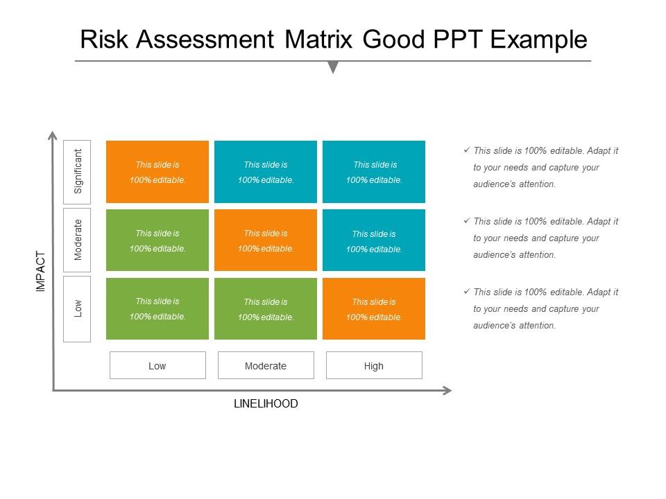
Presenting risk assessment matrix PPT slide. Extremely well designed PPT design patterns. Provides an incredible concept framework and quite beneficial for business specialists from diverse sectors. The exclusive extent of malleable PPT icons and designs. Revise able magnitude and intensity for the Presentation graphic or icons. Flexibility to customize the same into divergent configurations like PDF or JPG. Quite simple and easy downloading process.

FAQs for Risk assessment matrix

So you need probability and impact - how likely is it and how screwed are you if it happens? Plot them on a grid, usually 3x3 or 5x5. One axis is probability, other is impact. Rate everything low/medium/high or use numbers 1-5, whatever works. Some teams throw in detectability too but honestly that's overkill most of the time. The trick is getting everyone to agree on what "medium probability" actually means - otherwise you'll have chaos. Oh and don't overthink the fancy stuff, basic two-dimensional grids work fine for almost everything.

First thing - figure out what would actually destroy your business vs just piss everyone off for a day. Map those thresholds out honestly. Then tweak your probability and impact scales to match what you're actually dealing with. Like, a startup worrying about server downtime is totally different from a hospital's concerns, right? Change up the scoring and colors so they actually reflect how your team makes decisions. Here's the real test though: run it against some disaster that already happened. If your matrix says last year's massive outage was "low risk," your scales are garbage and need fixing.

Look at your past incidents and how often similar stuff happens to gauge likelihood. Control effectiveness matters too. Impact-wise, think money lost, operations getting messed up, reputation hits, and regulatory headaches. Honestly, a 1-5 scale works best for both - keeps everyone on the same page. Your company's risk tolerance should shape the criteria though. The trick is staying consistent when you rate each risk, otherwise you can't really compare them properly. Set clear definitions for each level right from the start, then don't deviate. Makes the whole process way more reliable.

Dude, risk matrices are actually pretty clutch for getting teams on the same page. You know how engineering will say something's "kinda risky" while finance is like "we're all gonna die"? With a matrix, everyone's using the same 1-5 scale for probability and impact. Makes prioritizing so much easier - plus leadership actually listens when you can show them a visual. I've seen it work magic in cross-team projects. Marketing, ops, tech - they can finally have real conversations about trade-offs instead of talking past each other. Honestly wish more companies used them from the start.

Don't make your matrix too generic - actually tailor it to what your business does. The worst thing I see? Companies using "high" and "medium" without explaining what those mean. Everyone just guesses differently and it becomes pointless. Oh, and don't only focus on bad stuff happening. Positive risks exist too (yeah, that's a thing). Most teams build it once then forget about it for years while their company totally changes. Define your scales clearly from the start. Review it every so often or you'll end up with something completely useless.

Update it yearly at minimum, but that's really just the bare bones. Major changes? New rules? Big incidents? Time to dust it off again. Honestly, I've watched teams just file these away and never look back - total waste. Quarterly reviews work well, even if it's just a quick scan. Your matrix has to match what's actually happening now, not last year's situation. Train people to speak up when something feels off or outdated. Oh, and set those calendar reminders or you'll definitely forget.

Honestly, ditch the spreadsheets and go digital. Risk management software pulls data from everywhere automatically - saves you hours of tedious updates. Interactive heat maps are way cooler than static charts, plus you'll get alerts when things actually change. Your team can all work on it at once with cloud tools too. Dashboards let you spot trends over time, which is pretty useful. I'd start with dedicated risk software first, though even upgrading from Excel helps. The real-time aspect alone makes it worth switching.

Look, just bake it into your normal project stuff from the start. Create one during kickoff, then actually update it at milestones - I swear half the teams I know build these things and then never touch them again. Give someone ownership of the big risks and track fixes in whatever PM tool you're already using. Monthly team reviews work pretty well, honestly. The whole trick is keeping it alive instead of letting it collect digital dust. Oh, and don't overthink it - just update when things change or new problems pop up.

You definitely need stakeholder input - can't do this solo. Finance spots regulatory stuff operations misses, while frontline workers see day-to-day risks management's blind to. Different people, different perspectives, you know? Getting everyone involved early also means they'll actually use the thing later instead of fighting it. Map out your key players first. Then do workshops or just sit down with them individually to get their take on how likely each risk is and what the impact would be. Trust me, their buy-in makes everything way less painful down the road.

So qualitative uses those vague scales - high/medium/low, likely/unlikely, whatever. It's pretty subjective, depends on who's doing the judging. Quantitative actually crunches numbers - real percentages and dollar amounts. Honestly, I've seen both work fine in risk matrices. Go qualitative when you're moving fast or don't have great data yet. Numbers give you better comparisons though, if you've got them. Really just depends what you're working with. Oh, and quantitative takes way longer if that matters for your timeline.

Honestly, color-coded risk matrices are a game changer. Red jumps out at you - that's your "drop everything" stuff. Green? You can breathe easy for now. Yellow sits in the middle, obviously. Your team won't zone out during presentations anymore because everyone gets it instantly. No more explaining which risks matter most - people just see it. Decision-making speeds up like crazy since there's no confusion about priorities. I'd stick with basic red-yellow-green at first. You'll be shocked how much smoother your risk conversations get once you can actually visualize everything.

Honestly, skip the boring slideshow and jump straight into hands-on workshops with real scenarios from your company. Way more effective. Your team needs to practice assessing probability and impact properly - I've watched too many people just throw dots around randomly without thinking! Cover what low/medium/high risks actually mean for decisions. Different people should assess the same risks and compare notes during regular calibration sessions. Oh, and make sure everyone's on the same page about your risk appetite and when you'll actually respond to stuff. That alignment piece is huge.

Oh definitely check out aviation first - Boeing maps out everything from engine failures to random bird strikes, which honestly seems a bit paranoid but makes sense given the stakes. Pharma companies do the same thing when developing drugs, weighing regulatory headaches against their timelines. Construction giants like Bechtel can't survive without them for environmental and safety stuff. Tech uses them too for cyber threats. Your industry's regulatory body probably has case studies you can steal ideas from - they're usually anonymized but super practical for real situations.

So basically, a risk matrix is your best friend when auditors show up. You can point to it and say "look, we actually know what we're doing here." Most regulations want proof you're systematically tracking risks, not just winging it. The matrix documents how you identify stuff, score it, and decide what to tackle first. Honestly, it makes compliance reporting so much less painful when everything's already mapped out. You'll want to connect your specific regulatory requirements to different risk categories upfront - saves tons of time later. Plus auditors love seeing that objective scoring when you're explaining why you spent budget on X instead of Y.

Honestly, just start with Excel or Google Sheets - most teams never outgrow them anyway. Way easier than you'd think for basic risk matrices. Need something fancier? ServiceNow, Resolver, or LogicGate are solid GRC tools, though they'll cost you. Visio works too if you're going for the visual route. Oh, and if your team's always collaborating (which, let's be real, they probably are), Miro or Lucidchart let everyone jump in and edit simultaneously. That's pretty clutch. My advice? Use whatever you've already got first. You can always upgrade later if you need better reporting or want to integrate with other systems.

Ratings and Reviews

90% of 100
Review Form
Write a review
Most Relevant Reviews
  1. 100%

    by Demarcus Robertson

    Nice and innovative design.
  2. 80%

    by Joe Thomas

    Design layout is very impressive.

2 Item(s)

per page: