


Risk matrix risk assessment and mitigation strategies presentation diagrams




Try Before you Buy Download Free Sample Product
 Impress Your
 Audience
 100%
100% Editable
 Save Hours
 of Time


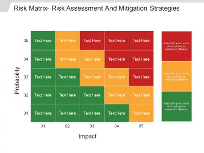
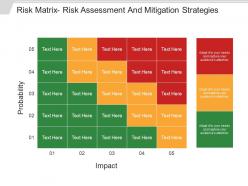
Use our Risk Matrix Risk Assessment and Mitigation Strategies Presentation Diagrams to identify risks and their impacts depending on the probability of various situations. Our template shows a simple visualization matrix which is a management method to help you present possible risks and define the risk levels. As a result, you can support management decision making and plan activities to mitigate those risks. Our diagram illustrates levels of probability of risks and their impact with green color interpreting no risk, yellow color showing medium risk and red color expressing higher risk. Our presentation consists of risk matrix diagram which focuses on the highest priority risks, and present complex risk data in a visual chart. This eye catchy graphic can be used by any audience, students for their projects or business partners. So, identify risks and take essential steps to deal with those risks using our risk matrix and assessment PowerPoint template and curb risks by outlining a plan. Institute better coordination with our Risk Matrix Risk Assessment And Mitigation Strategies Presentation Diagrams. Establish guidelines to improve cooperation.
People who downloaded this PowerPoint presentation also viewed the following :
Risk matrix risk assessment and mitigation strategies presentation diagrams with all 5 slides:
Convince folks to extend a hand of friendship with our Risk Matrix Risk Assessment And Mitigation Strategies Presentation Diagrams. It helps bring about accord.



FAQs for Risk matrix risk assessment and mitigation
You need two main axes - probability (how likely) and impact (how bad if it happens). Most people go with either 3x3 or 5x5 grids. Honestly? 5x5 gives better detail but might be overkill for small teams. Color coding helps a ton - red/yellow/green is pretty standard. The tricky part is making sure everyone's on the same page about what "high probability" actually means for your situation. Otherwise you'll get wildly different ratings from people. Oh, and set clear thresholds for when you actually need to act on risks, not just identify them.
Okay so basically you plot risks on a grid - likelihood vs. impact. The ones that land in the high-high corner? Those are your "oh crap" priorities. Way better than just arguing about random problems in meetings (trust me on this one). Your team can actually see why you're freaking out about certain issues while ignoring others. Stakeholders get it too since it's visual. Just grab your biggest concerns and start plotting them out. You'll probably be shocked how obvious the priorities become once they're mapped out like that.
The vague scales will kill you - "high, medium, low" means nothing when everyone's got different ideas about what those actually mean. I've watched teams argue for hours over whether something's "medium" or "high" risk. Keep it simple though, maybe 3x3 or 4x4 max. Those crazy 7x7 matrices? Total waste of time. Nobody uses them right. Make your criteria super specific and measurable instead of fuzzy. Don't try jamming every risk into perfect little categories either - some stuff just doesn't fit neatly. Get the right people involved from the start, then test your matrix on a few real scenarios before you roll it out to everyone.
So a risk matrix is just plotting your risks on a grid - probability versus impact. Traditional risk assessments? Those are the thick reports with all the detailed analysis and mitigation plans. Honestly, the matrix is way better for executive meetings since it's that quick red-yellow-green visual. Those lengthy reports are thorough but nobody really wants to read through 20 pages. Plus matrices are way easier to update when things change. I've found you kind of need both though - use the matrix for quick decisions and figuring out priorities, then do the full assessment for anything that lands in your high-risk zone.
Look at your historical data first - what's actually happened before in your industry? Then check your current controls. Impact-wise, think money, operations getting screwed up, reputation hits, regulatory headaches, safety stuff. Basically anything that'd mess with your business. Don't be dramatic about it though, just realistic. Direct effects are obvious but indirect ones can bite you too. Oh and your company's risk tolerance matters way more than people think. The main thing is staying consistent when you're scoring everything so you can actually compare risks later.
Honestly, tech makes risk matrices way less boring. Instead of some dusty spreadsheet, you get real-time updates and alerts when stuff hits critical levels. The AI features are actually pretty slick - they'll catch risks you totally missed. Interactive dashboards are where it's at though, way better than those old static charts nobody wants to read. You can track how risks shift over time too, which is super helpful. I'd start small with basic risk management software or even just upgrade your Excel game. Makes the whole process way more visual and - dare I say it - almost enjoyable for stakeholders.
Look, quarterly reviews are the bare minimum - monthly is way better if things move fast at your company. Definitely update it after any incidents or when operations change. New regulations too, obviously. Don't try doing this alone though, that's a mistake I see all the time. Pull in people from different departments because they'll catch stuff you totally missed. Actually document what you changed and why - trust me, someone will ask about it six months later and you won't remember. Oh, and set those calendar reminders right now or you'll keep putting it off.
Dude, you've gotta stay on top of that risk matrix or it'll become useless fast. Set up quarterly reviews with your team and leadership - seriously, I've watched so many companies build these things then completely abandon them. When you meet, check if your risks still match what the business actually cares about right now. Company priorities shift all the time (mine does anyway), so your scoring should too. Pull in people from other departments during reviews. They'll catch stuff you missed. Oh, and if leadership suddenly decides to pivot the whole strategy? Your risk categories need updating ASAP. Think of it like maintenance - skip it and everything breaks down.
Definitely get your stakeholders involved early - they know way more about what can actually blow up in their departments than you do. Operations, finance, compliance people... they'll give you the real scoop on probability and impact instead of just guessing. Plus everyone has different comfort levels with risk, so you need those varied perspectives. Otherwise you'll end up with some fancy matrix that looks good on paper but doesn't match reality. I learned this the hard way on my last project - thought I could wing it solo and missed some obvious stuff.
Risk matrices aren't one-size-fits-all, which is actually pretty cool. You can tweak the probability and impact scales for whatever industry you're in. Healthcare focuses on patient safety stuff, while manufacturing worries more about equipment breaking down and worker injuries. Financial companies might measure impact by regulatory fines - makes sense when you think about it. Construction? They're all about safety violations and project delays. The trick is getting your actual team involved to figure out what "high risk" means for you guys specifically. Start by listing your top 10 risks and build around those. Way better than using some generic template that doesn't fit.
So many choices honestly. Excel or Google Sheets are where most people start - they're flexible and you've probably got them already. LogicGate, ServiceNow GRC, or Resolver are solid if you want something fancier. I've actually seen people make decent ones in PowerPoint but that gets annoying real quick. Project management stuff like Monday.com or Asana often has templates built right in too. My take? Start with Excel first to figure out what you actually need. Then maybe upgrade later if you're dealing with really complex enterprise stuff - no point overcomplicating it from day one.
Honestly, just make it part of your regular routine instead of some big separate thing. During sprint planning in Agile? Throw in 10 minutes to plot any new risks. Waterfall projects work too - update your matrix at each phase review. PMI already has risk stuff baked in anyway, so the matrix just becomes your visual tool. I'd start super simple though - create a basic template and update it weekly in team meetings. The trick is making it automatic, not something you do once and forget about. Weekly updates sound like overkill but trust me, risks change fast.
So color coding is basically your cheat sheet for figuring out what fires to put out first. Red means drop everything - this is gonna blow up. Yellow's like "watch this one closely," and green means you're fine for now. Honestly, it saves so much time in meetings because nobody has to decode spreadsheets. Leadership loves it too since they can spot the disasters at a glance. I always tackle the red stuff first, then work down. Sounds obvious but you'd be surprised how many people get distracted by the easy green wins instead.
Honestly, risk matrices are a lifesaver for compliance stuff. Regulators eat up that standardized approach - you can show them exactly how you're spotting and ranking compliance issues against their requirements. Creates those clean visual reports that executives actually look at instead of ignoring spreadsheet dumps. The consistent scoring proves you're being systematic about risk management, which auditors love seeing. Start by matching your compliance requirements to the matrix categories (saves so much headache later). Oh, and it beats scrambling to explain your process when audit season rolls around. Way less stressful than winging it.
Oh man, airlines are probably the biggest users - they're constantly mapping out weather delays, mechanical issues, all that stuff. Healthcare uses them too for patient safety. Construction sites obviously need them for jobsite dangers. Even smaller businesses get into it though. Restaurants track food safety risks, event planners worry about vendors bailing or venue problems. Honestly, cybersecurity teams are probably going crazy with these things right now mapping data breaches. The trick is you can't just make one and forget about it - gotta keep updating as new problems pop up.
-
Awesomely designed templates, Easy to understand.
-
Designs have enough space to add content.