


Risk matrix impact analysis





Try Before you Buy Download Free Sample Product
 Impress Your
 Audience
 100%
100% Editable
 Save Hours
 of Time


Our Risk Matrix Impact Analysis are topically designed to provide an attractive backdrop to any subject. Use them to look like a presentation pro.
People who downloaded this PowerPoint presentation also viewed the following :
Risk matrix impact analysis with all 2 slides:
Use our Risk Matrix Impact Analysis to effectively help you save your valuable time. They are readymade to fit into any presentation structure.
FAQs for Risk
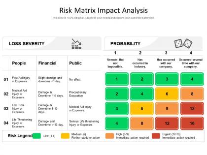
So a risk matrix is just this visual grid where you plot risks by how likely they are vs how bad they'd be if they happened. Picture a heat map but for problems. One axis is probability, the other is impact. Drop each risk into its box, and whatever lands in that red "high chance, big damage" corner becomes your top priority. Way better than drowning in random lists of doom scenarios, you know? I'd start with a basic 3x3 setup - you can always make it fancier later. Really helps you figure out what actually deserves your panic versus what you can put on the back burner.
So a risk matrix is basically two things: how likely something is to happen, and how screwed you'd be if it does. Plot stuff on a grid - one side shows probability (rare to almost certain), the other shows how bad the impact would be. Most people use 3x3, 4x4, or 5x5 grids. Honestly though, 5x5 gets messy fast unless you really need that detail. Where the two factors meet gives you your risk level - usually green for low, yellow for medium, red for high. I'd start with 3x3 since it's way easier to wrap your head around. You can always get fancier later.
So basically you want to look at how often this stuff has happened before, plus what's different about your situation now. Then think about all the ways it could mess things up - money, day-to-day operations, your reputation, safety issues, whatever applies. I'm a big fan of just using 1-5 scales for both how likely it is and how bad it'd be, though some people do the whole low/medium/high thing instead. Just stay consistent with whatever you pick. Definitely get other people involved who actually know what they're talking about in your specific area. Write down why you decided what you decided - trust me, you'll forget later and want to adjust things anyway.
Honestly, risk matrices are everywhere - construction, healthcare, manufacturing, finance. Pretty much any industry where stuff can go badly wrong. Project management uses them constantly too, especially in tech and oil/gas. Aviation's another big one. The visual aspect is what makes them so useful - you get that quick snapshot of probability versus impact. Makes sense when you think about it. Construction sites would be chaos without proper risk assessment tools like these. If you're dealing with regulatory stuff or potential accidents that could cost serious money, definitely worth setting one up. Way better than just winging it.
So basically a risk matrix helps you see which problems are actually worth worrying about. Plot out your biggest risks - what's likely to happen vs. what would really hurt if it did. High probability + high impact = deal with this first, obviously. Low probability stuff? Maybe ignore it for now (unpopular opinion but whatever). It's honestly super helpful when you're trying to figure out where to spend your time and budget instead of just panicking about everything equally. Start with your top 10 risks and you'll spot patterns pretty quickly.
Look, risk matrices are decent but they've got some real problems. They oversimplify everything - shoving messy, complicated risks into these tidy little categories that don't really capture what's actually happening. The scoring is super subjective too, like what I think is "high probability" might be totally different from what you think. They're also garbage at showing how risks connect to each other or change over time. Honestly? The false precision thing bugs me the most - they make everything look so clean and mathematical when it's really just educated guessing. Still use them, but dig deeper on anything that actually matters to your business.
Definitely start with that risk matrix - visuals are everything with these presentations. Jump straight into the red zones because honestly, executives will check out if you begin with low-priority stuff. I learned that the hard way. Walk them through the heat map and ditch the risk jargon completely. Connect everything back to outcomes they actually care about - revenue, reputation, whatever keeps them up at night. And here's the key part: don't just dump problems on them. Come armed with your recommended actions and what resources you'll need for the high-priority risks. They want solutions, not more headaches.
Honestly, Excel or Google Sheets work great for most people - they're flexible and you probably already know how to use them. If you want something fancier, check out GRC platforms like ServiceNow or LogicGate since they come with templates built in. I've even seen teams throw together decent ones in PowerPoint, which sounds weird but actually works pretty well. Monday.com and Smartsheet have risk matrix options too if you're already using those for project stuff. My advice? Start with Excel to nail down your format first, then maybe upgrade later if you need better sharing features.
Honestly, risk matrices work best when you don't rely on them for everything. Run your Monte Carlo or fault tree analysis first - that's where the real number crunching happens. Then just map those results onto your matrix for presentations. Executives love the visual summary, but you still have the detailed analysis backing it up. I mean, trying to force complex risk scenarios into a simple grid never works well anyway. Think of the matrix as your translation layer - it takes all that technical stuff and makes it digestible for stakeholders. Way more effective than picking just one approach.
Yeah, definitely customize it for each project! The scales should match what you're actually dealing with - like software projects might worry about "delays sprint by 1 day" vs "delays release by 3+ months" while construction focuses more on safety stuff. You can tweak the colors and thresholds however you want (though honestly, red-yellow-green is pretty universal for a reason). Just make sure your whole team agrees on what everything means before you start. Otherwise you'll have people rating the same risk completely differently, which gets messy fast. Document it somewhere obvious so nobody forgets mid-project.
Monthly updates work best, especially if your industry moves fast. Quarterly's the bare minimum though. Your probability and impact scales get stale quick - what seemed "high risk" last year might be nothing now. Don't just review it alone either, loop in other people who actually know what's happening. Oh and write down why you changed stuff, because I guarantee you'll forget your reasoning later. The biggest mistake? Building this thing then never touching it again until some compliance person asks for it. Actually use it or it's pointless.
So this is actually super interesting - your team's cultural backgrounds totally shift how they see risks on that matrix. Someone from a more cautious culture might freak out over something that seems like no big deal to others. And don't get me started on probability stuff - some people are naturally optimistic while others always expect things to go sideways. I've noticed collectivist cultures really stress about reputation risks way more than individualistic ones do. You'll want to talk through your criteria with everyone upfront. Maybe even make different versions for global projects? Sounds like overkill but it actually helps a ton.
So basically you plot risks on a grid - likelihood vs impact. High probability AND high impact? Those go in the top right corner and yeah, that's your "oh shit, fix this immediately" pile. Everything visual like that just makes way more sense to me than endless lists. Bottom left is low-risk stuff you can mostly ignore for now. I'd definitely hit the red zones first, then just work down based on what time and budget you've got left. Way easier than trying to keep it all in your head.
Honestly, risk matrices are lifesavers for compliance teams. You plot risks by how likely they are vs how bad they'd be - creates this visual map of your biggest problems. Great for when auditors show up asking what you're actually doing about regulatory stuff. I'd start by listing out your current compliance headaches and see where they land on the grid. You can prioritize what needs fixing now versus later. Plus the documentation angle is clutch - regulators love seeing you've thought things through systematically. Quick heads up though, you'll probably find way more high-priority issues than expected once you map everything out.
Honestly, the visual stuff is what makes or breaks these things. You want clear colors that actually make sense - red for high risk, not some weird purple situation. I've seen matrices that look absolutely terrible, like someone just threw colors at a wall. Make sure your fonts are readable and give everything room to breathe - cramped layouts are the worst. Your axis labels shouldn't require a magnifying glass to read. People need to get it in about 10 seconds, otherwise you've lost them. Also, don't go crazy with the rainbow effect. Stick to colors that logically connect to risk levels and you'll be fine.
No Reviews