


Sales highlights powerpoint slide ideas





Try Before you Buy Download Free Sample Product
 Impress Your
 Audience
 100%
100% Editable
 Save Hours
 of Time


Folks enjoy the interaction due to our Sales Highlights Powerpoint Slide Ideas. They will find it an inspiring experience.
People who downloaded this PowerPoint presentation also viewed the following :
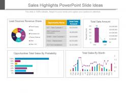
Sales highlights powerpoint slide ideas with all 4 slides:
Our Sales Highlights Powerpoint Slide Ideas give you a court to play on. Dribble your way along and score a goal.
FAQs for Sales highlights
Honestly, just stick to the stuff that actually matters - revenue, deal volume, conversion rates. Maybe throw in pipeline health if it's looking decent. Charts are way better than text blocks because nobody wants to stare at a wall of numbers. I always do year-over-year comparisons since executives eat that trend stuff up. Customer acquisition cost is solid too if you've got room. Don't go overboard though - like 4-6 metrics tops or people's eyes will glaze over. Just make sure whatever you pick actually supports your main point.
Dude, visuals beat boring spreadsheets every time. Your audience will actually remember bar charts showing comparisons or line graphs tracking growth - way better than drowning them in raw numbers. I'm obsessed with progress bars for hitting targets because people get genuinely excited seeing how close you are. Colors and sizing help too, especially for highlighting your biggest wins. Honestly, most people's eyes glaze over with data dumps. But turn those numbers into a clear story? They'll follow along and actually retain what you're saying. It's like the difference between reading a textbook and watching a good documentary.
Put your biggest wins right at the top - revenue, major deals, whatever looks most impressive. Trust me, people zone out super fast in these things. Group stuff by what actually matters to your audience (new customers, renewals, regions, etc.). Bullet points are your friend here, not paragraphs. Keep it to 3-5 highlights max per slide or you'll overwhelm them. Make those killer numbers stand out with bold text or color - honestly, half the battle is just making it easy to scan. Lead with impact, organize logically, and you're golden.
Oh definitely go with line charts for sales growth - they're perfect for showing trends over time. Column charts work well too if you want to compare specific periods side by side. I mean, bar charts exist but they're honestly better for comparing different products or regions, not really time-based stuff. You could get fancy with a combination chart that shows both your actual sales numbers and growth percentages together. That usually looks pretty impressive. Just make sure everything's labeled clearly so people don't get confused trying to read it.
Okay so here's what works - treat your sales highlights like you're telling a story. Start with whatever problem or challenge you guys were dealing with. Then walk through how you actually solved it, and boom - end with the big wins. I swear this makes such a difference because suddenly your boring spreadsheet numbers become like... actual plot points people care about? Try saying stuff like "Here's what happened when we..." or "Everything changed once we..." The whole thing just sticks way better when there's a narrative people can actually follow instead of random data dumps.
Dude, color psychology is no joke when it comes to sales slides. Green's your best friend for revenue numbers - makes people think money and growth. Blue builds trust (there's a reason every bank uses it). Red? Save it for urgent stuff or warnings, otherwise it stresses people out. I honestly thought this was all BS until I started paying attention to which presentations actually landed deals. Now I'm weird about it lol. Don't go crazy though - pick 2-3 colors max that match the vibe you want. Pretty slides mean nothing if they're making your prospects feel anxious instead of excited about working with you.
Monthly updates usually work best, but it really depends on your pace. Fast-moving team closing deals left and right? Go weekly. Most people though can get away with once a month - gives you time to actually collect decent data instead of constantly scrambling around. Oh, and definitely lead with your biggest wins from the recent quarter. Nobody cares about that deal you closed in January when it's already April, you know? Set a phone reminder or you'll totally forget (I always do). Weekly might be overkill unless you're absolutely crushing it.
Stick to 5-7 bullet points tops on that sales slide. More than that and people just zone out. One line per bullet, two max if you really need it. I can't tell you how many presentations I've sat through where the slide is packed with microscopic text - nobody's reading that from row 10. Focus on your biggest wins: revenue jumps, landing major clients, crushing your targets. The stuff that actually makes people sit up. Oh, and practice it so you can blast through everything in under 2 minutes. Trust me, shorter is always better with this kind of thing.
Honestly, it's all about knowing your audience. Executives want the big picture - revenue growth, market share, major wins. Sales teams? They care about territory numbers and pipeline health since that's what affects their paychecks. Product people want to know which features are actually moving the needle. Finance will zero in on margins and acquisition costs (they always do). Same $2M deal can be "we crushed our quarterly target" for leadership or "our new pricing strategy is working" for product. I learned this the hard way - you've gotta lead with whatever keeps that specific room engaged.
Make your numbers pop with big, bold fonts - nobody wants to squint from the back of the room. Add context too, like "150% of target" or "our best Q3 ever." I'm a sucker for green when showing growth, red only if something's urgent. Honestly, cramming tons of tiny text on slides is my biggest pet peeve. Stick to 3-4 key wins max. Icons and simple charts help break things up visually. Each highlight should connect to your main story though - don't just throw random numbers at people. Less really is more with this stuff.
Honestly, video testimonials with customer photos and pull quotes work way better than boring text blocks. The split-screen thing is pretty solid too - headshot on one side, their quote with actual numbers on the other. Though don't go crazy with it or it gets repetitive. What's really cool is making fake social media posts that look like LinkedIn or Google reviews. Before/after timelines showing their journey hit different too. Oh, and definitely get permission first - learned that the hard way. Numbers make everything more believable, so push for specific results in their testimonials.
Seasonal charts are your best friend here - throw some snowflakes and leaf icons on there to make it pop. Line graphs work too if you're not into the cutesy stuff. Honestly, the visual approach just clicks better than boring spreadsheets. Show your peak seasons right up front, then call out any weird dips with quick explanations. Maybe Q4 tanks because everyone's broke after holidays? Your audience will get it immediately and know exactly when to gear up for busy periods. Trust me, they'll actually remember this stuff when it's visual.
Dude, honestly just start with Canva - their sales templates are actually decent and you won't spend forever tweaking fonts. For fancier stuff, Adobe Creative Suite is amazing but probably overkill unless you're really into design. Figma's great too for custom charts that don't look boring. Even GIMP works if you need quick image fixes (and it's free). I usually mix Canva templates with something like Tableau for the data stuff - makes everything look way more legit. Seriously though, Canva first. You can always get fancy later but it'll get you results right away.
So you can connect your CRM straight to PowerPoint and it'll auto-update your slides with fresh numbers. Set it up once, then forget about it. I use Zapier for most of this stuff - works pretty well. Your charts just refresh themselves, which is clutch for those Monday morning sales meetings. No more copying and pasting data like some kind of caveman. Power Automate's another good option if you're already in the Microsoft world. Honestly saves me like 30 minutes every week, and I never have to do that awkward "oh wait, these numbers are from last month" dance again.
Don't dump a million data points on one slide - people's eyes just glaze over. Those generic PowerPoint templates are honestly the worst, makes you look super unprofessional. Pick 3-5 solid wins and stick to them. Your charts need to be readable from the cheap seats, and keep colors consistent throughout (sounds obvious but you'd be surprised). Skip metrics that don't actually mean anything to the business. Lead with the "so what" factor - like why should Bob from accounting even care? Clean visuals work way better than cluttered ones. Trust me on this.
-
Great designs, Easily Editable.
-
Informative presentations that are easily editable.