


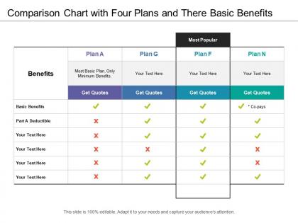
Comparison chart with four plans and there basic benefits




Try Before you Buy Download Free Sample Product
 Impress Your
 Audience
 100%
100% Editable
 Save Hours
 of Time


Initiate a cost cutting exercise with our Comparison Chart With Four Plans And There Basic Benefits. You will find it highly inexpensive.
People who downloaded this PowerPoint presentation also viewed the following :
Comparison chart with four plans and there basic benefits with all 5 slides:
Our Comparison Chart With Four Plans And There Basic Benefits will become your crowning glory. They will adorn your thoughts beautifully.
FAQs for Comparison chart with four plans and
So basically it's about storage and team stuff. Basic gives you 2GB and the standard templates - fine if you're just messing around solo. Pro jumps to 100GB plus fancy animations and team sharing, which is honestly where most people should probably land. You also get those premium stock photos that don't look like every other presentation out there. Enterprise has unlimited everything - storage, custom branding, the works. Your IT people won't hate it either since there's actual admin controls. If you're doing client work or collaborating, Pro's your best bet.
Honestly? Yeah, go premium if you need the fancy stuff. Basic templates hit a wall pretty quick once you want anything beyond super simple. The extra cash gets you way better customization, solid integrations, and priority support - which you'll definitely need when stuff breaks (and it will). Mobile responsiveness is usually way better too. I mean, if it's just for messing around, basic works fine. But anything client-facing or with specific requirements? Worth the upgrade for sure. The loading speeds alone make a difference.
Honestly, templates are such a game changer - they'll cut your prep time in half easy. You're not reinventing the wheel every single time, just tweaking what already works. Pick ones that match your vibe and then customize the colors, fonts, whatever fits the project. The consistency thing is huge too because clients notice when your stuff looks cohesive and professional. I learned this the hard way after pulling too many all-nighters starting from scratch lol. Plus you can still make everything look custom even though you're working smarter, not harder.
Yeah, presentation costs are brutal when you're already broke as a student. Design software subscriptions and decent templates cost way too much, so you end up stuck with crappy free alternatives while other students have access to the good stuff. It's so unfair - your work looks amateur not because you suck at it, but because you can't afford Photoshop or whatever. Definitely hunt around for student discounts though, most companies offer them but hide them pretty well. Adobe has student pricing that's actually reasonable, and Canva's free version isn't terrible if you get creative with it.
Look, tech and consulting companies probably get the most out of these since they're pitching nonstop. Finance and healthcare teams use them tons too - they've got all this complex data to make sense of plus compliance stuff to worry about. Schools are surprisingly big users because professors present to like everyone. Oh, and literally any field where you're explaining complicated things to different people will see benefits. Quick question though - does your team mostly do internal updates or external pitches? That'll help you figure out which template style makes sense.
Testimonials are honestly pretty helpful for seeing past the marketing BS. Look for the ones with actual details about ROI and support quality - not just "this product is amazing!" Focus on businesses that match your size and industry since their experience will be way more relevant. I always check what Premium vs Basic users are saying. Like, Premium folks might rave about collaboration features while Basic users are stuck complaining about storage limits. That tells you where the real value is. Some testimonials are total fluff though, so dig for the specifics about what actually worked day-to-day.
Dude, don't sleep on customer support when you're picking a template plan. Yeah templates seem easy but you'll definitely run into weird formatting stuff or can't figure out how to customize something. Premium plans usually hook you up with live chat or priority support - literally saves your butt when you're scrambling before a big presentation. Basic plans? You're stuck emailing and waiting forever. I learned this the hard way lol. Check their response times before you buy. Some let you test their support first which is actually pretty smart to do.
Dude, visuals are a game changer - people remember like 65% more when you mix pictures with text instead of just boring words. Charts work great for comparing benefits, videos show actual user stuff, and infographics break down those weird plan details nobody understands. I mean, who wants to read paragraphs about deductibles? Animations help with step-by-step things, comparison tables are perfect for side-by-side features. Oh and skip the stock photos - they're terrible. Real pics only. Just start with one solid visual per main point and you'll be good.
Honestly, the ROI is pretty solid when you think long-term. Your team stops looking like they're all using random templates from 2015 (you know what I mean). Deck creation gets way faster since you're not starting from scratch every time. Plus consistent messaging actually makes your brand look professional. Companies with standardized frameworks see 40% faster prep times - that's real data, not just corporate fluff. Better audience engagement too. I'd start by looking at what slide types you use most often. Once you nail down those core templates, everything else falls into place.
Oh man, collaboration features are a game changer! No more of that "final_final_ACTUAL_final.pptx" madness we've all lived through. Everyone can jump in and edit different slides at once, plus the commenting thing is clutch for getting feedback without endless email chains. Real-time changes mean you actually see what's happening instead of guessing. The higher plans usually throw in better admin stuff and connect with project tools, which honestly makes tracking way less of a headache. Just heads up though - check your plan's limits first. Some cap how many people can edit simultaneously or how long they keep comment history, and that gets annoying fast when deadlines hit.
So basically the cheap plans are super easy - just drag stuff around with templates they give you. But you're pretty limited. Mid-tier ones let you mess with CSS and get more control, though honestly that's where it gets tricky if you're not tech-savvy. Premium gives you everything - full design control, white-label stuff, developer tools. It's always that same trade-off between simple vs. flexible, you know? I'd just pick whatever feels right for your skill level since most places let you upgrade later anyway. Your work usually transfers over fine.
Honestly, template updates are what separate the good plans from the trash ones. You don't want to pay for stuff that'll look ancient in two years - total waste of money. Good providers drop new templates regularly and keep refreshing their styles so you're not stuck with 2019 vibes forever. But some companies? They just dump a bunch of templates at launch and basically ghost their own product. Super annoying. When you're comparing plans, check how often they actually update and if it costs extra. Makes a huge difference long-term.
Honestly, digital is so much better for the environment. You're skipping all that paper waste - like 20-50 sheets per presentation, plus ink cartridges that are stupid expensive anyway. No shipping materials either. The best part? When you need to update something (which happens all the time), you're not throwing away a bunch of printed copies. Digital devices use way less energy than manufacturing and tossing physical materials. If you're presenting to multiple groups, your carbon footprint drops big time. I'd definitely stick with digital templates whenever you can swing it.
Honestly, template choice can make or break your whole presentation. I've watched amazing content completely flop because the slides were a mess - like, people literally stopped paying attention. Clean, consistent design lets your audience focus on what you're actually saying instead of getting distracted by random fonts everywhere. Good templates create that visual flow where your main points really hit. Also helps with memory retention since people aren't working overtime just to process what they're looking at. My advice? Find something that matches your vibe and don't overthink it.
Look at audience participation - how many questions did you get, were people actually engaged? Timing's crucial too. Did you rush through slides or drag on forever? I've watched brilliant speakers bomb just because their pacing was off. Follow up with surveys to see if they retained anything meaningful. Short quiz maybe? The real win is whether people remember your key points a month later, not just whether they seemed interested in the moment. Oh, and if you wanted them to take action - track whether they actually did it.
-
Illustrative design with editable content. Exceptional value for money. Highly pleased with the product.
-
Visually stunning presentation, love the content.