


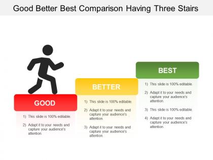
Good better best comparison having three stairs


Try Before you Buy Download Free Sample Product
 Impress Your
 Audience
Editable
of Time


Ambivalence disappears due to our Good Better Best Comparison Having Three Stairs. Folks feel driven to be decisive.
People who downloaded this PowerPoint presentation also viewed the following :
Good better best comparison having three stairs with all 5 slides:
Make a good case for change with our Good Better Best Comparison Having Three Stairs. Colleagues will definitely agree to accept.

FAQs for Good better best comparison
You need three levels of analysis - strategic (big picture stuff like goals and market position), tactical (how you actually run things day-to-day), and operational (the nitty-gritty metrics). It's kinda like zooming in and out on Google Maps, honestly. Each level shows different problems, but they're all connected. Here's what I'd do: map out where you currently stand across all three, then look for the gaps between them. That's usually where things fall apart. The real magic happens when you see how a decision at one level screws up (or helps) the others.
Honestly, tri-level comparisons are a game changer for presentations. Instead of just showing two numbers, you're giving three perspectives - like this quarter vs last quarter vs same quarter last year. People immediately get the full picture without having to guess what's "normal." I can't tell you how many times I've watched someone present two data points and the whole room is like "okay but is that good?" Grouped bar charts work great for this. You'll dodge all those annoying follow-up questions where people ask for more context. Plus it shows seasonality and actual trends, not just random fluctuations.
Honestly, manufacturing companies see the biggest wins with these tri-level models. You've got plant vs regional vs global comparisons that actually make sense. Retail chains use them too - store, district, corporate levels. Healthcare systems love comparing departments against facilities against entire networks. Oh, and financial services are all over this for risk analysis across branches. The key thing? You need at least 3 clear reporting levels and actual performance gaps to hunt down. I'd map out your hierarchy first before diving in. Works best when you're trying to figure out where problems actually start.
Don't make your comparison levels too similar - you'll just confuse people instead of helping them. I've seen so many analyses where someone tries to cram every tiny detail into each tier, and honestly? It's a mess. Keep your three levels clean with obvious differences between them. Each one should actually matter to whoever's making the decision. Start backwards - figure out what specific choice or insight you're after, then build your levels around that. Oh, and make sure the scope makes sense across all three. Sometimes people go super detailed on one level then stay super vague on another, which defeats the whole point.
So instead of just comparing two things, tri-level comparison looks at three layers at once. Picture comparing apples to apples AND oranges simultaneously - sounds chaotic but you get way better insights. You're analyzing best case, worst case, and most likely scenarios together, or hitting three different variables in your dataset. Honestly, it's a game-changer for spotting patterns you'd totally miss with basic A vs B stuff. The relationships become so much clearer. Next time you're diving into analysis, try mapping out those three levels first. You'll catch trends and weird outliers that would've slipped right past you otherwise.
Honestly, I'd go with **Tableau** or **Power BI** first - they're built for this kind of multi-level stuff and the drill-down features are pretty smooth. **R with ggplot2** is amazing if you don't mind coding, but fair warning: it can be a pain to learn. Excel's fine for basic comparisons but gets messy fast with bigger datasets. Oh, and **Python with matplotlib** is solid too if you're already using it for other things. Really though, just use whatever your team already knows. I've seen people waste weeks switching tools when they could've just built something that works.
Yeah, tri-level comparisons totally work for qualitative stuff! I'd map out your three levels first though - saves so much headache later. You can do individual level (specific responses), group level (themes across different demographics), then structural level for bigger patterns. Honestly, it's one of the better ways to catch things you'd otherwise miss. The trick is staying systematic when you're coding at each level, then hunt for connections or contradictions between them. Way more nuanced than just looking at everything the same way.
Yeah, your audience totally determines if tri-level comparisons actually work. Younger crowds are great with complex stuff - they're already juggling like five apps at once anyway. But older or traditional audiences? Keep it simple and linear. I bombed a boardroom presentation once because I overestimated what they wanted to follow. Technical people can handle intricate frameworks, while general audiences need super clear distinctions between your three points. Oh, and definitely look at who's actually showing up before you decide how complex to get. Your visual setup should match their attention span too.
Go with grouped bar charts - they're perfect for tri-level stuff since people can compare all three categories instantly. Stacked charts? Yeah, avoid those. Nobody can actually compare the middle sections without doing mental math, which is annoying. Pick colors that make sense, like going from light to dark for your three levels. Definitely label everything clearly, and if you've got room, throw data labels right on the bars. The whole point is someone should get it in like 3 seconds max. Oh, and run it by someone else first - you'd be surprised what trips people up!
So basically tri-level comparison lets you look at three things at once when you're sizing up marketing strategies - like cost vs reach vs how well it'll actually convert. Way better than obsessing over just one number, you know? I swear it saves so much headache when you've got bosses wanting different things. Plus you catch all the trade-offs early instead of realizing later that your budget's toast. Oh and definitely try it with your next three campaign ideas - map them against cost, timeline, and expected ROI. Makes the differences super obvious.
When you're comparing three things, colors totally save the day. Pick three distinct ones - blue, green, orange work great - and stick with them throughout. Bar charts beat boring spreadsheets every time (seriously, who wants to stare at rows of numbers?). The trick is staying consistent with your color choices. If Level A is blue on slide one, it better be blue on slide ten too. Otherwise people spend more time figuring out your system than actually listening to your points. Side-by-side visuals make differences super obvious. Your audience will thank you for not making them decode some confusing rainbow mess halfway through your presentation.
Oh man, for online presentations I'd definitely make those tri-level comparisons way more visual. Start with your basic comparison on the slide, then click to reveal the intermediate stuff, then the advanced parts. Breakout rooms are honestly a game changer here - split groups by each level, then bring everyone back to compare notes. Since people can't just whisper questions like they would in person, you gotta pause more and actually ask if things make sense. Maybe throw in some polls too? The whole thing falls apart if people zone out, which happens so easily on Zoom.
Dude, benchmark choice is make-or-break for your tri-level thing. Bad benchmarks = useless results that'll fool you into thinking your solution rocks when it doesn't (or vice versa). You need realistic alternatives that actual users would consider - not some random weak stuff that makes you look good by default. Honestly, most people rush this part and regret it later. Take time upfront to find 2-3 solid comparison points across your performance range. It's like... if you're only comparing to garbage, of course you'll win, but what's the point?
Honestly, feedback from past presentations is your best friend here. When people look confused during the operational stuff, that's your cue to simplify or build better bridges between levels. I've definitely seen eyes glaze over during strategic parts too - happens to everyone. Document what worked right after presenting while it's still fresh in your mind. Which transitions felt smooth? What made people perk up? Start keeping a simple log of this stuff. Trust me, you'll actually use those notes later when prepping your next tri-level comparison. Your future self will be grateful.
Track three main things at each level: money stuff (revenue, profits, costs), how smoothly things run (productivity, quality, speed), and where you stand competitively (market share, customer happiness). The trick is connecting them - like your team's productivity should actually tie to overall company efficiency. Honestly, most people get caught up in metrics that look impressive but don't mean much. I'd start simple: pick one from each category for your team, division, and company levels. Then watch how moving the needle on one affects the others - that's where it gets interesting.
-
Best Representation of topics, really appreciable.
-
Attractive design and informative presentation.