


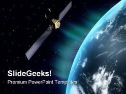
Satellite globe powerpoint templates and powerpoint backgrounds 0611





Try Before you Buy Download Free Sample Product
 Impress Your
 Audience
 100%
100% Editable
 Save Hours
 of Time


Take their breath away with our Satellite Globe PowerPoint Templates And PowerPoint Backgrounds 0611. They will gulp in the oxygen of your thoughts.
People who downloaded this PowerPoint presentation also viewed the following :
Satellite globe powerpoint templates and powerpoint backgrounds 0611 with all 3 slides:
Make sure your team reaches the peak. Climb along with our Satellite Globe PowerPoint Templates And PowerPoint Backgrounds 0611.
FAQs for Satellite globe powerpoint templates and
Oh nice! So for the satellite globe thing - definitely go with high contrast between your globe and background or your text will be impossible to read. Dark backgrounds are usually your best bet. Make sure you get high-res satellite imagery because pixelated globes look terrible, trust me on that one. For text placement, either use the empty space around it or throw some semi-transparent overlays right on the globe. Animation-wise, a little rotation is cool but don't get too crazy with it. People will get distracted from whatever you're actually trying to say. Start simple first, then make it fancy later!
Honestly, satellite globe templates are so much better than regular flat maps for presentations. They give you that cool bird's-eye view from space that people instantly connect with. Your audience can actually see terrain and weather patterns in 3D, which helps them understand spatial stuff way better. I mean, who doesn't like looking at Earth from above? They're perfect when you're showing climate data or population distribution - anything where location really matters. The visual impact is just stronger. People remember the content more because it doesn't look like every other boring map they've seen. Definitely worth using if geography's a big part of your presentation.
Heat maps are your best bet for satellite globe stuff - they show density patterns really well and honestly just look amazing on a spinning globe. Flight path trackers work great too, especially if you're showing connections between regions or data flow. Data point clusters are solid for customer locations or network coverage, whatever you're tracking geographically. Oh, and stick with simple color schemes because too many colors gets chaotic fast on a globe (learned that one the hard way). I'd start with just one data layer first, then build from there if you need more complexity.
Dude, those satellite globe templates are seriously effective! They make your content feel way more connected to the real world instead of just abstract concepts. People literally see the global scope when you put data on a rotating earth visual. Way cooler than bullet points, obviously. The 3D movement keeps everyone's attention while you're presenting - I've noticed people actually lean in when I use them. Perfect for international business stuff, climate data, maybe tech rollouts. Oh, and they work great as opening slides or for highlighting key stats. Trust me, you'll see the difference.
Honestly just stick with PowerPoint first - you'd be shocked how much you can do without switching programs. Change colors, add text, resize stuff, swap images. It's all there. Canva works too if you want something simpler, and obviously Adobe Illustrator is amazing for vector stuff but that's probably way more than you need. Oh and Photoshop's good for any photo editing within the template. But seriously, try PowerPoint's tools first. I always end up going back to it anyway since it's already open and does like 90% of what I need.
Honestly, those satellite globe templates are gold for making lessons way more interesting. Kids go crazy for anything that looks space-related or techy. Perfect for weather patterns, climate stuff, or explaining how satellites actually function. They work great in presentations too - international topics, space exploration, global communication networks, whatever. The visual thing really clicks with students, especially for concepts that would normally put them to sleep. Oh, and grab a few different styles while you're at it. That way you can switch it up depending on what you're teaching that day.
Tech companies are the obvious ones - they eat this stuff up. Telecom, logistics, and consulting firms too. Government agencies use them constantly, and aerospace companies for pretty obvious reasons. You see these templates everywhere now for supply chain stuff, market analysis, satellite communications... honestly they're getting a bit played out but whatever, they still work. If you need to show "global reach" or connectivity, they'll do the job. Just match your brand colors and call it a day. Way better than starting from scratch.
Dude, don't cram a wall of text on those slides - nobody can read that from the back row. Also learned this the hard way but check your image resolution first. Pixelated maps look terrible when projected. Your colors need enough contrast or people literally won't see the text against the globe background. Oh and those spinning animations? Cool in theory but honestly just distracting if they never stop moving. Keep things simple. Test everything on the actual projector beforehand - what looks good on your laptop might be trash on the big screen.
Honestly, those spinning globe animations are kinda nauseating on video calls - learned that the hard way! Make your text way bigger than usual, like 24pt minimum, since everyone's staring at tiny laptop screens. High-contrast colors are your friend here. Simple transitions work better than fancy stuff, especially when people's WiFi is being sketchy. I always test my slides on my phone first - sounds weird but if I can read everything there, then remote folks won't be squinting trying to figure out what I'm saying.
Get templates with crisp satellite imagery that won't look blurry when you blow them up. Look for editable stuff - text boxes, color schemes you can tweak to match your brand. Multiple slide layouts are clutch because copying the same globe everywhere gets old fast (trust me on this one). Vector graphics scale way better than regular images. If you're feeling fancy, some come with animation options too. The good ones throw in charts and data viz elements that actually work with the globe theme. Oh, and definitely download a preview first to see how colors look on your setup.
Using satellite imagery in your slides is honestly a game-changer. People remember visual stuff way better - like 60% better than just text. When you show actual satellite views instead of boring old maps, it gives your audience something real to latch onto. Their brains process that spatial info differently than regular data. I mean, there's something about seeing places from above that just clicks better, you know? If you're presenting global trends or comparing regions, pair your key points with satellite shots of those actual spots. It'll help people mentally connect the dots way easier.
Yeah absolutely! Color contrast is the big one - those earth blues and greens can be really hard to tell apart if someone has vision issues. Don't just use color alone to show stuff either (like only green for "good areas"). Screen readers can't read complex globe graphics, so alt text is super important. Those spinning animations look slick but honestly they can mess with people who get motion sick. I'd throw in some text labels next to your visuals and test everything in high contrast mode - catches problems fast before you present.
Oh yeah, satellite globe templates are getting so much cooler now! Interactive 3D stuff is everywhere - like you can actually watch orbital paths move instead of staring at boring static images. Dark space themes look amazing, honestly way better than those old green-and-blue Earth designs. Most are going minimalist with clean fonts too. Real-time data is the big thing though - you can show live satellite positions and network connections. Blues and teals are replacing the traditional color schemes. Look for ones where you can adjust animation speeds and highlight specific regions. Makes presentations actually interesting for once!
So basically you'll want to swap out the default images for satellite shots that actually focus on your target region. Color schemes matter more than you'd think - warmer tones work great for Middle Eastern audiences, cooler blues for Scandinavian folks. Don't just translate the text either. Icons and symbols need to match local preferences, plus consider how people read (left-to-right vs right-to-left, etc). I always research the specific audience first because those small visual tweaks really show you get their perspective. It's honestly one of those details that makes a huge difference.
Dude, animations totally transform satellite presentations from boring static images into something people actually want to watch. Rotating globes show orbital patterns really well, and zooming into specific regions keeps everyone engaged. I honestly can't tell you how many space presentations I've sat through that made me want to fall asleep - could've been so much better with basic animations! Use them to guide where people look and help visualize tricky satellite movements. Oh, and don't go crazy with effects. Stick to maybe 2-3 styles max or you'll end up with something that looks like a 90s screensaver.
-
Very well designed and informative templates.
-
Topic best represented with attractive design.