


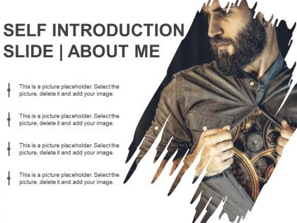
Selbsteinführungsfolie Über mich Powerpoint-Anleitung





Try Before you Buy Download Free Sample Product
 Impress Your
 Audience
 100%
100% Editable
 Save Hours
 of Time


Oft müssen Sie sich bei Geschäftstreffen und Vorstellungsgesprächen vorstellen. Unser PowerPoint-Leitfaden zur Selbsteinführung über mich wird Ihnen helfen, die Aufmerksamkeit des Publikums auf sich zu ziehen. Diese Über mich PPT-Vorlage kann verwendet werden, um Berufswahl, Bildungshintergrund, Berufserfahrung, Hobbys, Ziele und Soft Skills auf klare und organisierte Weise darzustellen. Das Schreiben, Gestalten und Vorbereiten Ihrer Präsentation reicht nicht aus, es sei denn, Sie planen eine starke Einführung. Ihr Publikum wird sich mit Ihnen verbundener fühlen, wenn Sie sich vor Beginn der Rede vorstellen. Die Folie kann verwendet werden, um PPT-Designs zu Themen wie über sich selbst, Einführungsrede, über mich selbst, persönliche Vorstellung, visueller Lebenslauf, über uns und persönliches Profil zu erstellen. Eine Selbstpräsentation zu erstellen erfordert viel Zeit und Mühe. Laden Sie daher die Selbsteinführungsfolie über mich PowerPoint-Diagramm herunter, um schnell eine wirkungsvolle Selbstpräsentation zu erstellen. Klären Sie Ihre Absichten mit unserem Powerpoint-Leitfaden zur Selbsteinführung über mich. Beseitigen Sie alle Befürchtungen, die die Leute hegen könnten.
People who downloaded this PowerPoint presentation also viewed the following :
Selbsteinführungsfolie Über mich Powerpoint-Leitfaden mit allen 5 Folien:
Verbessern Sie Ihr Spiel mit unserem Powerpoint-Leitfaden zur Selbsteinführung über mich. Sie tragen zu Ihrer Beweglichkeit bei.

FAQs for Self introduction slide about
Keep it simple - name, role, relevant background. What you bring to the group matters most. Don't overshare personal stuff (nobody needs your life story), but one quick hobby or fun fact actually helps people remember you. Oh, and definitely practice saying it out loud first - I learned that the hard way after rushing through mine like an auctioneer. Focus on what's actually relevant for that specific meeting. Contact info if they'll need it. Short sentences work better than rambling - people's attention spans are terrible during intros.
Dude, forget the wall of text approach - you want people to actually remember you, right? Go with clean layouts and tons of white space. Stick to 2-3 colors that feel like "you" and fonts readable from the cheap seats. I swear, half the slides I see look like a kindergarten art explosion happened. Don't do that! Throw in a decent headshot and maybe some simple icons to break things up. Less text is always better. Oh, and use visual hierarchy so their eyes know where to look first. The whole point is being memorable, not making people squint.
Nobody wants to hear your resume read back to them, you know? Instead, tell a quick story that actually means something - maybe how you figured out what you wanted to do, or honestly, even a time you messed up and learned from it. People remember stories way better than just facts. Keep it short though, like 30 seconds max. I'd do it like: here's what happened, here's what I did about it, here's what changed. Way more interesting than "I have 5 years experience in..." Trust me on this one.
Oh man, this is so important! What you put on your self-intro slide totally depends on who you're presenting to. Like, Americans expect you to show off your achievements - that's confidence. But try that in Japan and you'll look arrogant. Some cultures want personal stuff (hobbies, family) to connect with you. Others? Strictly business only. Even your photo matters - whether you're smiling, how formal you look. I bombed a presentation once because I didn't research this beforehand. Don't make my mistake! Look up their cultural norms first and adjust everything accordingly.
Definitely go with something clean like Calibri or Arial - nobody wants to squint at your slide from the back. Make your name big (36-44pt) since that's what matters most. Job title can be smaller, maybe 24-28pt. I made the mistake once of using this "elegant" script font and literally nobody could read it from like 5 feet away, super embarrassing. Keep everything else at least 18-20pt or bigger. Honestly, just avoid decorative fonts entirely - they look amateur anyway. Oh, and test it from across the room first! You'll thank me later when people can actually see your info while you're presenting.
Honestly, just pick 2-3 things you want people to remember about you and let that drive everything. Your colors, fonts, even your headshot should all match that vibe. Like if you're the analytical but creative person, maybe go with clean layouts but throw in some bold colors? I always think the headshot thing is huge too—are you more casual and approachable or buttoned-up and authoritative? Don't overthink it though. The whole point is people remembering you for the right reasons, but it has to feel like actually YOU or it'll just come off weird.
Ugh, don't cram your whole life story on one slide - nobody cares about every job you've ever had. Pick like 2-3 things that actually matter to whoever's listening. Skip the cheesy buzzwords too ("passionate," "results-driven" blah blah) unless you've got real examples. Honestly, the most important thing? Add something personal or weird that'll make you memorable. Oh, and practice out loud beforehand! I learned this the hard way - reading straight off slides makes you sound like a robot. Keep it visual, ditch the text walls.
Honestly, just figure out who you're talking to first. Executives? Hit them with your biggest business wins and strategic stuff. Tech people actually want the detailed project breakdowns - they eat that up. Academic folks care about your research and publications way more than anything else. I'd keep your basic intro the same but swap out like 2-3 points depending on the room. Always open with whatever credential hits hardest for that specific crowd. It's kinda obvious but most people forget to do their homework on the audience beforehand. Makes such a difference though.
Absolutely! Photos work great - a good headshot is solid, but honestly I like when people throw in pics of their hobbies or stuff that shows personality. Way better than just text blocks. Video clips can be really cool too, especially for remote presentations. Just don't go overboard with the fancy stuff. I learned this the hard way once when my audio completely failed during a big presentation - always test your tech first! Keep things simple so they load fast. The whole point is adding something that actually tells people who you are, not just looking impressive.
Okay so colors actually matter way more than you'd think for intro slides. Blue's your safe bet - screams trustworthy and professional. Red gives off major energy vibes but can come across aggressive if you go overboard. Green's pretty chill and approachable. Orange feels creative, purple's innovative (maybe too much for stuffy crowds though). I once used this awful bright yellow and... yeah, don't do that lol. Honestly, just pick 2-3 colors that actually match your vibe AND what your audience expects. You don't want them judging you before you even open your mouth.
Honestly, don't bore people with your entire work history - nobody cares about that random internship from 2015. Skip hobbies unless they're actually relevant. I made this mistake once and watched people's eyes glaze over while I listed every previous job. Just hit your current role and maybe one solid achievement that matters. Education? Only mention it if it's directly tied to what you're talking about. Personal stuff like family or what you did last weekend is a hard no. Three bullet points tops. People want to know who you are right now, not your whole life story. Keep it snappy.
Honestly, just pick work stuff that actually shows who you are as a person. Talk about a project that genuinely mattered to you - not just what you did, but why you cared about it. Those random hobbies? They're gold if they connect to work skills somehow. Like my friend who does pottery and talks about how it taught her patience with detailed work (weird but it works). Don't do the whole "I'm a team player" thing - everyone says that. Instead, tell a real story that shows your values. Be yourself, not some interview robot. You want them thinking they'd actually enjoy working with you.
Honestly? Just use Canva - it's got way better design stuff than PowerPoint and makes everything look actually good without being complicated. Google Slides works fine too if you're already used to it. PowerPoint's obviously there if you need something super basic. Oh, and Figma's amazing if you want total control but it's kind of a pain to learn. Adobe Express is decent, sits somewhere in between. I'd probably start with Canva's free version first. Worst case, you can always export it and mess with it in PowerPoint after if something's not working right.
Honestly, throw some actual numbers into your intro - it makes such a huge difference. Instead of being another person who says they're "results-driven" (cringe), say something like "I boosted sales 40% my first year" or "managed a team of 15 across three projects." Numbers stick in people's heads way better. Personal stats work too if they fit - like "I've lived in 5 countries" or whatever. The key is picking maybe one or two metrics that actually matter for whoever you're talking to. Don't go overboard though, you'll sound like a walking resume.
Virtual intros are tricky because everyone's half-distracted scrolling their phones or checking email. Look at your camera, not the screen - took me forever to remember this! Slow down too since people process stuff differently through screens. Maybe throw in a fun background if that's your vibe, anything to stand out from the millionth Zoom call of the day. In-person you've got natural body language working for you. Keep slides simple either way, but leave them up longer virtually. Oh and definitely practice your timing beforehand - virtual delays are real and awkward.
-
Great quality slides in rapid time.
-
Visually stunning presentation, love the content.