

Shop Floor Powerpoint Ppt Template Bundles
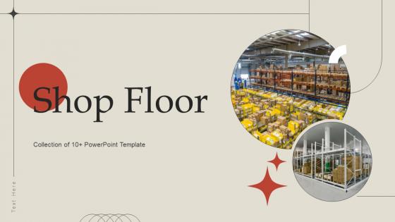




Try Before you Buy Download Free Sample Product
 Impress Your
 Audience
 100%
100% Editable
 Save Hours
 of Time


Introducing our dynamic Shop Floor PPT, an indispensable tool for optimizing your industrial workspace. Dive into the intricacies of Workshop Space, gaining insights into efficient Floor Layout Design that enhances productivity. Explore innovative solutions for maximizing your Industrial Floor potential, ensuring a seamless workflow. Our presentation delves into Warehouse Floor management, providing strategic approaches to streamline inventory processes. Uncover strategies to elevate your Production Area efficiency, emphasizing Lean Manufacturing principles. With visually engaging content, this PPT is a comprehensive guide to achieving operational excellence on the shop floor. Elevate your business with insights into space utilization, workflow optimization, and best practices for a thriving industrial environment.
People who downloaded this PowerPoint presentation also viewed the following :
Shop Floor Powerpoint Ppt Template Bundles with all 22 slides:
Use our Shop Floor Powerpoint Ppt Template Bundles to effectively help you save your valuable time. They are readymade to fit into any presentation structure.











FAQs for Shop Floor Powerpoint
You definitely want visual workflow diagrams and process maps as your foundation. KPI tracking sections are crucial too - operators need to see the numbers easily. Equipment photos work great alongside safety protocols. Shift handover templates are honestly a game-changer, way more useful than most people realize. Before/after comparison spaces help tons with problem-solving frameworks. Clean visuals matter more than you'd think - if it looks cluttered, nobody's updating it. Start simple with just one process though. Don't overwhelm yourself trying to map everything at once. Build it out as you go.
Dude, pictures are game-changers for shop floor training. Workers actually get it when they can see what you mean instead of just hearing about it. Before/after shots of equipment setups work great, plus you can slap red arrows on danger zones or break down tricky procedures step-by-step. Honestly, one photo of proper lifting technique crushes any wordy explanation. People remember visual stuff way better - they'll think of that bright warning when they're actually working. Oh, and use real photos from your own facility instead of generic stock images. Makes it feel more relevant.
Honestly, you'll get way more professional-looking slides that actually make sense to the executives. Built-in charts for all your production stuff - OEE dashboards, throughput trends, quality metrics. Saves a ridiculous amount of time too since you're not rebuilding everything from scratch each month. I used to spend forever trying to figure out how to show downtime data properly. Your stakeholders will love the consistency because they'll know exactly where everything is. Just drop in your numbers and boom, you're done. Way better than winging it every time.
Yeah, just swap out the photos and terminology for whatever industry you're working with. Like if it's automotive, ditch the generic machinery pics for actual assembly line shots. Change your metrics to cycle time, defect rates - that kind of stuff. Electronics is more about clean rooms and yield rates obviously. The colors are super easy to update in the master slides with your brand palette. Oh and honestly? Most templates assume a standard workflow, so you might need to mess with the layout if your industry does things differently. But the bones of it should work fine.
Make those slides super visual - big charts people can actually see from anywhere in the room. One message per slide, trust me on this. I used to cram everything together and just watched people's eyes glaze over, not fun. Color-code your KPIs so everyone can spot trends fast. Start with the worst stuff first, then hit your wins. Oh, and always end with who's doing what by when - otherwise you'll get that awkward silence where nobody knows what happens next. Honestly, half the battle is just making it easy to follow along.
So basically, having one standard PowerPoint template for your shop floor meetings makes everything way clearer. Your management team and floor workers will actually be on the same page for once. Use it for KPIs, safety stuff, production targets - whatever you need to share. It cuts through all that corporate BS (seriously, why do managers love buzzwords so much?) and just shows the data people actually care about. The consistency is huge too. Whether it's daily numbers or bigger quarterly goals, everything looks the same so people know what they're looking at. Just pick one template, customize it for your team's needs, and stick with it for all your meetings.
Honestly, start with a basic process flow diagram - that's your foundation right there. Gantt charts are clutch for workflow stuff, and Kanban boards if you're doing that whole work-in-progress tracking thing. Bar charts work well when you're comparing different shifts or teams. Line graphs? Perfect for trends over time. Heat maps are kinda overlooked but they're amazing for spotting bottlenecks instantly. Skip pie charts though - they're pretty useless for workflow stories. Oh, and once you've got your process flow down, just add your performance metrics on top with those line or bar charts. Makes the whole picture way clearer.
Dude, just connect your PowerPoint to Excel's data feeds or hook it up with PowerBI. Link those slides directly to your MES system or whatever production database you're using - even basic CSV files work if they auto-update. Way better than those dead charts everyone makes. Set up refresh intervals so the data stays current, though you'll need network access obviously. Design your template with spots for live charts and KPI stuff first. Honestly? Start small with just one metric. Once you watch those production numbers change in real-time, you'll be hooked and want everything automated.
Dark blues, blacks, or grays work best with bright yellow/orange for alerts. Large sans-serif fonts only - people need to read these fast during their shifts. Don't get fancy with the design, honestly it'll just distract everyone. Make your KPIs and status stuff really stand out visually. Industrial lighting is harsh so high contrast is key. Oh and definitely test your colors on the actual display in the shop first - I learned that one the hard way. Keep text minimal per slide since workers are glancing at these quickly, not studying them.
Dude, those shop floor PowerPoint templates are actually pretty genius for lean training. You can drop in your actual workspace layouts and processes people already know - way better than boring theoretical stuff. I'd start with mapping out one familiar process and build from there. Throw in some before/after photos of improvements you've made, maybe add interactive parts where people spot waste in areas they walk through daily. The visual thing really works because honestly? Nobody's staying awake through abstract lean concepts when they could see how 5S or kaizen actually fits their workstation. Makes the whole thing way more relevant.
Dude, storytelling is a total game-changer for those shop floor presentations. You know how everyone's eyes glaze over when you just dump charts on them? Tell a story instead. Walk them through what happened, why it screws things up, and what you're gonna do about it. People actually listen when you frame it like - here's your team (the heroes), here's the mess they're dealing with, and here's how we fix it. They'll remember way more too. Honestly, I've seen the most boring operational stuff become engaging just by structuring it like a problem-solution story instead of listing a bunch of metrics.
Oh man, these templates are a game changer. All the boring layout stuff is already handled - safety metrics, production numbers, quality stats, the whole nine yards. You literally just drop in your data and you're done. I used to waste like 2+ hours fighting with PowerPoint every week, now it's maybe 30 minutes? The formatting headaches are gone since everything's pre-built. Honestly wish I'd found these sooner. Just swap your numbers in, maybe tweak a chart or two, and boom - you look way more organized than you actually are.
Honestly, standardized templates are a lifesaver. Your teams will finally present data the same way, which makes comparing stuff between departments so much easier. I used to waste like an hour every week just formatting charts - now people aren't starting from scratch constantly. When someone's out sick or switches roles, knowledge transfer becomes way smoother too. Executives love it because they can actually scan updates quickly instead of decoding everyone's weird formatting choices. Oh, and definitely get your team leads on board first before rolling it out. Maybe do a quick training session so people don't freak out about change.
Honestly, those shop floor PowerPoint templates are lifesavers for change management. You just drop in your real data and floor photos instead of building slides from scratch every single time. Workers get used to seeing the same format, so they actually pay attention when you're rolling out new processes or hitting project milestones. Trust me, you'll thank yourself when you're prepping for those brutal 6 AM shift meetings and don't have to design anything. Keep using the same layouts - it makes your communication way more consistent and professional looking without the extra work.
One main point per slide, that's my rule. Use bullet points instead of cramming paragraphs everywhere - people need to get info fast during those quick meetings. Big fonts too, at least 24pt because honestly, shop floor lighting sucks half the time. Charts beat walls of text every time for showing performance stuff. Oh, and match your colors to safety protocols - red for problems, green for hitting targets. That actually makes more sense than you'd think. Don't go over 5-7 points max or you'll lose everyone. Always end with clear action steps so people know what they're supposed to do next.
-
I faced no difficulty while searching for the slide I wanted. Honestly, the website’s interface is easy to use and can be navigated easily!
-
Really like the color and design of the presentation.