


Six pillar diagram with the house shaped




Try Before you Buy Download Free Sample Product
 Impress Your
 Audience
 100%
100% Editable
 Save Hours
 of Time


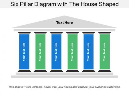
Expose invalid arguments with our Six Pillar Diagram With The House Shaped. Indicate flaws in the initial assumptions.
People who downloaded this PowerPoint presentation also viewed the following :
Six pillar diagram with the house shaped with all 5 slides:
Happily go with our Six Pillar Diagram With The House Shaped. Your decision will bring great cheer.

FAQs for Six pillar diagram with
So basically the Six Pillar House Diagram breaks down complex strategies into six key pieces that support your main idea. Each pillar is like a foundation block holding up your argument. I actually love this method - it makes messy concepts way clearer for audiences. Perfect when you're presenting to stakeholders and need to show your approach is solid from all angles. Works great for strategic plans or any multi-part solution really. People can instantly see how everything fits together instead of getting lost in the details. Definitely try it next time you've got something complicated to explain.
So basically this Six Pillar thing works by making you pick six main parts that support your whole concept - think of it like actual pillars holding up a house. Way less overwhelming than trying to juggle everything at once. You can focus on one piece, then see how they all connect. Honestly saved my butt when I had to explain that weird project to my manager last month. Your brain just processes it better when there's a clear structure instead of random chaos floating around. Next time you're stuck on something complex, just grab six key components and map them out. It'll probably click way faster than you think.
So the six pillars are usually Safety, Quality, Cost, Delivery, Morale, and Environment - though honestly some companies switch out Productivity or whatever fits their industry better. Picture it like a building foundation where if one pillar gets weak, the whole thing can come crashing down. Rate each area honestly in your current ops first. That's where you'll spot the biggest problems that need fixing. The visual really helps you see which areas are eating up resources or causing headaches. Oh and don't sugarcoat the ratings - being brutally honest upfront saves you time later.
So the Six Pillar House thing basically stops you from half-assing your planning. You work through each pillar one by one instead of just throwing ideas at the wall. What's cool is how it shows connections between different parts of your strategy - like you'll suddenly notice that your marketing plan totally depends on fixing your operations first. Been there! It catches blind spots you'd normally miss. The visual setup makes it way easier for teams to actually see what's going on instead of just talking in circles. Honestly, it's just a really solid framework that keeps you organized without being overly complicated.
Yeah totally! The Six Pillar thing works pretty much anywhere - you just swap out what the pillars actually are. Like manufacturing might do safety, quality, efficiency, whatever. Healthcare would probably go with patient care, compliance, tech stuff, staff training. The basic structure stays the same though. I've honestly seen companies use it everywhere - tech startups, construction, you name it. Just figure out what actually drives success in your industry first, then fit those into the six spots. Way easier than starting from scratch.
Honestly, most people mess up by trying to tackle all six pillars right away. Bad move. Start with 2-3 max and nail those first. Also - and this drives me crazy - everyone makes them way too vague. Like "leadership" tells me absolutely nothing about what you actually do. Get specific! "Data-driven decision making" is so much better. Oh, and watch out for overlap between your pillars. I've seen people basically repeat the same thing three different ways, which just muddles everything later when you're trying to create content. My advice? Pick your strongest ones first, make them distinct, then expand once you've got those locked down.
Dude, visuals just hit different than walls of text - your brain actually retains that stuff. Colors help each pillar pop, icons make things instantly recognizable, and arrows show how everything flows together. Most people honestly zone out when you dump a bunch of bullet points on them (guilty as charged). The diagram lets them see the whole picture first, then dive into specifics. Oh, and throw some real examples in each section! Makes it way more relatable. I swear, a good visual can save you like 20 minutes of explaining.
Honestly just use whatever you've got already - PowerPoint or Google Slides work fine for basic ones. Canva's got some surprisingly decent templates if you want it to look nicer. Lucidchart and Miro are solid too, though I always forget about those until someone mentions them. Don't overthink the tool though. Clean and readable beats fancy any day. Visio's good but feels like using a sledgehammer to hang a picture frame unless you're cranking out diagrams constantly. I'd mess around with the free options first before spending money on anything.
Okay so visual hierarchy is huge here - if your pillars all look identical, nobody's gonna know which ones matter most. Mix up the heights, colors, or thickness to show what's priority. Labels need to be readable (seriously, microscopic text kills presentations). Your foundation should connect to everything, and don't cram it all together - white space is your friend. I always sketch something rough first to see if it makes sense, because what seems obvious to you might be confusing to fresh eyes. Test it on someone before you finalize anything.
Okay so basically storytelling makes your Six Pillar thing way more interesting than just going down a checklist. You're taking people on a journey through each pillar instead of boring them with "point one, point two." It's like giving a house tour vs just reading the floor plan, you know? Each pillar becomes part of the bigger story you're telling. People actually remember stories better anyway - something about how our brains work. Plus it shows how all the pillars connect to each other. Honestly, presentations without some kind of narrative just feel flat to me. Try making each pillar a chapter in your main argument.
So basically, get everyone to rate where your team stands on each of the six pillars - think of it as a team health checkup. Then compare everyone's ratings. Those differences you'll find? That's where the real conversations happen, and honestly, those discussions are way more valuable than the actual scores. Pretty quickly you'll see which areas are already strong and which ones need work. I'd run this maybe every few months or so - you'll be surprised how much better the team gets at understanding itself over time.
So unlike regular org charts that just show who reports to who, the Six Pillar thing actually maps out how different core areas connect and influence each other. Way more useful honestly. Regular process flows are pretty linear - do this, then that. But this approach lets you spot dependencies and gaps you'd totally miss otherwise. Think house blueprint vs basic flowchart, if that makes sense? Perfect for when you need everyone to see the big picture instead of just their little piece of it. Really shines during strategic planning sessions.
Monthly reviews work really well for this - just check how each pillar's doing and where they connect. Add arrows or feedback indicators flowing between them on your diagram (way better than those boring static ones nobody looks at). Color coding helps too, maybe green/yellow/red for progress. Short bursts work better than long planning sessions, trust me on that. The whole point is making your Six Pillar House actually live and breathe with your project instead of collecting dust. Visual feedback right on the diagram itself makes all the difference.
Oh nice question! Manufacturing companies are all over this thing - especially automotive and aerospace for quality stuff. Healthcare uses it for patient safety frameworks too. Tech companies apply it to product development, and I've noticed some consulting firms basically built their whole business around it (pretty clever tbh). Financial services jumped on it for risk management as well. My advice? Pick whichever pillar matches your biggest headache right now and start there. You can always expand later once you get the hang of it. Works way better than trying to tackle everything at once.
Real examples make this stuff click way better. Tech startups crash all the time because they nail the product and funding but can't keep good people around - classic weak "People" pillar. Companies absolutely crush five areas then implode because they totally ignored something basic like customer service or governance. Honestly, the framework's pretty good at catching those blind spots early. My old team would pull it out during quarterly planning to see where we actually stood versus where we thought we were. Run your business through it sometime - bet you'll find at least one area that's been bugging you but you haven't addressed yet.
-
The content is very helpful from business point of view.
-
Qualitative and comprehensive slides.