

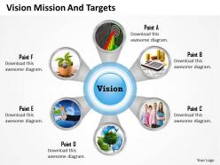
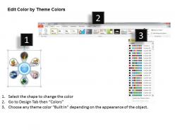
Pictorial diagram with six staged 0214





Try Before you Buy Download Free Sample Product
 Impress Your
 Audience
 100%
100% Editable
 Save Hours
 of Time


Get glamorous with our Pictorial Diagram With Six Staged 0214. They generate complete fascination.
People who downloaded this PowerPoint presentation also viewed the following :
Pictorial diagram with six staged 0214 with all 5 slides:
Fast forward your career with our Pictorial Diagram With Six Staged 0214. They help you press the right buttons.
FAQs for Pictorial diagram with
So pictorial diagrams are basically drawings or images that look like the actual thing they're showing - you know those IKEA manuals? Perfect example. Instead of boring boxes and arrows like flowcharts, these use realistic pictures or symbols. Your brain gets it instantly without having to decode anything. That's honestly the biggest advantage - no legend needed. Most people can figure them out right away, which is why they're great for instructions, safety stuff, or when you're dealing with people who speak different languages. Way more intuitive than other diagram types.
Pictorial diagrams are clutch when you're dealing with processes or relationships that would be a nightmare to explain in text. Mixed audiences love them - especially when you've got both tech people and non-tech people in the room. Workflows, org charts, data comparisons... anything where seeing the connections matters more than just reading about them. Honestly, they're lifesavers in meetings because you skip all that back-and-forth explaining. Just don't use them to make boring stuff look fancy - only when the visual actually helps people understand faster. If it clicks quicker visually, go for it.
Look, the main thing is keeping those icons super simple - you don't want people squinting trying to figure out what your little drawings mean. Colors are your friend for grouping stuff together or making important bits pop. Leave plenty of white space or it'll look like a hot mess. Size things based on how important they are too. Honestly, less text is always better, but make sure what's there actually makes sense at first glance. Oh, and here's a trick I learned the hard way - step back from your screen when you're done. If you can't read it from across the room, neither can Bob sitting in the last row checking his phone.
Color can totally transform your diagrams - it creates visual hierarchy and helps people actually understand what they're looking at. Different colors let you categorize info, guide someone's eye through steps, or make the important stuff pop. Honestly, black and white diagrams just feel outdated at this point. Just don't go crazy with like 12 different colors or anything. Stick to a consistent palette and remember colorblind users exist! Smart move: pair colors with shapes or patterns too, so your diagram still works even if someone can't see all the colors properly.
Honestly, just go with Canva if you want something fast and easy - their templates are pretty decent and you can drag stuff around without wanting to throw your computer out the window. Adobe Illustrator's obviously more powerful but ugh, the learning curve is brutal. I spent like three hours once just trying to figure out how to make a simple arrow look right. Lucidchart and Miro are somewhere in between - they're actually great for team stuff since everyone can edit at once. Start with Canva, see how it goes. You can always upgrade later when you're feeling fancy.
Your brain just handles pictures way better than words - it's weird but true. When you see a diagram, you can instantly spot how things connect instead of getting lost in paragraphs of explanation. It's like those IKEA instructions actually (though let's be honest, sometimes even those are confusing). But seriously, visual stuff helps you catch patterns and see the big picture faster. I always tell people to sketch things out when they're stuck on something complicated. Even terrible drawings work! Your mind processes images quicker, so diagrams turn messy concepts into something that actually makes sense.
Oh man, pictorial diagrams are everywhere and they're so useful! Doctors use anatomical ones to show patients what's happening during procedures - way clearer than just talking. Engineering totally depends on schematics for circuits and blueprints. I mean, good luck wiring anything without a diagram, right? Schools love flowcharts to break down tricky concepts. Instruction manuals do those step-by-step picture guides too, which is smart since they work regardless of language. Actually, my IKEA furniture would still be in pieces without those little drawings. Next time something's hard to explain, just sketch it out first - seriously works.
Honestly, the worst thing you can do is cram way too much stuff into one diagram. Keep it simple or people won't get it. Also - and I see this constantly - don't switch up your colors and symbols randomly throughout. Pick a style and stick with it, you know? Your labels need to be big enough to actually read too. Nothing's more annoying than squinting at tiny text. Oh, and if you're using weird symbols, throw in a legend. I always test mine on my roommate first - if she looks confused, back to the drawing board.
Honestly, it all comes down to who's looking at your diagram and what they're trying to do. Troubleshooting something? Pack in the technical details and label everything. But if it's just for training or a quick overview, stick to the main stuff. I usually think "what's the bare minimum they need to see to actually get their work done?" Everything else just makes it messy. Oh, and definitely test it first - show a rough version to someone who'd actually use it. If they're confused or asking a ton of questions, you've probably got too much (or too little) detail going on.
Dude, pictorial diagrams are seriously a lifesaver for presentations. People's brains just grab onto visuals way better than boring text blocks. I learned this the hard way after watching too many eyes glaze over during my early work presentations lol. When you show relationships between ideas visually, it clicks instantly. Plus everyone's attention span is shot these days anyway - diagrams break things into chunks people can actually follow. Your audience will remember so much more because they're processing info multiple ways. Honestly, try swapping half your bullet points for simple diagrams next time. You'll see the difference immediately.
Pictorial diagrams work great as visual anchors for each chapter - like little scene-setters that show context before you get into the weaty details. Before/after scenarios are perfect for this, or when you're mapping out complex relationships that'd take forever to explain otherwise. Customer journey maps are honestly my favorite use case since they make weird abstract stuff actually make sense. Keep them simple though - people should get it in 3-4 seconds, then you can build the story around it. Oh and start with your story arc first, figure out where 3-5 diagrams would actually help clarify your points instead of just... existing.
Go with SVG if you can - it scales without getting blurry when people zoom in. PNG's solid too for colorful stuff. Print needs vector formats like PDF or EPS though. I swear, half the presentations I see have these awful pixelated JPEGs that look terrible blown up on screen. Create everything in Illustrator or even PowerPoint first, then export whatever format you need. Way easier than trying to fix a low-res mess later. Vector files are your friend basically - they'll look crisp whether it's on someone's phone or printed poster-size.
Honestly, getting feedback on your diagrams is a game changer. Show them to real people early - even rough sketches work fine. They'll catch stuff you'd never notice, like confusing icons or weird visual flow. We get too attached to our own work, you know? Users will tell you straight up where their eyes go first and what doesn't make sense. I always test before I'm too deep into the design because changing everything later sucks. Sometimes they'll point out missing steps or sections that feel overwhelming. Quick tip though - don't wait for it to be perfect before showing people.
Oh definitely! Colors alone can totally mess you up - red screams danger here but it's actually lucky in China. Hand gestures and symbols are tricky too. Plus reading patterns matter more than you'd think - some cultures read right-to-left so they'll follow your diagram flow backwards from what you intended. Honestly, I learned this the hard way on a project once. Test your stuff with people from those regions first, or at least google the cultural meanings beforehand. Way easier than fixing it later.
Honestly, the simplest way is just doing before/after quizzes - test people with diagrams vs text-only and compare scores. You'll want to check both immediate understanding and retention (maybe follow up a week later). A/B testing works great for this. Eye-tracking studies give you amazing data but they're stupid expensive. More realistic metrics? Time on page, how far people scroll, stuff like that. I'd probably start small with basic comprehension tests between your two groups. Oh, and don't forget to test retention - that's where diagrams really shine compared to plain text.
-
Out of the box and creative design.
-
Very unique, user-friendly presentation interface.