


Sponsorship pitch deck ppt template




Try Before you Buy Download Free Sample Product
 Impress Your
 Audience
 100%
100% Editable
 Save Hours
 of Time


When it comes to organizing events, most event planners rank securing sponsors as one of the topmost challenging aspects of their job. Here is a competently designed pitch deck for sponsorship that will assist the event planners or event planning startups to gain the interest of the best possible event sponsors. At first, event startups can develop the investors interest by using slides about us, our underlying magic, and social media reach. The event highlights section will assist the agencies in providing in-depth detail about their event, covering the event overview, target market, guest speakers, and timeline. To gain sponsors attention, event planners can use slides, namely sponsorship packages, and benefits along with opportunities to sponsors. One can even present stats and info related to in depth event details like guest speakers, VIP, target market, etc. Firms can exhibit infographics for their social media reach on different platforms using elements like followers, average clicks, post reach, post impressions, and more. Finally, agencies can use the contact us slide to display different channels such as phone, website, and social media to connect with interested sponsors. Book a free demo with our research team and customize the deck based on needs. Get access now.
People who downloaded this PowerPoint presentation also viewed the following :
Content of this Powerpoint Presentation
Slide 1: This slide displays title i.e. 'Sponsorship Pitch Deck' and your Company Name.
Slide 2: This slide presents table of contents.
Slide 3: This slide convince the potential sponsors to invest in the festival by highlighting a small detail about the company.
Slide 4: This slide address audience about the magic behind the festival.
Slide 5: This slide illustrates the informational statistics highlighting the social media presence of the festival organized by the rising stars.
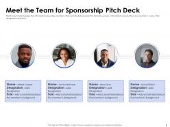
Slide 6: This slide displays the information about key members that contributes towards the festival success.
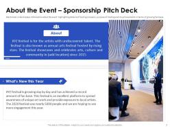
Slide 7: This slide displays information about the event highlighting details of hosting company.
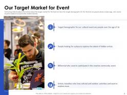
Slide 8: This slide displays information about the target market for the festival.
Slide 9: This slide provide the information about the guest speakers and the VIPs who will be the part of festival.
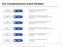
Slide 10: This slide illustrates the event timeline of the festival covering details of pre-event and post-event activities.
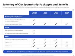
Slide 11: This slide provides information about various event sponsorship packages along with the details of benefits.
Slide 12: This slide displays information about the opportunities that sponsors will get if they host the event.
Slide 13: This slide presents contact details of company.
Slide 14: This is the icons slide.
Slide 15: This slide presents title for additional slides.
Slide 16: This slide exhibits targets.
Slide 17: This slide presents linear process.
Slide 18: This slide shows about your company, target audience and its client's values.
Slide 19: This slide exhibits yearly timeline.
Slide 20: This slide presents your company's vision, mission and goals.
Slide 21: This slide displays puzzle.
Slide 22: This slide depicts posts for past experiences of clients.
Slide 23: This slide depicts mind map.
Slide 24: This slide depicts 30-60-90 days plan for projects.
Slide 25: This slide shows roadmap.
Slide 26: This is thank you slide & contains contact details of company like office address, phone no., etc.
Sponsorship pitch deck ppt template with all 26 slides:
Use our Sponsorship Pitch Deck Ppt Template to effectively help you save your valuable time. They are readymade to fit into any presentation structure.










FAQs for Sponsorship pitch
Okay so for your pitch deck you'll want to hit the basics first - who you are, your audience numbers, what you're offering. Definitely include clear sponsorship packages with actual pricing. Past event metrics and social media reach are huge because sponsors eat that stuff up. The "what's in it for them" section is honestly the most important part - they don't really care about your passion project, just what they get out of it lol. Keep it under 15 slides and make sure you actually research each sponsor instead of sending the same generic thing to everyone. Oh and include clear next steps!
Honestly, just creep on your competitors first - check their websites and socials to see who's already sponsoring similar stuff. You want companies that actually care about reaching your audience, not just random big names. Mid-size companies are usually better bets anyway since they're not drowning in sponsorship requests like the mega-corps. Make a list of prospects ranked by how good the fit seems. Oh, and don't blast the same generic pitch to everyone - that's how you end up in spam folders. Research events like yours to see who sponsors those too. Target companies whose values match what you're doing.
Oh man, storytelling changes everything! Skip the boring demographics dump - nobody cares about your reach numbers if they're falling asleep. Paint a real picture instead. Show the actual problem you're solving, walk them through your audience's journey, then make the sponsor the hero who saves the day. I swear, most pitch decks are just spreadsheets in disguise. You want them thinking "wow, this story matters" not "here's another ad buy." Focus on real people whose lives get better because of your event. Then connect the dots - here's how your money makes that magic happen. Way more compelling than charts, trust me.
Dude, visuals are everything for sponsorship pitches. Charts showing your audience growth, photos from past events, mockups of their logo on your stuff - that's what actually sells them. Nobody wants to read pages of text about demographics when you can just show it. Plus honestly, a slick visual presentation makes you look way more legit than someone who just throws together a Word doc. The whole point is helping them picture the partnership, right? So load up on branded mockups and clear ROI graphics they can scan quickly. Makes their decision so much easier.
Start with your follower counts and engagement rates - that's what they actually look at first. Break down your demographics too, like age groups and location stuff that matches who they're trying to reach. Conversion rates are honestly your best weapon if you've got them. Shows you don't just get likes, you actually make people buy things. Don't forget average views and impressions. Oh, and if you have any testimonials from past sponsors, definitely throw those in. Makes a huge difference. Just make sure all your data is recent though - using old numbers makes you look sloppy.
You've gotta tailor your pitch to what each sponsor actually gives a damn about. Corporate folks? Hit them with brand exposure numbers, audience demographics, ROI projections - the whole nine yards. Non-profits are completely different animals though - they want community impact and mission alignment, not sales metrics. Government sponsors care about public benefit and economic development stuff. Here's what I'd do: research each prospect beforehand and swap out like 3-4 slides that speak their specific language. Same event, totally different angles. Makes them feel like you actually get what they're trying to accomplish instead of just mass-blasting everyone.
Okay so the two big ones I always see: people make it all about themselves instead of what the sponsor actually gets out of it. Like don't just list your achievements for 10 slides straight - nobody cares about that stuff. Focus on their ROI, how you'll get their brand in front of the right people, that kind of thing. Second mistake is cramming way too much on each slide. Keep it clean, one main point per slide. Also throw in real audience data and customize it so it doesn't look like you copy-pasted this to everyone. Most sponsors are drowning in these decks anyway, so make yours scannable. Oh and avoid those generic templates - they're such a dead giveaway.
Honestly, you gotta hit them with real numbers that actually matter to what they're trying to achieve. Show your audience demographics, engagement rates, previous sponsor ROI if you've got it. Skip the fluffy "great exposure" stuff - that makes me cringe every time. Break it down: exact impressions, audience type, social reach, speaking ops, whatever fits your event. Then connect those specifics directly to their marketing goals. I always finish with cost per impression or lead compared to their other channels. Makes it way easier for them to justify the spend internally.
Dude, definitely cap it at 10-15 slides - nobody's reading a whole dissertation. Clean design is everything. Tons of white space, maybe 2-3 colors max. Charts and graphics beat walls of text every time. Oh, and avoid the rainbow explosion look (you know what I mean). Big headers work great. So do bullet points and solid photos of your event. One thing people forget - tons of sponsors check these on their phones first, so make sure yours actually looks good on mobile. Short sentences help too.
Dude, the call-to-action is everything. I've watched so many decent pitches just... die because they ended with "let us know if you're interested." Like, that's it? You're basically making sponsors do all the work to figure out next steps. Instead, give them something concrete. Schedule a follow-up call, ask for a proposal meeting, or set a deadline for feedback. Short sentences work here. The whole point is removing friction - you want them thinking "yeah, I can do that" not "hmm, what exactly are they asking for?" Honestly, it's the difference between closing deals and wondering why nobody gets back to you.
Keep it simple - 3-5 solid demographics that matter. Age ranges, income, location, interests that actually connect to what sponsors want. Charts help way more than walls of text. I made this mistake once and sent like 30 slides of data... total overkill. Short beats long every time. Your audience's income level? Super relevant. How many of them prefer cats vs dogs? Not so much. Just tie each stat back to why they should care about reaching your people. Think big picture stuff that makes sponsors go "yeah, these are exactly who we want to sell to."
Definitely include 2-3 solid case studies with real numbers from your past sponsorships. Show stuff that actually matters to them - brand awareness, leads, social reach, sales bump, whatever. Don't just slap logos on there without context (seriously, that's so annoying). Each one should tell the full story: what the sponsor wanted, what you did for them, and the exact results they got. Charts or graphics help make the numbers stand out. One slide per case study works best - keeps it tight but gives them the proof they need to say yes.
Definitely shoot them a thank-you email within 24 hours - you want to stay fresh in their minds. Attach any materials you mentioned but didn't actually share during the pitch. After that, touch base weekly with actual updates that matter to them. Maybe share a campaign win or mention an upcoming event that fits their goals. Just don't be one of those people sending "checking in!" emails with zero substance - that's annoying as hell. Each follow-up should add real value, like sharing industry news or floating partnership ideas. Give them 3-4 weeks to think it over, then ask directly about next steps.
Okay so you basically need to prove your audiences actually overlap instead of just saying they do. Get demographic data - ages, interests, spending patterns, whatever shows your crowd matches who they're trying to reach. Point out where your values genuinely align (don't stretch it if it's not really there). Find examples of similar partnerships they've done before that worked well. The big thing though? Be super specific about what they get out of it beyond slapping their logo somewhere. Like what's the real benefit for their brand. Companies are honestly pretty skeptical these days so you need solid proof.
Honestly? Just go with PowerPoint or Google Slides. Everyone can open them and they work fine. Canva's pretty good too if you want nicer templates without being a designer - their stuff actually looks decent. You could get all fancy with Figma or Adobe if you're into that, but like... why overcomplicate it? Your story matters way more than whatever software you picked. I've seen terrible pitches in beautiful decks and great pitches in basic slides. Oh, and export to PDF when you're done. Makes sharing so much easier.
-
Colors used are bright and distinctive.
-
Great designs, really helpful.
-
Best Representation of topics, really appreciable.