


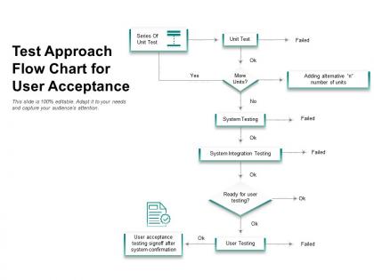
Test approach flow chart for user acceptance




Try Before you Buy Download Free Sample Product
 Impress Your
 Audience
 100%
100% Editable
 Save Hours
 of Time


Our Test Approach Flow Chart For User Acceptance are explicit and effective. They combine clarity and concise expression.
People who downloaded this PowerPoint presentation also viewed the following :
Test approach flow chart for user acceptance with all 2 slides:
Give your audience a fulfilling experience. They will find our Test Approach Flow Chart For User Acceptance elevating.
FAQs for Test approach flow chart
For your flow chart, start with the big phases - test planning, environment setup, execution, and defect management. Map out where teams hand things off to each other. Entry and exit criteria are super important for each phase (learned that the hard way lol). Don't forget decision points for pass/fail stuff. If you're running automation and manual testing at the same time, show those parallel streams too. Honestly, most of these charts end up being wall decorations, so focus on making yours actually usable when everything's on fire. Sketch the major flow first, then add the nitty-gritty details.
Honestly, flowcharts are game-changers for testing. No more confusion about what comes next or people asking the same questions over and over. New team members can actually see the whole process laid out instead of guessing. Stakeholders get it way faster than reading through boring docs - they're visual people anyway. When you're in standups talking about where testing stands, you can just point to the chart. Super helpful for timelines too. Just stick it somewhere obvious like your wiki or dashboard where everyone can find it easily. Trust me, you'll reference it more than you think.
For flow charts, most people go with Visio, Lucidchart, or Draw.io. If you've got Microsoft licenses already, Visio works great. Draw.io is honestly my favorite though - it's completely free and runs right in your browser. No downloads or anything. Lucidchart's pretty good too, especially if your team needs to collaborate a lot. Some folks use Miro or even just PowerPoint when they're desperate, but those get messy fast with complex stuff. I'd say try Draw.io first. You can whip up something decent in like 15 minutes and figure out if it'll work before spending money on the fancy tools.
Start with the stuff that'll totally break your app if it fails - like payment processing or login. Unit tests are your best friend here since they catch problems super early and run fast. Then work your way up through integration and system testing. I always do API testing before UI testing because APIs are way more stable, even though UI tests *feel* more realistic. Performance and exploratory testing can wait until your core features actually work. When you're building that flow chart, map it out this way so your team knows what to tackle first when deadlines get crazy.
So risk assessment is basically what drives your whole test flowchart structure. Start by listing your biggest risks - those become the areas where you need detailed testing branches. High-risk stuff gets priority in your flow, while low-risk components can take shortcuts. It's like creating a roadmap for where to spend your time and resources. Honestly, I've seen too many people jump straight into building generic flowcharts that don't match their actual project needs. The risks should shape how you structure everything. Without doing this upfront, you're just guessing at what matters most.
Honestly, flow charts are game-changers for catching testing gaps. You map out your approach visually and boom - missing scenarios jump right out at you. Same with redundancies where you're basically testing the same thing twice (been there). Short sentences work great here. But then you get these longer flows where you can trace through the logic and actually see where conditions aren't being checked. Makes you think way more systematically instead of just throwing test cases at the wall. Definitely try it on your next feature - I was skeptical at first but you'll spot stuff you totally would've missed otherwise.
Yeah, test approach flowcharts work with basically any methodology you're using. Waterfall charts show those formal handoff gates between phases. Agile ones focus more on iterative cycles and feedback loops. DevOps flows highlight all the automation and CI/CD stuff. I've honestly seen some pretty creative hybrid approaches that teams built from scratch - way better than just grabbing some generic template online. The trick is making it match how your team actually works, not how you think you should work. Even weird custom methodologies can be mapped out if you think about your testing phases and decision points.
Honestly, just match your flowchart to what you're actually dealing with. Small projects? Keep it simple - merge steps together and ditch the unnecessary approval stuff. Focus on what actually matters for testing. Bigger projects obviously need more detail, extra checkpoints, risk checks, all that jazz. But here's the thing - I've watched teams spend forever tweaking their charts instead of, you know, actually testing anything. Pretty counterproductive if you ask me. Start basic and only add complexity where you genuinely need oversight or have to meet compliance rules. Match the decision points to your project's real risk level.
Don't overcomplicate it - that's the biggest mistake I see. You'll create this massive tangled mess that nobody wants to look at. Focus on your main decision points instead of mapping every tiny possibility. Get your team involved early too, because what clicks for you might totally confuse someone else. Be specific about your decision criteria - vague stuff doesn't help anyone when they're actually trying to use it. Oh, and definitely include failure paths. Things break, tests fail, that's just reality. Start basic, ask for feedback, then build from there. It should make decisions easier, not harder.
Just throw review checkpoints directly into your flowchart at the spots where stakeholders actually need to chime in. After risk assessment, strategy stuff, scope changes - you know the drill. I always use those diamond decision boxes that literally say "stakeholder sign-off?" because otherwise people just assume someone else handled it. Oh, and build in feedback loops that circle back to earlier steps since stakeholders will definitely change their minds later (they always do). The whole point is making these touchpoints super obvious so your process doesn't get stuck waiting around for people to respond.
Your flow chart's gonna change constantly as you figure out what actually works. Start simple with a basic linear path. Then reality hits - you'll add decision points and parallel branches when things get messy. Honestly, half your initial risk assumptions will be completely wrong (happens to everyone). Requirements shift, weird technical issues pop up, and you'll need specialized branches for different components. After major milestones or when you hit big roadblocks, just update the thing. Also tweak your entry/exit criteria as you go - they're never perfect from day one.
Honestly, treat that flow chart like it's alive - it needs to change as your project does. Monthly reviews work well, or whenever big requirements shift. Walk through each decision point and ask if it still makes sense. I've watched teams cling to outdated flows forever just because changing feels like work. Don't be those people. When requirements change, map the new scenarios first, test different paths, then update everything. The trick is building reviews into your normal routine instead of scrambling when stuff breaks. Block out those review sessions now.
Honestly, start with just 2-3 metrics that actually matter to your team - don't go overboard measuring everything. Test coverage percentage is pretty solid for seeing how much you're actually hitting. Defect detection rate shows if you're catching bugs before they escape (which, let's be real, is the whole point). Pass/fail rates and execution time tell you if your tests are efficient - nobody's got time for tests that drag on forever. Oh, and defect leakage is huge - that's bugs found in production vs during testing. Track these across a few releases and you'll start seeing patterns. Way more useful than obsessing over every single metric from day one.
So basically a test approach flow chart is like your roadmap for getting new testers up to speed. Walk them through real scenarios with it - they'll see exactly how you'd tackle different features or bugs. Way more effective than drowning them in docs (because who actually reads those, right?). The visual stuff clicks faster than walls of text. They can reference it when they're stuck on their first tickets too. Honestly, just give them a copy and have them shadow you through a couple test cycles. Makes the whole decision-making process way clearer than trying to explain it verbally.
Color code everything - green for test execution, blue for planning, red for bugs. Use rectangles for processes, diamonds for decisions, circles for start/end points. Swim lanes are clutch for showing who does what. I swear, half the flowcharts I see look like someone threw spaghetti at a wall. Keep arrows directional and clear. Throw in some icons - little bug symbols, checkmarks for approvals. Oh, and stick with consistent fonts or it'll look amateur. The whole point is making something people can scan quickly without getting lost in the weeds.
No Reviews