


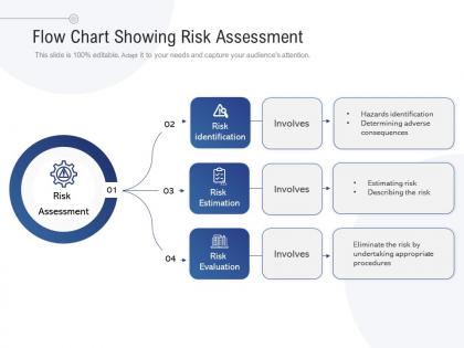
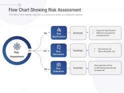
Flow chart showing risk assessment




Try Before you Buy Download Free Sample Product
 Impress Your
 Audience
 100%
100% Editable
 Save Hours
 of Time


Our Flow Chart Showing Risk Assessment get them completely awestruck. Your expertise will enthrall them.
People who downloaded this PowerPoint presentation also viewed the following :
Flow chart showing risk assessment with all 2 slides:
Get them on the edge with our Flow Chart Showing Risk Assessment. They will find you absolutely enthralling.
FAQs for Flow chart
Start with listing out all the risks you can think of, then figure out how likely each one is and what damage it'd cause. Map out where you need to make decisions about whether to accept risks or do something about them. Getting everyone to agree on what's acceptable vs not? That's honestly where most projects get stuck. After that, write down what you'll actually do for different risk levels and show how those decisions connect. Oh, and build in some review points since things change. Keep the whole thing visual - nobody's using a flowchart they can't understand in 30 seconds.
Honestly, risk assessment flowcharts are game-changers for catching problems early. You map out each decision point and spot what could tank your project at every step. Sounds doom-and-gloom, but it beats scrambling later when things go sideways. The visual layout helps everyone stay on the same page about which fires need putting out first versus what you can just keep an eye on. I started using them after a project went completely off the rails last year – wish I'd discovered them sooner! Your planning meetings will actually make sense for once.
Honestly, start with the obvious stuff that could completely wreck your project - operational risks like equipment dying or supply chain mess-ups, financial nightmares (budget explosions, funding drying up), strategic threats from market shifts or competitors. Then hit compliance and regulatory headaches. Oh, and reputational damage - that one's brutal when it hits. I swear, everyone forgets about environmental and cyber risks these days, which is wild considering how much they matter now. Don't get too deep in the weeds though. Focus on what could actually kill the project first, then worry about the smaller annoyances later.
Start with a basic template and swap out the generic risks for stuff that actually happens in your industry. Healthcare? Focus on patient safety and HIPAA violations. Manufacturing? Think equipment breakdowns and worker injuries. The flowchart structure stays the same - you're just changing the "what could go wrong" sections. Get your team together to brainstorm the real risks you deal with daily. Honestly, this part's way more useful than using some cookie-cutter version. Just make sure it still flows logically from spotting problems to fixing them. Don't overcomplicate it.
Lucidchart and Visio are probably your best bets - they've got templates already built in and sharing is pretty straightforward. Draw.io works great too if you don't want to spend money. I actually know people who just use PowerPoint, though it gets annoying with complex stuff. There are fancier options like @RISK if you need heavy-duty modeling, but honestly? Start with whatever your team already uses. The actual content is what matters most anyway. Oh, and make sure you can export to PDF - stakeholders love their PDFs for some reason.
Flowcharts are honestly a game-changer for messy risk situations. You just map out each "what-if" scenario with branches showing where things could go wrong. Way better than trying to keep everything straight in your head. I used to hate drawing these out but they actually help you catch how risks connect to each other. You'll spot the decision points that really matter and see potential bottlenecks before they bite you. Plus you can trace how one problem cascades into others. Trust me - sketch it out first next time you're dealing with something complicated.
Honestly, the biggest mistake is overcomplicating things - cramming every possible scenario into one flowchart makes it completely unreadable. Don't work on it alone either! Different departments will spot stuff you totally missed. I see people write vague descriptions like "operational issues" all the time instead of being specific about what could actually go wrong. Also make sure you've got clear decision points and next steps for each risk level, otherwise people won't know what to do with it. Start simple, test with your team first. You can always add complexity later once it's actually working.
Look, officially you should review it yearly, but that's honestly just checking a box. Real talk though - update it whenever your processes change or new regulations come out. Had an incident? Time to revisit it. New tech rollout? Same thing. I've watched teams cling to flowcharts that are basically fiction at this point because they haven't updated them. Set that annual reminder, but don't wait if something feels wrong. Your gut's usually right about this stuff - organizational changes are huge red flags too.
Honestly, you really need those stakeholders involved - they know the actual risks way better than you do. Get people from different departments in early because finance will catch budget stuff that ops totally misses. The cool thing is when they help build it, they'll actually use it later instead of ignoring your beautiful flowchart when everything's on fire. Maybe run a workshop? Walk through some scenarios together and build the decision tree as a group. Way more effective than trying to guess what matters to them.
Healthcare, manufacturing, and finance are where risk flowcharts really shine. Healthcare maps out patient safety stuff and medication errors. Manufacturing is obsessed with preventing equipment failures - makes sense since downtime costs them a fortune. Finance uses them for credit risk and fraud detection mostly. Construction and oil & gas are big on them too since safety mistakes can literally kill people. Oh, and compliance - financial services eat that stuff up. Honestly? Start with whatever industry you already know. Once you get the hang of it in one area, it's pretty easy to adapt the whole approach elsewhere.
So basically a risk assessment flowchart takes all that messy risk stuff and makes it visual so people actually get it. I use them in stakeholder meetings all the time - way better than drowning everyone in technical details. Your team stays on the same page about decision points. When you need approval for risk strategies, the visual really helps sell your ideas. Honestly beats explaining everything from scratch every time. Try rolling one out in your next project meeting and see what happens. Makes the whole process feel less overwhelming for everyone involved.
Honestly, I'd start with completion rates - like, are people actually finishing these things or bailing halfway through? Time matters too; if it's taking them 20 minutes, your flow is probably broken. The accuracy one is smart - check if your initial risk scores match what actually happens later. User feedback is clutch though, people will straight up tell you if it sucks. Oh, and see if different people rate the same risks consistently. I'd probably just pick 2-3 of these and check monthly rather than going crazy with data. You'll spot the trends pretty quick.
So your flowchart is basically a visual roadmap that fits inside whatever risk framework you're already using - ISO 31000, COSO, whatever your company picked. Just drop it into the "risk identification and analysis" part. Most frameworks handle the big picture governance stuff while your flowchart walks you through each specific risk scenario step by step. Honestly, it's like having GPS but for risks (yeah, I went there). Map out where your flowchart steps match up with your framework's phases first. You'll probably spot some gaps that need filling, but that's totally normal.
So basically, qualitative flowcharts use words like "high risk" or "low risk" with colors - you know, red/yellow/green stuff that makes sense right away. Quantitative ones show actual numbers and percentages, which is more accurate but can freak people out if they're not math people. Honestly? I'd go qualitative first since your team can actually understand it without pulling out calculators. You can always add numbers later if you need them, but those color-coded boxes are way easier to digest in meetings.
Honestly, a risk assessment flowchart is your best bet here. Map out which regulations hit your company first, then build in decision points for each compliance thing you need to check. I've watched so many businesses get absolutely wrecked because they missed some tiny requirement that seemed pointless at the time. The flowchart documents everything, which makes audits less painful. Oh, and definitely get other people to look it over - you'll miss stuff you don't even realize. Just don't forget to update it when rules change, because they always do.
No Reviews