


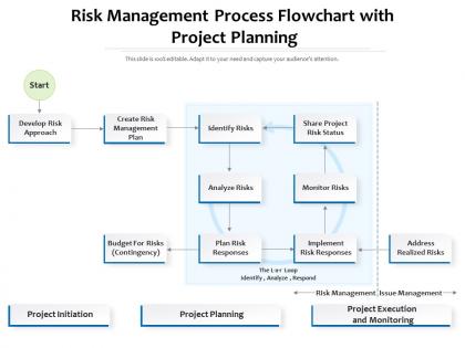
Risk management process flowchart with project planning




Try Before you Buy Download Free Sample Product
 Impress Your
 Audience
 100%
100% Editable
 Save Hours
 of Time


Our Risk Management Process Flowchart With Project Planning are topically designed to provide an attractive backdrop to any subject. Use them to look like a presentation pro.
People who downloaded this PowerPoint presentation also viewed the following :
Risk management process flowchart with project planning with all 2 slides:
Use our Risk Management Process Flowchart With Project Planning to effectively help you save your valuable time. They are readymade to fit into any presentation structure.
FAQs for Risk management process flowchart
So basically you need five main pieces: spot the risks first, then figure out how likely they are and what damage they'd do. After that comes the fun part - deciding whether to avoid them completely, reduce the impact, pass them off to someone else, or just roll with it. Implementation follows, then you've gotta keep watching since things change constantly. Make sure your flowchart shows it's all connected in a loop because you'll be cycling through this stuff forever. Oh, and use different shapes for actions vs decisions - sounds obvious but it actually helps people follow along way better.
Okay so risk assessment is basically just one step in the whole risk management process. Assessment is where you figure out what could actually go wrong - like the detective work part. But management covers everything: the assessment, planning how to handle stuff, putting controls in place, monitoring it all. I always think of it like this - assessment is diagnosing what's broken, management is the entire fix. Pretty straightforward really. When you look at that flowchart, you'll see assessment as one little box, but management is literally the whole thing from start to finish.
Start with ISO 31000 - that's your bread and butter for risk management frameworks. It'll give you a solid base for structuring everything. After that, think about what actually applies to your business. Financial services? SOX is gonna be on your list. COSO works well for internal controls. Cybersecurity stuff means NIST. Healthcare is honestly a pain with all the HIPAA requirements, but you can't avoid it. Don't try to cram every standard into your flowchart though. Pick ISO 31000 as your foundation, then just add the regulatory stuff that's actually relevant. Way better than creating some franken-chart that nobody will use.
Honestly, Microsoft Visio is your best bet if you've got it - everyone uses it for process stuff and it plays nice with Office. But if you don't want to spend money, draw.io is actually pretty solid. I use it constantly and it's totally free. Lucidchart's another web option that's decent. Some of those fancy GRC platforms like Archer have flowchart tools built in, but that's probably overkill unless you're already using them. Worst case? PowerPoint works fine for basic stuff. I'd just go with whatever your company already has licenses for first.
Start with figuring out who actually needs to be involved - don't just grab the usual suspects from leadership. Include frontline people, customers, maybe external partners too. They'll catch stuff you'd totally miss. Skip the one-off meetings (they're pretty much useless) and do regular check-ins instead. People need to feel like they own part of the process, not like they're just ticking boxes. Set up clear ways for everyone to communicate and report risks. Oh, and make sure everyone knows their role from day one. The whole thing should feel collaborative, not like some compliance nightmare.
So probability and impact analysis is where you actually put numbers on your risks - scoring how likely they are and how much damage they'd cause. It's the meaty part of risk assessment. You'll use those scores to build your prioritization matrix, which helps you figure out what needs immediate attention vs. what you can just keep an eye on. Honestly, the scoring criteria thing is huge - stay consistent or you'll end up comparing totally different things. I learned that the hard way on a project last year! Short version: this step turns your risk list into something actionable.
Look, first figure out how you actually handle risks right now - then build your flowchart around that. Don't just grab some fancy template because it looks professional (learned that the hard way). Adjust the decision points and approval levels based on your company size. A startup doesn't need the same complex approval chains as a bank with tons of compliance stuff. Map out your specific risk types - cyber, financial, operational, whatever hits your business. Short approval chains work great for smaller teams. Include the stakeholders who'll actually use this thing, and honestly? Make sure it reflects your real processes, not some idealized version that'll never get followed.
Don't overcomplicate it - that's the death trap right there. Too many decision points and people just give up. Focus on your main steps instead of trying to map every tiny detail. Make sure someone owns each part too, because when stuff hits the fan, you don't want everyone pointing fingers at each other. Oh, and customize it for your actual company processes, not some generic template you found online. Honestly? Test it first with a real scenario before you launch it to everyone. Pick your top 3-5 risk types and build something people can actually use when they're stressed.
You definitely need those feedback loops and arrows going in circles - that's what shows it's continuous, not just a straight line to "done." I'd add decision points like "Has the risk changed?" that circle back to your assessment step. So many people mess this up by ending at mitigation (drives me nuts honestly). Monthly or quarterly review checkpoints work great too, depending on what you're dealing with. The whole point is making it obvious that risk management never really stops - it just keeps cycling. Oh, and try dotted lines for the monitoring stuff that runs alongside everything else. Makes it way cleaner visually.
Color coding is your best friend here - red for high risk, yellow for medium, green for low. Makes everything super clear at a glance. Different shapes matter too: diamonds for decisions, rectangles for processes, circles for start/end. But honestly? I've seen people go nuts with decorations and it just looks messy. Stick to clean fonts and give everything room to breathe with white space. Flow should go left-to-right or top-to-bottom so people don't get lost. Throw in a few icons if they actually help, but don't overdo it. Test it on someone who's never seen it before - they'll catch confusing spots you missed.
So there's a few ways to handle this. Version control systems work great, or you can use something like Miro or Lucidchart for real-time updates. But honestly? The biggest thing is just making sure someone actually owns it - otherwise it'll just sit there collecting digital dust lol. What I'd do is set quarterly reviews where your team flags new risks, then update everything at once instead of constantly tweaking it. You could even link it to your incident reporting so new stuff triggers a review automatically. Really though, just pick whatever your team will actually stick with and make sure someone's clearly responsible for keeping it current.
Just build the risk stuff into what you're already doing instead of making it a separate thing. Pick 2-3 processes where problems usually pop up - maybe project approvals or buying stuff. Then add quick risk checks right into those existing steps. Your team won't hate you for it since they're basically doing the same workflow, just with extra checkpoints built in. Honestly, standalone systems just collect dust anyway. Map out where risks actually happen in your current process first, then slot the assessments into those natural decision points. Way easier than training everyone on something completely new.
Honestly, you'll want to track both the early warning signs and the after-the-fact stuff. Time to resolve incidents is huge. Also watch your risk identification rate and how many risks actually have mitigation plans - that one's surprisingly telling. Staff training completion rates matter more than people think. Here's what I'd focus on: are you catching problems before they blow up? That prevention-to-reaction ratio is gold. Incident frequency trends usually tell the real story anyway, not those fancy executive dashboards. Start with maybe 3-5 metrics that actually matter to your specific business, then build from there once you've got those working.
Yeah, culture totally changes how you'd run through that risk flowchart. In the identification phase, something that seems risky to your team might be no big deal to theirs. Plus communication styles are all over the map - some cultures will tell you straight up if something's wrong, others dance around it. Your probability assessments get tricky too since cultures view uncertainty and timelines so differently. Honestly, hierarchy plays into this more than people realize. Individual-focused solutions that work great in the US? They'll probably bomb in more team-oriented cultures. Just adapt each step to match local norms but don't mess with your core process.
Start with basic risk management training - online courses work fine for covering identification and assessment basics. Get your team practicing with your actual flowchart though, since every company does theirs differently (learned that the hard way). Make sure everyone has clear examples and guidelines for filling it out. Pick a couple people to be your "risk champions" who get extra training and can help others when they're stuck. The real magic happens in those regular practice sessions where you work through actual scenarios together. Short ones work better than marathon training sessions, trust me.
-
Designs have enough space to add content.
-
I discovered this website through a google search, the services matched my needs perfectly and the pricing was very reasonable. I was thrilled with the product and the customer service. I will definitely use their slides again for my presentations and recommend them to other colleagues.
-
Very unique, user-friendly presentation interface.
-
Excellent template with unique design.
-
Innovative and Colorful designs.
-
Very well designed and informative templates.
-
Informative design.
-
Informative presentations that are easily editable.
-
Awesomely designed templates, Easy to understand.