


Three staged winner podium flat powerpoint design




Try Before you Buy Download Free Sample Product
 Impress Your
 Audience
 100%
100% Editable
 Save Hours
 of Time


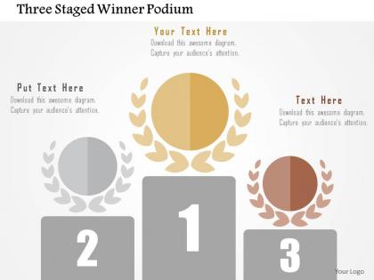
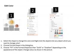
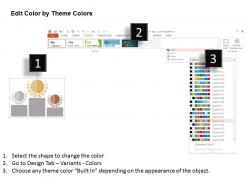
Select three staged winner podium flat PPT template design slide to highlight let your know team understand the importance of becoming the industry leader. You can easily demonstrate your team about how to achieve success with this visually impressive PowerPoint slide. Make use of this professionally designed presentation diagram assist you to shape up your knowledge of your team about the success. This design contains the concept of winning and is useful for business and education related presentations. You may modify the PowerPoint layout as per your exact requirement or can share it as accessible. The winner podium PPT visual is very adaptable in nature. You can insert it in the presentation and then share it with your spectators. Our Three Staged Winner Podium Flat Powerpoint Design are a blend of beauty and brains. They are both functional and attractive.
People who downloaded this PowerPoint presentation also viewed the following :
Three staged winner podium flat powerpoint design with all 5 slides:
Under pressure at work? Take the edge off by having us handle the design of your next big presentation with our Three Staged Winner Podium Flat Powerpoint Design.
FAQs for Three staged winner podium
You'll want a solid hook right at the start, then break everything up with clear sections and consistent formatting. Build in spaces for titles, bullets, and images so you're not starting from scratch each time. Typography should be readable - I swear, half the presentations I sit through have fonts I can barely see from the back row. White space is your friend. Pick colors that look good on screens AND when printed (learned that one the hard way). Keep slide transitions smooth, nothing too flashy. Oh, and always end with a Q&A slide ready to go.
Your colors can totally change how people feel about your presentation without them even knowing it. Blue's great for building trust - especially when you're showing data or stats. Red grabs attention fast but can feel kinda aggressive if you go overboard. Green says "growth" and feels balanced, orange is energetic, purple screams innovation or fancy stuff. I've literally watched boring presentations become way more engaging just by ditching those default grays for something strategic. Honestly, pick colors based on the vibe you want, not what's prettiest. Your audience will subconsciously respond to warm vs cool tones differently.
Minimalist stuff is everywhere right now - clean slides with tons of white space that actually let your content breathe. Bold fonts are having a moment too. Dark mode templates? They're literally on every design site (and yeah, they do look pretty cool). People are ditching those crazy busy slides packed with text. Instead you're seeing geometric shapes, subtle animations, and color schemes that actually work together across the whole presentation. Oh, and single statement slides are huge. Honestly though? Just pick whatever fits your vibe and stick with it. Don't try cramming every trend into one deck.
Think about who you're presenting to and match their world. Executives? Keep it super clean - they just want the main points without any mess. Creative people are the opposite though - go wild with colors and crazy layouts. They eat that stuff up. Technical folks need everything organized with tons of data and clear sections. Sales teams want something that feels punchy and gets people excited. Honestly, just picture what they stare at all day. Are they knee-deep in Excel or scrolling TikTok? That's your answer right there.
Stick with your brand colors and fonts - makes everything look way more professional. High-quality images are key, but they should actually relate to what you're saying (not just random stock photos because you panicked). Text needs to be readable over backgrounds, obviously. Animations are cool but don't go overboard or people will focus on the spinning logo instead of your point. Create a few slide templates ahead of time so you're not scrambling later. Oh, and test everything on the actual screen you'll be using - I learned this the hard way when my fonts looked tiny during the real presentation.
Honestly, templates are lifesavers when you're staring at that blank PowerPoint going "well, crap." They've got all the design stuff figured out already - fonts, colors, layouts that actually look good together. You just dump in your content and boom, suddenly you look like you know what you're doing. I mean, I can barely match my socks but with a decent template I look professional lol. You can still tweak things to fit what you need, but the boring foundation work is done. Saves me hours every time, and my boss thinks I'm some design genius now.
Honestly, typography can make or break your whole presentation. Pick fonts big enough that people in the back aren't squinting - I learned this the hard way once. Clean sans-serif fonts work best for most text. Avoid anything too fancy or decorative because it'll be unreadable from far away. You can use maybe one accent font for headers if you want. The fonts you choose actually set the mood too. Playful stuff for creative topics, professional ones for business meetings. Oh, and make sure there's good contrast with your background colors. Nobody wants to strain their eyes reading light gray text on white!
So contrast is huge - dark text on light backgrounds every time. Those gray-on-gray designs might look fancy but honestly, they're impossible to read. Stick with fonts like Arial or Calibri, nothing too fancy. Make your text at least 24pt too. Structure matters - clear headings and bullet points help screen readers navigate smoothly. Don't forget alt text for images! Here's a trick I learned: view everything in grayscale first. If you can't read it clearly that way, people with visual impairments definitely can't either.
Honestly, custom templates are a game changer for control over your brand. You get to pick everything - colors, fonts, how stuff's laid out - so it actually matches what your audience expects. Pre-made ones? They're decent for starting out fast, but they feel kinda generic after using them for a bit. Plus you're always trying to make your content fit into someone else's boxes, which is annoying. I'd say test your idea with a pre-made template first. Once you figure out what works, then drop some money on custom. Way better investment that way.
Honestly, less is more with animations. Stick to simple transitions like fade or push - nothing flashy. I learned this the hard way after watching someone's presentation that looked like a rave lol. Having bullet points appear one at a time actually helps though, keeps people focused on what you're saying instead of reading ahead. Just be consistent throughout your slides. Save the fancy entrance effects for important stuff like key data or big quotes. Oh and definitely practice the timing! Nothing's worse than awkward pauses while you wait for animations to finish. The whole point is guiding attention, not putting on a light show.
Ugh, the worst thing you can do is cram everything onto one slide - I've sat through way too many presentations like that. Give your content room to breathe with plenty of white space. Stick to 2-3 fonts tops, and please make them readable! 18pt minimum or people in the back will hate you. Simple color scheme works best. Just make sure there's decent contrast so folks can actually see the text. Pro tip: test it with real content first because slides that look amazing when empty sometimes completely fall apart once you add your actual data.
Think of templates like a roadmap for your story - they show you when to drop key info and how to build up the good stuff. Clear sections force you to stay organized so people can actually follow what you're saying (instead of zoning out halfway through). Honestly, I'm obsessed with templates that create suspense. But sometimes you need the straightforward, step-by-step approach instead. Just match whatever structure fits your content naturally. Don't fight against your template's flow. Work with it and your storytelling won't feel forced or weird.
Hey! So basically you need to make everything bigger - bump font sizes up like 20% minimum because screens are brutal. Colors get all washed out on video calls too, which is super annoying. I'd strip down any cluttered slides since people zone out way easier virtually. Maybe throw in some polls or interactive stuff? Short sentences work better than long rambling ones. Oh and honestly, test everything beforehand - what looks perfect on your monitor might be unreadable on someone's phone. Start with your favorite in-person template and just scale it up for screens.
Honestly, post-presentation surveys work great - just ask about template clarity and visual appeal. People are way more honest than you'd expect. During sessions, try quick polls too. Your presentation platform probably has analytics showing where people drop off, which is super helpful data. I'd definitely chat with anyone who presents regularly since they catch usability problems you miss. Oh, and don't go overboard collecting feedback right away - pick one method first. The analytics thing though? That's where you'll find the real insights about what's actually working.
So Podium lets you embed analytics straight into your templates - tracks slide view time, link clicks, where people engage most. Pretty cool actually. The metrics dashboard shows exactly when your audience checks out (which can be brutal but super helpful). I'd also throw in feedback forms right in the template so you get responses while it's fresh. Pick like 2-3 metrics that actually matter for your goals first - don't go crazy measuring everything. Then compare how different template versions perform against your baseline. Honestly, seeing where people drop off the first time is kind of a wake-up call.
-
Excellent work done on template design and graphics.
-
Best way of representation of the topic.