

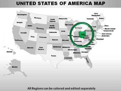
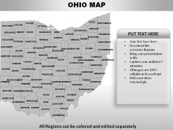
Usa ohio state powerpoint maps




Try Before you Buy Download Free Sample Product
 Impress Your
 Audience
 100%
100% Editable
 Save Hours
 of Time


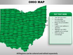
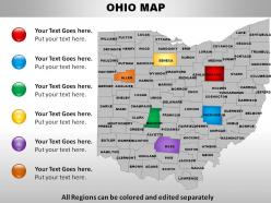
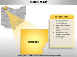
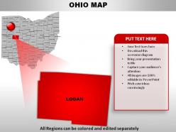
Get your audience shaken and stirred. Our USA Ohio State Powerpoint Maps are licensed to thrill.
People who downloaded this PowerPoint presentation also viewed the following :
Usa ohio state powerpoint maps with all 28 slides:
Take the stand with our USA Ohio State Powerpoint Maps. Maintain control at the dais.

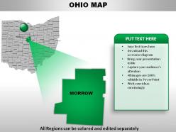

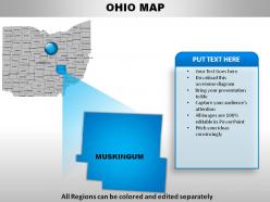
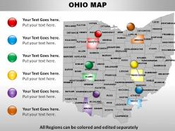
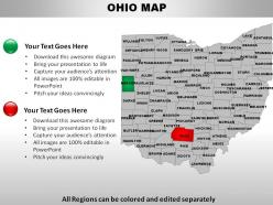
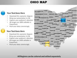
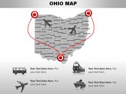

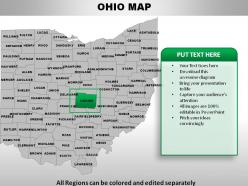
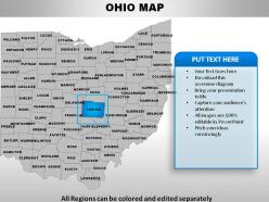

FAQs for Usa ohio
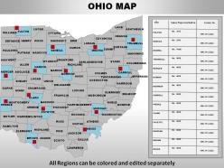
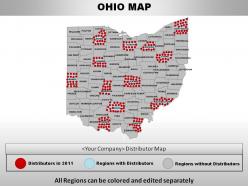
Oh those are just editable map templates for Ohio presentations. Way better than screenshotting Google Maps, trust me. You can change colors, highlight different cities or regions, throw in your own data - whatever you need. Business people love them for sales territory stuff, teachers use them too. Honestly they save so much time when you're putting together anything location-based. I'd grab a few different styles now and save them in a folder. That way you're not scrambling later when your boss suddenly wants geographic breakdowns or whatever.
Honestly, you can map almost anything with location data in Ohio. County-level stuff works best since there are 88 clearly defined counties - demographics, sales data, election results, whatever. I've seen cool maps showing restaurant locations and school district performance. Regional breakdowns work too if you don't need that much detail. Population density maps are super popular. Just make sure your data actually connects to specific geographic areas in the state. Oh, and don't use crazy colors that'll confuse people - keep it simple and you're good to go.
Honestly, those Ohio State PowerPoint maps are so much better than regular bullet points. You can color-code different districts, highlight specific regions, or even animate reveals to keep people hooked. Your audience will actually remember stuff when they see data geographically instead of just reading text. I've seen presentations where people add callouts to specific locations - works really well for regional data. Plus you can walk through trends state by state, which is way more engaging. My coworker used one last month and everyone was actually paying attention for once. Definitely try it next time you're presenting to stakeholders.
Definitely go for vector graphics - trust me, pixelated county lines look awful in presentations. You'll want all 88 counties as separate objects so you can change colors and add your own data. Major cities should be labeled, plus highways if you need them. Honestly, half the maps out there are just fancy JPEGs which are completely useless for customization. Check if it scales well by zooming way in - it should stay super crisp. Also make sure it comes with decent color schemes that don't look like a kindergarten art project. A legend template is pretty helpful too.
Dude, those Ohio State PowerPoint maps are perfect for geography and history classes! Your students will actually pay attention when you can zoom into specific counties or highlight different regions. Kids need that visual stuff - trust me on this one. The maps come ready to go, so you're not stuck making graphics yourself (which honestly takes forever). Colors are totally customizable too. You can throw in data overlays and annotations depending on what you're teaching. I'd grab a couple different styles and just keep them handy for whenever you need them.
Real estate companies use them all the time for property locations. Healthcare systems map their facilities, schools show district boundaries, and logistics companies track distribution routes. Manufacturing loves them for supply chain stuff too. Government agencies are obsessed with them for budget presentations - I swear every county meeting has at least three. Retail chains use them to show store coverage, and even nonprofits map their program reach. Honestly, if your data connects to specific Ohio locations, these maps beat the hell out of boring spreadsheets. Just don't force it if geography doesn't actually matter for your story.
Honestly, maps are so much better for Ohio data than regular charts. Your audience sees patterns instantly instead of staring at bars and trying to figure out what county that represents. Don't get me wrong - charts work great for showing changes over time. But if you're presenting demographics or sales across different regions? Maps make it obvious right away. I used one last month for survey results and people got it immediately. Takes seconds instead of having everyone squint at your slide trying to decode pie charts. Way less painful for everyone involved.
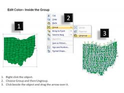
Yeah definitely! Those Ohio State maps are super customizable. Most templates let you mess with colors, fonts, and styling so everything matches your presentation. The counties are usually separate pieces, which is clutch for color-coding different data points - way better than making maps yourself tbh. You can tweak backgrounds, borders, text, whatever. Just right-click on stuff and use PowerPoint's normal formatting options. Should work perfectly for your brand colors and all that.
Honestly, just use regular PowerPoint - it's got everything you need to start. The built-in shapes and drawing tools work great for basic county outlines and stuff. Adobe Illustrator makes prettier maps if you're feeling ambitious, or you could try MapChart online. I've seen people pull vector files from Freepik too, which is kinda smart actually. Government mapping sites are another option. But seriously, mess around with PowerPoint's tools first. You'll probably get way further than you think before needing anything fancier.
Those Ohio PowerPoint maps are actually pretty solid for sales stuff. Map out where your customers are, then color-code counties by revenue or whatever metrics you care about. Makes it super easy to spot where you're killing it vs where there's room to grow. Way better than staring at endless spreadsheets during those quarterly meetings (seriously, anything's better than that). I'd start with plotting your current customer base first. Then you can layer on demographic data or see where competitors might be weak. Really helps when you're trying to show the team geographic patterns they'd totally miss otherwise.
Dude, those Ohio PowerPoint maps are actually clutch for project stuff. I use them all the time to show where team members and clients are scattered around the state. Makes it way easier to figure out resource allocation than scrolling through boring spreadsheets. People get super creative with the color-coding too - different phases, departments, whatever. Your audience will instantly get the geographic logistics instead of trying to picture where "Zanesville" even is lol. Focus on specific counties if that's where you're concentrating efforts. Honestly just grab a template and start plotting - it'll make your presentations look way more professional.
Dude, those Ohio State PowerPoint maps are so much better now than they used to be. The old ones were basically clipart garbage - super basic outlines that you couldn't really customize. Now you can actually edit everything: colors, highlight specific counties, add your own data, even throw in animations if you're feeling fancy. The quality difference is honestly night and day. Way cleaner design, better color options, actually looks professional instead of something from 2003. Oh and they're vector graphics now too, which is clutch for scaling. If you're still stuck with the old versions, definitely upgrade - your presentations will look way more legit.
Ugh, the worst thing people do is cram way too much data onto one map - nobody can read that mess from the back row. Colors are another disaster - if you're using light blue and slightly lighter blue, good luck figuring out what's what. Don't forget your legend either, or people will just stare at random colored blobs wondering what they mean. And seriously, those county-by-county animations are painful to sit through. Stick to 3-4 main points, use colors that actually pop against each other, and maybe walk to the back of the room first to see if you can actually read your own work.
So PowerPoint maps for Ohio are actually pretty clutch for community work. You can throw demographic data right onto different counties or regions - population stuff, income, age groups, whatever you need. Way better than drowning in Excel sheets, trust me. The visual thing makes it super obvious where the gaps are or which areas need more resources. Perfect for when you're pitching to grant people too since they love that visual stuff. Just grab your data first and figure out which Ohio regions match what you're trying to do. Makes patterns jump out at you.
Yeah, totally! Color scheme needs to match your other slides - clashing maps look weird. Make it big enough so people can actually see what you're pointing out. I've sat through way too many presentations where the map was like postage stamp sized and useless from the back. Labels are crucial too, or people won't know which counties you're talking about. Oh and try animating different data points instead of showing everything at once. That progressive reveal thing works way better than info-dumping everything on one slide.
-
Unique and attractive product design.
-
Innovative and Colorful designs.