


User Journey Pain Points Powerpoint Ppt Template Bundles




Try Before you Buy Download Free Sample Product
 Impress Your
 Audience
 100%
100% Editable
 Save Hours
 of Time


Our User Journey Pain Points Powerpoint Ppt Template Bundles are topically designed to provide an attractive backdrop to any subject. Use them to look like a presentation pro.
People who downloaded this PowerPoint presentation also viewed the following :
User Journey Pain Points Powerpoint Ppt Template Bundles with all 17 slides:
Use our User Journey Pain Points Powerpoint Ppt Template Bundles to effectively help you save your valuable time. They are readymade to fit into any presentation structure.
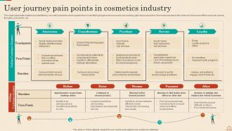
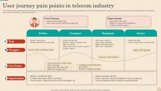
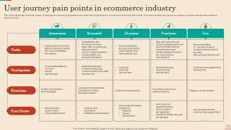

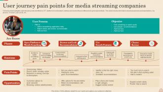
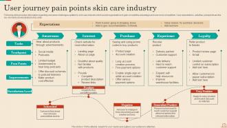
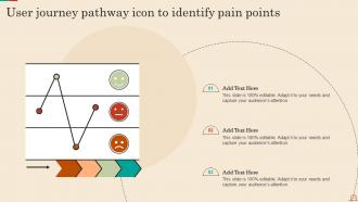






FAQs for User Journey Pain Points Powerpoint
Ugh, the search function is terrible - you can't filter by anything useful like industry or style. Finding decent templates takes forever when you're scrolling through hundreds of generic options. Then once you pick one, good luck customizing it without everything falling apart. Swap one image and suddenly the whole layout's a mess. Most templates are either way too basic or ridiculously overcomplicated, which is annoying. There's like zero middle ground. My advice? Better categories would help, but honestly they need more flexible designs that actually work when you change stuff. The rigid layouts are what kill me the most.
Okay so most people hit our homepage first and either search or browse categories. Sounds simple, right? Wrong. They get totally overwhelmed by all the options and just start randomly clicking through category pages. Never actually finding what they want. Our search is pretty terrible too, which doesn't help. Have you checked out those user session recordings yet? Seriously, watching people struggle through our navigation is painful. They either scroll forever or just bail completely. Those category labels we have are confusing as hell - we've gotta fix that.
Yeah, your users are super frustrated with the template setup. Categories overlap way too much - like people can't tell if something goes under "Marketing" or "Communications" which is honestly pretty reasonable confusion. The naming just doesn't click for most people. Popular templates end up buried in weird subcategories instead of being easy to find. Search works okay, but everyone still wants to browse logically organized groups. I'd definitely audit the whole structure. Maybe try some card sorting with real users? That usually reveals how people actually think about organizing this stuff. Ten minutes to find a template is brutal.
Oh totally, we get tons of complaints about this. Template gallery is the worst offender - people hate waiting for those previews, mobile users especially. Checkout's pretty slow too which sucks for sales obviously. Dashboard itself? Actually loads fine. But throw in heavy templates with animations and images and it crawls. Honestly the template thing bugs me most since that's everyone's first impression. I'd probably focus there first if you're looking at performance fixes - that's where people decide if they're sticking around or bouncing.
Yeah, people get super excited about all the customization options at first. Then they freeze up completely - classic analysis paralysis. The interface is part of the problem too since it just throws everything at you instead of easing you in. What really trips users up is not knowing which tweaks will mess up the mobile version or slow things down. Honestly, the whole thing could use some cleanup. You should definitely watch a few user sessions to see what I mean. After that we can probably surface the popular options first and tuck the technical stuff away somewhere.
Ugh, the worst part is definitely tech issues. Your video works perfectly at home, then completely dies during the actual presentation. Audio's another nightmare - sounds crisp on your laptop but turns into static hell through those awful conference room speakers. File sizes are brutal too, especially when you hit upload limits or can't even email the thing because it's massive. And don't get me started on finding decent multimedia that won't get you in copyright trouble. My advice? Test everything on the actual equipment first. Sounds obvious but trust me, it'll save your butt. Keep simple backup versions ready.
Yeah, the preview thing is a total mess right now. Users keep saying they feel like they're shopping blindfolded - can't see enough detail to actually know what they're buying. The images are way too small and don't show the features people actually care about. What's worse? Half the time what arrives doesn't match what the preview showed, so boom - returns and angry support tickets everywhere. Maybe we should try interactive demos or something? I mean, anything's gotta be better than the current setup where people are basically gambling every time they hit purchase.
Yeah, customers are really annoyed with our licensing stuff right now. People keep complaining about all the legal nonsense - they just want to know if they can use templates for business without getting a law degree first. Our current terms are buried in these massive walls of text that no one bothers reading. Most users end up messaging support for basic questions about what's allowed. Honestly, who has time to decode that mess? We should make a simple visual guide or FAQ that explains the key permissions in normal language instead.
Honestly, search and filtering is what everyone complains about most. People want to narrow stuff down by industry or style instead of scrolling forever. Better customization tools are clutch too - like swapping colors or tweaking layouts without rebuilding everything. Oh, and preview features! Nobody has time to click through dozens of templates just to see what they look like. The filtering issue gets really annoying when you're up against deadlines (been there). Focus on making discovery way faster and customization less clunky. That's where you'll actually move the needle on user happiness.
Oh man, checkout is brutal - that's where we're bleeding customers left and right. Mobile is the worst offender honestly, I literally won't buy anything on my phone anymore because it's such a pain. People bail when you force them to create accounts, ask for too much info, or surprise them with shipping costs at the end. Limited payment options don't help either. Check your analytics to see the exact drop-off points, then just fix the worst stuff first. The whole process probably takes way too long too.
Honestly, it's pretty solid for beginners - those drag-and-drop tools are actually intuitive and the tutorials don't make you want to throw your laptop out the window. Advanced users though? You'll probably get frustrated with how limited the customization gets. Oh, and the template library is actually worth browsing first before you commit to anything. Middle-skill people seem to have the sweet spot here since the features match what they need. Complex design stuff isn't really their strong suit. I'd say poke around their templates to see if it vibes with your level before jumping in.
People get frustrated when they're stuck and need specific help with templates - not some generic FAQ that doesn't actually answer their question. Step-by-step guides work best. So do real examples from other users. Inline help right in the template is gold because they don't have to hunt around for answers. You'll also want searchable docs that actually relate to what they're doing (obvious but worth saying). Oh, and definitely have a way for them to reach a human when things get messy. Sometimes you just need someone to walk you through the confusing parts, you know?
Ugh, checkout abandonment is so frustrating! Usually it's surprise shipping fees that kill it - nobody likes getting hit with $15 shipping at the end. Forcing people to create accounts is another big mistake. Payment stuff matters too - if your checkout looks shady or only takes weird payment methods, people bounce. Mobile is where most shopping happens now, so if that's broken you're screwed. Oh, and those crazy long forms? Nobody has patience for that. I'd check your mobile checkout first since that's probably where you're bleeding customers. Fix the obvious stuff like load times and return policies too.
Honestly, reviews are like your best friend when template hunting. Skip the 5-star stuff first - go straight to the recent bad reviews because that's where people spill about broken features and crappy mobile layouts. Way more helpful than just looking at pretty screenshots. Higher ratings usually mean less headaches, but the comments section is where you'll find the real tea. People will literally tell you if something's a nightmare to customize or if the support team ghosts you. I always spend like 10 minutes reading through them - saves me so much trouble later.
Honestly, the template thing is driving everyone crazy - people want flexibility but don't want to build from zero every time. Version control is a nightmare when you've got multiple people working on the same deck (been there, it's awful). Formatting consistency across slides eats up so much time too. Real-time feedback features are becoming huge, plus better ways to manage all your assets. I'd probably tackle the collaboration stuff first since that affects whole teams, then work on the customization headaches after.
-
I discovered some really original and instructive business slides here. I found that they suited me well.
-
Delighted to see unique and eye-catching PowerPoint designs that are so easy to customize.