


0914 complex networking diagram main office and branch office wan lan and cloud ppt slide




Try Before you Buy Download Free Sample Product
 Impress Your
 Audience
 100%
100% Editable
 Save Hours
 of Time


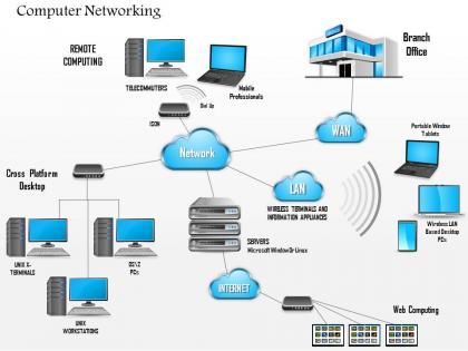
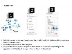
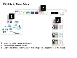
Choose complex Networking Diagram Main Office and Branch Office WAN LAN and Cloud Ppt Slide. The PowerPoint design shows the concept of computer networking which you can show to your audience. Giving information about the technology in the visual manner assists you to make people understand things in the better way. The presentation template gives you an access to show the technology networking aspects. Our designing team has crafted it with utmost care so that you can present it in the right manner. You can use this presentation diagram to show the details about network links which includes wired, wireless and exotic technologies. Besides this, you can also share information about network nodes such as bridges, switches, modems, firewalls, routers all these are related to the computer networking. Furthermore, the PowerPoint layout also assists you to highlight the organizational scope of the computer networking i.e. intranet, extranet, internet and dark net and internetwork. So this PPT template is quite useful to show the certain aspects related to the network security and connectivity. Our 0914 Complex Networking Diagram Main Office And Branch Office WAN LAN And Cloud Ppt Slide are exclusively crafted. They can be alluringly awesome.
People who downloaded this PowerPoint presentation also viewed the following :
0914 complex networking diagram main office and branch office wan lan and cloud ppt slide with all 5 slides:
Our 0914 Complex Networking Diagram Main Office And Branch Office WAN LAN And Cloud Ppt Slide team act with due diligence. They are careful about being absolutely accurate.
FAQs for 0914 complex networking diagram main office and branch office wan lan and
So you'll need the basics first - routers, switches, firewalls, all that gear. Show your IP schemes and VLANs clearly. Label everything with interface numbers and IP ranges, but don't go crazy with details upfront. Security boundaries are huge too. Honestly, most people mess this up by making it look like a bowl of spaghetti - group things logically! Physical vs logical connections need to be obvious. Oh, and use the same symbols throughout or you'll confuse everyone. Start high-level, then break it into detailed chunks for each segment.
Honestly, good network diagrams are like having a universal translator for your tech teams. Everyone can look at the same visual and immediately get what's happening - data flow, dependencies, where things might break. Saves you from those awkward meeting moments where half the room is confused about which server you're even discussing. Your devs, network folks, and security team can actually point to stuff and trace problems without playing 20 questions. The trick is picking a format everyone understands upfront. Trust me, it's way better than spending forever explaining the same setup over and over.
Honestly, just start with Draw.io (they renamed it to diagrams.net but whatever). It's free and handles complex network stuff pretty well. Lucidchart's another solid option - great for collaboration if you're working with a team. Visio's still what most companies use since they already have Microsoft licenses, though the web tools are just as good now. If you've got a Mac and don't mind spending money, OmniGraffle is amazing. Oh, and yEd is a lifesaver for those massive networks where you'd go insane trying to position everything manually. Start free, upgrade later if needed.
Honestly, it's all about who you're showing it to. Troubleshooting with your team? Go nuts with IP addresses, VLANs, port numbers - they'll need that stuff. But executives just want the big picture, not every technical detail. I made that mistake once and completely lost a client in the weeds of network specs. Pretty embarrassing actually. Think about what decisions your diagram has to support first. Are they configuring gear or just understanding the overall flow? Start with your main point, then only add details that actually matter for that specific goal. Usually less detail works better than drowning people in info.
Don't cram everything into one diagram - that's the fastest way to create a hot mess. Keep your symbols and colors consistent, otherwise people get confused. Crossing cables everywhere makes it look like absolute spaghetti, which honestly drives me nuts. Separate your logical stuff from physical layouts too. Mixed IP schemes without documentation? Recipe for disaster. Always label connections and throw in a legend. I usually start with core infrastructure first, then build outward. Group related components together - makes way more sense that way. Oh, and resist cramming multiple network views together!
Dude, you definitely need those complex network diagrams when shit hits the fan - multi-site outages, weird VLAN connectivity issues, performance problems across different segments. Security incidents too, when you're trying to trace where traffic's going and figure out breach paths. I've watched way too many techs burn hours troubleshooting with zero visibility into what's actually connected to what. Command-line tools only tell you so much, but diagrams show you dependencies between all your routers, switches, firewalls that you'd never catch otherwise. Seriously, map out your critical stuff now. When you get that lovely 3am call, you'll be so glad you did.
Honestly, color coding is a lifesaver for network diagrams. Your brain just gets it faster when different device types have their own colors - like routers in blue, switches in green, whatever works. It's kinda like how you'd highlight a textbook with different colors for main ideas vs examples. You can trace connections way quicker and spot where things might be getting jammed up. The key thing is picking your colors early and sticking with them. Otherwise your whole team will be confused about what purple means this week vs last week.
Dude, trust me on this - use standard symbols in your network diagrams. Anyone can jump in and understand what's going on without you having to explain your weird custom icons. When techs are actually installing stuff, they'll know exactly what equipment they're dealing with instead of guessing. Troubleshooting becomes so much easier too, especially when you're stressed and tracing connections. I learned this the hard way honestly. Just go with IEEE or Cisco standards. You'll be grateful later when you're staring at those diagrams during some random 3am emergency.
Ditch all the tech speak first - seriously, nobody wants to hear about protocols and configurations. Think highway systems or office buildings when you're explaining stuff. Color-coding is your best friend here, and slap clear labels on everything that actually explain what it does for their business. Less really is more with these folks - they'll ask if they want the nitty-gritty details. Walk them through how data moves step by step. Oh, and always circle back to how this whole thing affects their actual work day or bottom line at the end.
Look, scalability is just whether your network can grow without everything breaking. Plan for expansion from day one - bandwidth, hardware limits, traffic flow, all that stuff. I've watched way too many "quick fixes" turn into absolute disasters later. Your diagram needs clear paths for adding users or segments without tearing everything down. Modular design is key here. Use hierarchical layouts and mark where bottlenecks might hit. Figure out your current capacity and where you'll be in a few years, then add 30% extra room because you'll need it.
Network diagrams are honestly a game changer for finding security holes. They map out how your data moves around and show you which systems are talking to each other. Single points of failure jump out at you right away, plus you can spot unprotected network segments that attackers love to target. I always tell people to start with their most sensitive data flows first - that's where the worst vulnerabilities usually hide. The diagrams make compliance audits way less painful too since you can actually prove your network segmentation works. You'll be able to prioritize which systems need beefed up security based on how connected and critical they are.
Set up monthly or quarterly updates - depends how crazy your changes get. Trust me, document stuff RIGHT when you do it. I once wasted an entire afternoon figuring out what my coworker did last spring because nobody wrote it down. Version control is clutch for tracking changes over time. Split up diagram ownership between team members for different segments so it's not all on one person. Oh and those automated discovery tools? They're actually pretty decent at catching missed stuff. Main thing is baking updates into your regular workflow instead of treating it like homework you forgot about.
Honestly, that networking diagram is gonna save your butt when disaster hits. Shows you exactly how everything connects and where data flows. When systems start crashing, you'll spot single points of failure fast and see which backup routes actually exist. Trust me, scrambling to remember which switches connect to what servers while everything's down is the worst. Keep both digital and printed copies updated - somehow the documentation server always dies first (classic, right?). Having that visual map cuts your recovery time in half.
Healthcare companies build patient data flows right into their diagrams with HIPAA checkpoints everywhere. Financial services? They're totally paranoid about security - every single firewall and encryption point gets mapped out. Manufacturing focuses on IoT sensors and how production lines connect. Telecom creates these huge infrastructure maps for signal routing and bandwidth stuff. Honestly, the trick is just figuring out what your industry's regulators actually want to see. Then you design the whole diagram around that instead of trying to show everything at once.
Oh man, version control becomes a total nightmare. Network folks love their Visio, security teams want their fancy specialized tools, and devs just scribble on whatever's nearby. Honestly, it's like trying to organize a group chat with 20 people - chaos. One tiny change breaks everyone else's understanding of how stuff connects. Different teams focus on completely different layers too, so what looks "done" to one group is missing half the details another team needs. Set up one master source early and do regular check-ins before things spiral out of control.
-
Designs have enough space to add content.
-
Designs have enough space to add content.