


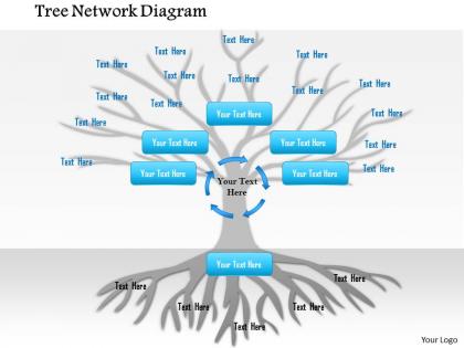
1114 tree network diagram powerpoint presentation




Try Before you Buy Download Free Sample Product
 Impress Your
 Audience
 100%
100% Editable
 Save Hours
 of Time


Our 1114 Tree Network Diagram Powerpoint Presentation ensure you don't ask for grace. You will be done before due date.
People who downloaded this PowerPoint presentation also viewed the following :
1114 tree network diagram powerpoint presentation with all 5 slides:
Our 1114 Tree Network Diagram Powerpoint Presentation act like an elixir. You will get an extra dose of energy.
FAQs for 1114 tree network
So tree network diagrams are basically like family trees but flipped upside down. One root node sits at the top, then everything branches out from there - parent nodes connect to child nodes, and those split into more branches. The cool thing is there's no loops, so data can't get trapped going in circles. Makes tracing connections really straightforward since everything flows one direction. You see these all over the place - org charts, computer file systems, those decision flowcharts. Honestly they're perfect when you need clear hierarchy without making things too complicated. Way cleaner than other network types.
So basically a 1114 tree forces you into four main branches from one root - that's where the numbers come from. Regular flowcharts let you branch however you want, but this one's super rigid on purpose. Mind maps can get crazy messy with branches everywhere, but the 1114 keeps you laser-focused on just those four categories. Honestly, I kind of love how limiting it is? When you're dealing with something complex, figure out your four main themes first. Then you can break those down into smaller bits. Way less overwhelming than staring at some massive spider diagram that goes in twelve directions.
So you've got your main idea at the top, then each level branches into exactly four nodes - that's the whole "1114" thing. Pretty simple once you get it. Draw connecting lines between levels to show how everything relates. Honestly, the hardest part is just keeping the spacing neat so it doesn't look like a hot mess. Each node needs a clear label for whatever you're mapping out. Start with your central concept, then figure out what four main things branch off from there. Oh and it flows top-down, so your most important stuff goes at the root. The pattern repeats at every level.
Honestly, 1114 tree diagrams are perfect for telecom and IT stuff - basically anywhere you've got hierarchical connections. HR departments love these for org charts during restructuring (probably because they look more professional than messy flowcharts). Project managers use them for dependency mapping too. They're also big in supply chain management and financial risk models. Oh, and manufacturing teams swear by them for process flows. The whole point is each node connects to exactly four sub-elements, which sounds limiting but actually works really well. I'd suggest sketching out your current workflow first - you'll know pretty quickly if the 1114 structure makes sense for your situation.
Find your root node first, then build outward in layers. Keep the stuff people click most near the center - saves everyone time. That 1114 structure is annoying since it's so uneven, but whatever. Try to minimize where your lines cross each other and space nodes consistently within each level. I'd go with either top-down or radial depending on how your data flows. Honestly, just test a few orientations. Can someone follow a path without their eyes getting confused? If yes, you're good. If they're squinting and tracing with their finger, rework it.
Dude, for that many network diagrams you definitely need something more powerful than basic drawing tools. I'd skip Visio unless you're already stuck in Microsoft world. Draw.io is actually pretty great and it's free - I use it all the time. Has templates and won't make you drag nodes around forever. Lucidchart's another solid option with good auto-routing. If you're dealing with really complex stuff, yEd or Gephi can handle bigger datasets better. Honestly though? Start with Draw.io first and see how it goes before spending money on anything else.
Honestly, these tree diagrams are pretty clutch for keeping projects organized. You get this visual breakdown of everything - tasks, dependencies, timelines - so you're not constantly hunting through messy spreadsheets. Spotting bottlenecks becomes way easier. Your team actually gets how their stuff fits into the bigger picture too, which cuts down on all that back-and-forth confusion. When things inevitably change (because they always do), you can see right away what gets affected. I'd start with your main deliverables first, then break those down into smaller chunks.
Don't cram too many boxes on each level - it gets cluttered and nobody can follow it. Also watch your spacing and keep everything lined up properly. I've seen so many diagrams where people just throw nodes everywhere without thinking about the visual flow. Make sure parent-child connections are obvious and try not to have lines crossing over each other if you can help it. Oh, and stick to one labeling style throughout - mixing different formats just looks sloppy. The whole point is making relationships clear, so if your tree structure doesn't actually match the logic you're showing, you're doing it wrong.
Dude, those tree diagrams are clutch for meetings. Non-tech people can actually follow what's happening instead of glazing over during network talks. Bottlenecks jump right out at you, same with redundant connections. When everyone's staring at the same visual, conversations get way more focused - honestly beats scrolling through documentation any day. Plus during outages? You can trace failure points super quick. I mean, the whole signal flow becomes obvious. Next time you're stuck explaining architecture to stakeholders, just sketch that 1114 layout first and watch how much smoother it goes.
Honestly, less is more with these tree diagrams - stick to what matters most. Pick consistent colors and shapes or you'll lose everyone trying to follow along. Walk through it branch by branch instead of hopping around randomly. Make your text big enough so people in back can actually read it. Complex trees? Just split them across multiple slides, no one will judge you for it. Animation can be pretty useful here - branches appearing one by one lets you control the story better. Oh and definitely test it on a projector first since they always look weird compared to your laptop screen.
Dude, these tree diagrams are actually pretty clutch for mapping out connections. You'll instantly spot who reports to who and where things might get bottlenecked. Way better than staring at endless spreadsheets trying to figure out the hierarchy. I usually throw some color coding on different departments when I'm showing it to people - makes the whole thing pop. You can catch gaps in your structure super quick too. Honestly beats trying to explain org charts through boring text descriptions. The visual just clicks, you know?
You can actually see how everything connects instead of squinting at indentation levels trying to figure it out. Hierarchical lists are basically just fancy outlines - fine for simple stuff, but they get confusing quick when things get complicated. Tree diagrams show the relationships right there visually. Your brain picks up on patterns and gaps way faster than scrolling through numbered lists. I'm honestly surprised more people don't use them by default. Try sketching your next project as a tree first - you'll probably spot issues that would've bitten you later. Plus it's just easier to explain to other people when they can see the actual structure.
Yeah totally! Tree diagrams work great for data flows, but honestly they're way better for hierarchical stuff - like data moving from sources down to endpoints. I'd use arrows and clear labels to show the direction. Where it gets weird is when your data starts jumping between different branches - then it looks like a hot mess lol. Color-coding different flow types helps a ton though. For straightforward parent-child relationships or data pipelines, they're actually really solid. Just don't expect them to handle complex multi-directional flows without looking like spaghetti!
Honestly, keeping that 1114 tree diagram updated is a game changer for project clarity. Your team can actually see where bottlenecks are forming and how task changes affect everything else. Way better than digging through endless status emails, right? I've watched projects completely derail when people skip this step. The visual format just clicks for most people - they get their role in the bigger picture instantly. Oh, and definitely refresh it after big milestones or scope shifts. Trust me, you'll be grateful later when things get hectic.
Dude, color-coding will save your sanity on those network diagrams. I usually go red for critical paths, blue for secondary stuff, green for backups. Makes such a difference when you're not squinting at identical black lines everywhere. You'll spot bottlenecks way faster and actually be able to trace data flows without losing your mind. Oh, and don't go crazy with colors - stick to maybe 3 or 4 max. I learned that the hard way after making one diagram look like a kid's art project. The visual hierarchy thing really works though.
-
Designs have enough space to add content.
-
Professional and unique presentations.