


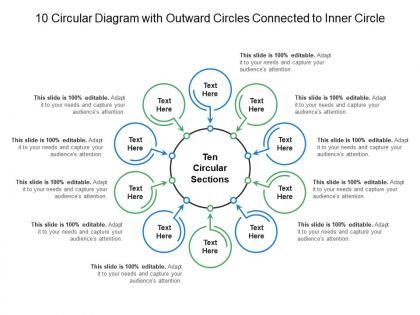
10 circular diagram with outward circles connected to inner circle




Try Before you Buy Download Free Sample Product
 Impress Your
 Audience
 100%
100% Editable
 Save Hours
 of Time


Get folks to indulge in a bit of humor with our 10 Circular Diagram With Outward Circles Connected To Inner Circle. It will create a jovial atmosphere.
People who downloaded this PowerPoint presentation also viewed the following :
10 circular diagram with outward circles connected to inner circle with all 5 slides:
Eliminate the chance of doubts forming with our 10 Circular Diagram With Outward Circles Connected To Inner Circle. Give a detailed account of each influential factor.
FAQs for 10 circular diagram with outward circles connected
So concentric circles are just circles that have the same center but different sizes - like a dartboard or when you drop something in water. The math part is pretty simple: if your first circle has center (h,k) and radius r₁, then the concentric ones share that same (h,k) center but use different radii like r₂, r₃, whatever. You'd write them as (x-h)² + (y-k)² = r₁² and (x-h)² + (y-k)² = r₂². Honestly, once you see a few problems with these, they're super easy to spot. Just look for that shared center point first - that's your dead giveaway.
Honestly, once you notice them you can't unsee concentric circles everywhere. Urban planners love this stuff - residential neighborhoods, then shops, then factories spreading out from downtown. Security works the same way too. Different clearance levels get you closer to the good stuff. Obviously there's target practice, but sound engineers map audio coverage like this. Oh, and water ripples do it naturally which is pretty neat. Next time you're sketching out zones or anything with intensity levels, just start with circles. Works every time.
Okay so concentric circles are everywhere in good design for a reason. Your eye gets pulled straight to the center - it's like they create this automatic focal point. Target's logo is the obvious example, but you'll see them in photography (water ripples look amazing), mandalas, all sorts of stuff. Artists use them to add depth and rhythm to flat compositions. There's something weirdly satisfying about looking at them too? Maybe it's the symmetry. They work great for symbolizing growth or cycles. If your design feels boring, throw in some concentric elements and see what happens.
So concentric circles are just circles that share the same center but have different sizes - like a dartboard or when you throw a rock in a pond. Since they're all centered at the same point, they nest inside each other perfectly. Pretty neat geometry honestly. You can use them to figure out areas between rings or work through problems with circular motion at different distances. The shared center point creates some cool properties when you're dealing with multiple circles at once. Grab a compass and draw a few - you'll get it right away once you see how they stack up.
Honestly, concentric circles are pretty versatile for data viz. Hierarchical stuff works great - center ring for main categories, outer rings for subcategories. Radar charts use them for showing different value levels too. Bulls-eye charts are solid for tracking progress against targets. I've been seeing them tons in marketing dashboards lately for demographic breakdowns - maybe a bit overused tbh. Just make sure your data actually has that nested structure first. Otherwise it looks like a hot mess. Definitely sketch it out before diving into whatever tool you're using. Trust me on that one.
Oh dude, they're literally everywhere once you notice! Tree rings are the classic one - each ring shows a year of growth spreading out from the middle. Drop a rock in water and watch those ripples expand in perfect circles. Cut an onion and boom, concentric layers. Spider webs do it too, though honestly I never really paid attention until someone pointed it out. Even your eye has that circular iris thing going on. It's actually pretty crazy how nature just defaults to this pattern. Walk outside and you'll start seeing them nonstop.
Oh man, concentric circles are literally everywhere once you start looking! UI designers use them for loading spinners and those satisfying ripple effects when you tap stuff. Data viz people love nested donut charts - honestly way cleaner than regular pie charts for showing layered info. Games need the math behind them for collision detection, and mobile apps use it for geofencing. You see them in network designs too. Radar charts are pretty slick for dashboards if you ask me. Basically anytime you've got hierarchical data or want to show relationships between different levels, circles within circles just work.
Think of concentric circles - your die-hard customers sit in the center, then casual buyers, prospects, and finally everyone else on the outer edge. This approach totally changed how I think about marketing spend. You'll pour more budget into that inner VIP circle and dial it back for the outer rings. Makes sense, right? Why blow money treating a random prospect like your best repeat customer. Map out where your customers actually fall, then check where your marketing dollars are going. I bet you'll find some weird mismatches that are just burning cash.
Oh man, the Colosseum is like the perfect example - those ringed seats gave everyone amazing views. Stonehenge does the same thing but way more mysterious, obviously. Most Roman amphitheaters copied that concentric design because it just works. Islamic architecture has some gorgeous examples too with the layered domes and circular courtyards. Honestly, studying how these guide people's movement through the space would be super helpful for your project. There's something about circles that naturally draws your eye inward, you know?
Okay so try drawing concentric circles - seriously, this changed how I think about projects. Put your core team and must-have deliverables in the middle circle. Then add rings for extended stakeholders, nice-to-haves, all that other stuff. Way better than those confusing org charts everyone makes! Same trick works for risks too - high-impact ones go center, minor stuff on the edges. I started sketching my current project like this last week and immediately saw where I was wasting time on outer-ring activities instead of focusing on what actually mattered. You'll probably catch some scope creep you didn't even notice.
Concentric circles are weird - they pull your eye straight to the center like some kind of visual magnet. The repetitive pattern creates this rhythmic thing that's either super relaxing or makes you feel dizzy (honestly depends on the person). That's why meditation apps love them, but they're also used in optical illusions to mess with your head. I find them pretty calming, though my sister says they give her a headache after like 30 seconds. If you're using them in design, definitely test it out first since people react so differently to the hypnotic effect.
Basically, put your most important thing dead center, then work outward with each ring being the next level down. So like if it's your team - boss goes in the middle, then their direct reports in the first circle, then everyone else after that. Honestly works way better than those boring org charts everyone hates. Each ring depends on the ones inside it, so people get the hierarchy instantly. I've done this for project stuff too, not just teams - super helpful when you're trying to explain who reports to who without drawing those awful box diagrams.
Honestly, you've got tons of options here. Canva's super easy if you just need something quick - no design skills required. PowerPoint actually works better than you'd think for this stuff, which surprised me. For more control, try Adobe Illustrator or Inkscape (that one's free). Lucidchart and Draw.io are built specifically for diagrams like this, so they're pretty solid choices too. I'd just start with whatever you already have installed. Most of these let you draw a circle, then duplicate and resize it without much hassle. Google Drawings works fine too if you're already in that ecosystem.
Oh man, concentric circles are literally everywhere once you start looking! Mandalas use them for that whole cosmic unity thing. Celtic spirals? Life cycles. Native American medicine wheels mark the four directions. It's like the universal symbol for "everything connects" or whatever. Buddhist prayer wheels have them, African adinkra symbols too. Even the peace sign if you think about it. I swear designers are obsessed with this pattern - probably because it's perfect for showing layers of meaning spreading out from one center point. Like ripples in a pond but make it spiritual, you know?
Try concept mapping first - put the main idea in the center, then students add details in outer circles. It's actually pretty flexible. Scaffolding works too since you're building outward from basic stuff to harder concepts. Some teachers do this cool thing where inner circles are what kids already know, outer rings are what they need help with. Inquiry-based learning is another option - central question in the middle, related themes expanding out. Honestly the creative possibilities are endless, but I'd just pick one subject to experiment with first. Don't overthink it!
-
Use of icon with content is very relateable, informative and appealing.
-
Top Quality presentations that are easily editable.