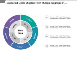
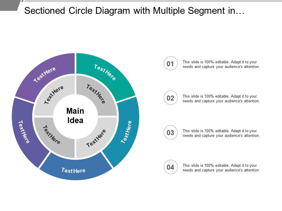
Sectioned circle diagram with multiple segment in different colors
Try Before you Buy Download Free Sample Product
Audience
Editable
of Time
Avoid delays due to haste with our Sectioned Circle Diagram With Multiple Segment In Different Colors. They allow you to have time on hand.
People who downloaded this PowerPoint presentation also viewed the following :
Sectioned circle diagram with multiple segment in different colors with all 5 slides:
Employ our Sectioned Circle Diagram With Multiple Segment In Different Colors in any forum. They adjust to diverse conditions.
FAQs for Sectioned circle diagram with multiple segment
Pie charts work best when you're showing parts of a whole - like breaking down your budget or showing market share percentages. People get the concept right away since it's just slices of a pie. But here's the thing - don't cram too many segments in there or it becomes a hot mess. I'd stick with maybe 5-7 categories tops. Always label everything clearly too. They're perfect for presentations when you need to show proportional stuff quickly. Just avoid them if your data isn't actually parts of a total - that's when things get weird and confusing.
Honestly, segmented circle diagrams are game-changers for making complex data actually readable. People can spot proportional relationships right away instead of getting lost in endless spreadsheets. They're like fancy pie charts - you can stack categories, show hierarchies, whatever you need. Your audience spends way less time figuring out what they're looking at. Perfect for market share stuff or anything where you're showing parts of a whole. Oh, and definitely color-code by priority or theme - makes a huge difference. I probably use these more than I should, but they just work so well for presentations.
Honestly, Excel or Google Sheets are probably your best bet - their pie chart tools work great and you can tweak them however you want. Canva's really nice if you want something prettier, though I always end up going down a rabbit hole with fonts and colors lol. Adobe Illustrator is perfect when you need total control over everything. Oh, and Lucidchart's awesome for team projects since everyone can edit together. I'd just start with Excel though - it's fast and gets the job done without any fuss.
Okay so color choices are huge for pie charts - seriously, they can make or break the whole thing. You need good contrast between sections or people won't be able to tell them apart. Don't go crazy with rainbow colors though (learned that the hard way lol). Pick colors that actually make sense with your data - like group related stuff together. Oh and definitely check if colorblind people can read it too. Maybe add some patterns or labels just in case. Honestly? Show it to a couple friends first before you present it.
So basically, segmented circle charts have gaps between each slice while regular pie charts don't. Those little spaces make it way easier to spot smaller sections that usually get buried. Plus you can pull certain segments out further if you want to highlight something specific - which honestly looks pretty cool in presentations. Regular pie charts are fine for showing basic proportions, but I'd go with segmented ones when you need people to actually focus on particular categories. The visual separation just works better for that stuff.
Oh nice question! So basically you've got two main approaches. Nested circles work great - your big category fills the whole circle, then you chop it into segments for subcategories, and keep subdividing from there. Kind of like those Russian nesting dolls but flat? The other way is concentric rings where each ring going outward is another level deeper. Make sure your segment sizes actually match your data proportions. Honestly though, don't go beyond 3-4 levels or you'll end up with something that looks like a pizza explosion. Start big picture and work inward.
For bigger slices, just slap the labels right on there. Smaller ones (anything under 5%) need leader lines or throw them in a legend - trust me on this. Nobody's gonna squint at tiny text crammed into a sliver. Keep everything horizontal so people don't have to tilt their heads like confused dogs. Put percentages next to the category names, use consistent fonts, and make sure your text actually shows up against the background colors. Honestly, the best test is showing it to someone else first. If they're like "wait, what does that say?" then you know your labeling's off.
Dude, make sure you label everything clearly and use colors that actually look different from each other. I always start with the biggest slice at 12 o'clock, then go clockwise by size - way cleaner that way. Don't go crazy with colors though, like some rainbow disaster. Your percentages better add up to 100% (I know, duh, but people mess this up constantly). Honestly? More than 7-8 slices and it just looks like chaos. Oh, and throw in a legend if there's any doubt what each piece means.
So there's actually a bunch of ways to switch up circle diagrams based on what you're working with. Standard pie slices work fine for categorical stuff - just use different colors. Time data? Try those concentric ring things that show progression. Hierarchical data looks sick with nested circles or sunburst layouts, honestly way cooler than regular charts. Multiple circles side by side work well when you're comparing groups. Half-circles are an option too. Really just sketch out what story you want first, then figure out which layout makes it super obvious. The visual should match how people already think about your data.
Okay so the big ones are making sure your percentages actually add up to 100% - sounds obvious but happens more than you'd think. Don't use tiny slices that nobody can read. Those default rainbow color schemes? Trash them, they're awful to look at. Keep your color palette simple and logical. Label placement is huge too - avoid cramped or overlapping text. Always start at 12 o'clock for that clean look. Oh and if you have really small segments, just group them into "other" instead of cluttering everything up. Makes it way more readable.
Oh, pie charts are great for that stuff! Market share breakdowns, customer demographics, budget splits - basically anything where you're showing parts of a whole. Just don't go crazy with too many slices or it'll look like a mess. I'd say stick to 6-7 max. Make sure you use colors that actually contrast so people can read it from across the room. Honestly, I still see presentations where everything's basically the same shade of blue and you can't tell what's what. Keep your labels clear and you're golden. They work best when your data adds up to 100%.
Honestly, those segmented circle charts are perfect for this stuff. They show your completion percentages super clearly - like "oh cool, we're 60% done" without having to dig through boring spreadsheets. Update yours weekly and use different colors for each section. Your stakeholders will love the quick visual overview. Plus they make it really obvious when you're behind schedule or if one phase is dragging on forever. I mean, they're basically just pie charts but way more useful for project tracking. Your team can instantly see where to focus next, which is clutch.
Dude, interactive circle diagrams are so much better than regular pie charts. People can actually click around and explore instead of zoning out while you talk. You can make segments appear one at a time, add hover details, or animate between different datasets. Honestly, I was skeptical at first but it really works. Your audience stays way more engaged because they're doing stuff, not just sitting there. Start broad then let them dig into specifics. Add some clickable spots to your next presentation - you'll see the difference immediately.
Segmented circles are way more versatile than you'd think! I love doing "identity wheels" where kids fill each section with different parts of themselves - hobbies, family background, future goals, whatever. Works great as an icebreaker. Story analysis is another good one - plot elements, character traits, that kind of thing. Math classes can use them for budgets or time management. Oh, and science teachers go crazy for these when teaching ecosystems or material composition. The trick is having students make their own instead of just looking at examples. That's honestly when they actually get it. Much better than worksheets if you ask me.
Pie charts work great when you're showing parts of a whole - think budget breakdowns or market share stuff. But bar graphs? Way better for comparing individual numbers or tracking changes over time. Line charts are where it's at for trends and continuous data. Look, pie charts get trashed a lot, but they're actually solid when you want people to instantly see proportional relationships. Just don't make the segments too small to read - that's annoying. Once you hit 6-7 categories, definitely switch to bars instead. Your viewers won't have to squint at tiny slices.
-
Excellent work done on template design and graphics.
-
Great quality slides in rapid time.