


12 month timeline stages for design an experiment infographic template




Try Before you Buy Download Free Sample Product
 Impress Your
 Audience
 100%
100% Editable
 Save Hours
 of Time


Our 12 Month Timeline Stages For Design An Experiment Infographic Template are topically designed to provide an attractive backdrop to any subject. Use them to look like a presentation pro.
People who downloaded this PowerPoint presentation also viewed the following :
Content of this Powerpoint Presentation
Do you know that medical research takes an average of 17 years from lab to clinic? Experiments and research can last for months or even years to determine the effect of one or more dependent variables.
This lengthy step-by-step procedure requires accurate tracking and planning, which is where a timeline template comes in handy. Timeline templates provide a visually appealing and helpful approach to display yearly plans and operations for easier comprehension.
Check out SlideTeam’s carefully crafted Top 10 12-Month Timeline Templates with Samples and Examples to use as a guide to success.
A 12-month timeline template to demonstrate the many stages of designing your experiment helps you track every aspect. This allows you to observe results at ease and convenience as well.
Create a timeline with eye-catching infographics for each phase of your medical or commercial experiment with this pre-made PowerPoint Template. This step-by-step guide will help you examine performance and outcomes at each stage of the experimentation process. Download today!
Explore our Deliverable Timeline Templates to help you divide the project into small tasks that need to be completed by a certain date.
Template 1: 12-Month Timeline Stages for Design an Experiment
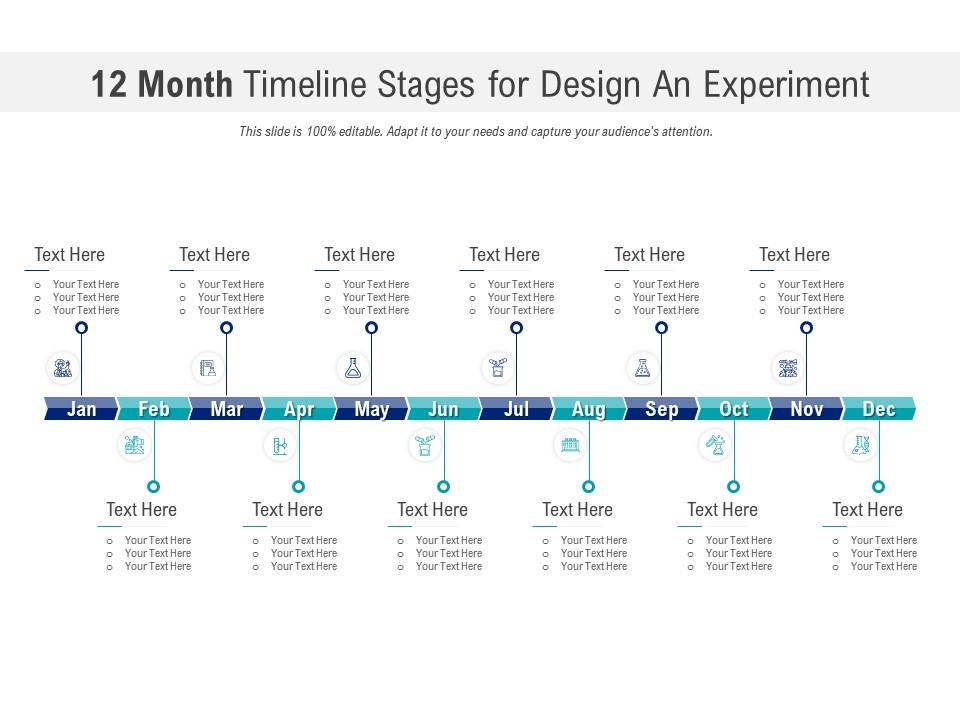
A well-designed experiment lends further credibility to the scientific validity of your findings. This PowerPoint Template has a 12-month timeline for developing a set of methods to systematically evaluate a hypothesis. This ready-to-download presentation offers a systematic approach for scientists, researchers, and others to identify and measure independent variables. Use this presentation to validate your experiment.
Remain on schedule.
This 12-month timeline form is a helpful resource for tracking your progress as you conduct your experiment. Use SlideTeam’s PPT Templates to connect tasks and demonstrate the relationship between them for an effective design process.
PS Define milestones or business plans that will be completed within a year with our ready-to-download Timeline Templates to increase productivity!
12 month timeline stages for design an experiment infographic template with all 2 slides:
Use our 12 Month Timeline Stages For Design An Experiment Infographic Template to effectively help you save your valuable time. They are readymade to fit into any presentation structure.
FAQs for 12 month timeline stages for design an
Honestly, I'd split this into five chunks: planning/hypothesis stuff, getting your resources together, pilot testing, actual execution, then analysis. Planning always takes way longer than you think - like, seriously budget extra time there. After that you're dealing with recruiting people, grabbing equipment, finding space. Don't skip the pilot test! It catches so much random stuff that would mess up your main study. Then you run the thing and crunch your data. Map it out with realistic timelines and tack on like 20% extra to each phase because something always goes sideways.
Honestly, it's all about what you're tracking and how long those metrics take to settle. Most experiments need at least 1-2 weeks because of weekly patterns - people behave differently on weekends, you know? But if you're looking at retention or lifetime value stuff, you're probably looking at 4-6 weeks minimum. I always run things longer than I think I need to. Way better to be sure than to launch something that crashes and burns later. Check your historical data first - see how much your numbers bounce around week to week, then size your test to catch changes that actually matter for the business.
Honestly, start with whatever you're already using - even Excel works great for Gantt charts. Asana and Trello are solid for mapping out phases if you want something fancier. REDCap's amazing for research stuff specifically, though it has a bit of a learning curve. Monday.com is pretty intuitive too. The real trick? Pick something your entire team will actually stick with. I've seen too many fancy setups die because half the team never logged in. LabArchives is another good one if you're doing lab work. But seriously, don't overthink it - a simple timeline that everyone uses beats a complex system that sits empty.
Honestly, get stakeholders involved way earlier than you think you need to. They'll completely change your timeline - trust me on this one. Budget constraints might force smaller sample sizes, or they'll want extra metrics that drag everything out. Sometimes they catch regulatory stuff you totally missed though, which saves your butt later. The annoying part is they almost always add complexity, so build in buffer time from the start. I'd say socialize your initial design at least 2-3 weeks before you need approval. Be ready to explain why you chose your methodology too - they'll definitely ask.
Honestly, I always pad my timelines by like 20-30% because stuff *will* go sideways. When it does, figure out what's actually crucial vs what would just be nice to have. Sometimes you can do things at the same time instead of one after another, or just simplify your approach without totally screwing up your results. The key thing though - and I learned this the hard way - is telling people about delays as soon as you know, not when you're already behind. Don't be that person scrambling last minute! Also write down what went wrong so you're not repeating the same mistakes.
Go after the critical path stuff first - anything that'll bottleneck everything else. IRB approvals, equipment orders, recruiting participants - that's where delays really screw you over. I learned this the hard way on my last project, honestly. Map out what has to happen in order versus what you can do at the same time. Makes a huge difference. Also, definitely pad your timeline around the risky tasks. Participants are unpredictable, so always have backup plans for those phases. Resource availability matters too, but don't let that override your critical dependencies.
Track your milestone completion rates and how actual vs planned duration looks for each phase - those are the big ones. Resource utilization percentages matter too. If you're working with human subjects, watch participant recruitment like a hawk because honestly, that's usually where everything falls apart first. Set up alerts when you drift 10-15% off schedule, then review weekly (daily if things get sketchy). I'd also measure how often you're actually hitting your checkpoints and track daily progress against weekly targets. Flag delays the second they pop up - don't wait around hoping they'll fix themselves.
Honestly, don't wait until problems hit to think about risk management - build it into your timeline from the start. During initial planning, list out what could go wrong: equipment breaking, samples getting contaminated, people dropping out. I got burned once when our main instrument died halfway through and we had zero backup plan. Set checkpoints at like 25%, 50%, 75% completion where you'll review risks and have contingencies ready. Way better to pivot early than scramble later when everything's already falling apart.
Dude, pilot testing is like a reality check for your timeline. You'll find out participants take way longer than you thought, or your procedures are messier than expected. I swear every pilot I've done reveals at least one timing disaster! Build in buffer time after to fix your main study schedule. Also, whatever adjustments the pilot shows you need? Add another 20% on top because there's always some random thing that goes wrong. Data collection is weirdly unpredictable like that.
Think of it as everyone's shared GPS for the project. No more "wait, I thought you were doing that" disasters, and people actually stick to deadlines when they're out in the open. Plus you can catch problems before they blow up - like if someone's piece is running behind, the whole team knows to pivot. Honestly, the hardest part is just keeping it updated when things inevitably change. Stick it wherever people actually look (not buried in some folder) and you're golden.
Honestly, most people totally underestimate prep time and forget to build in buffer periods. Things will go wrong - that's just research life. Don't schedule phases back-to-back without breathing room, because when that participant cancels last minute (and they will), you'll be scrambling. Data cleaning and analysis take forever too, not just the actual collection part. Everyone gets excited about the fun experimental stuff but forgets about all the boring setup work beforehand. Oh, and the teardown after - that's a pain but you can't skip it. Take whatever timeline you're thinking and add 25% padding to each milestone. Seriously.
Just shoot them a message right away - email for the formal stuff, Slack if it's more casual. I always explain what shifted, why it happened, and give the new dates. Seriously, don't just disappear when deadlines change - learned that the hard way! Any dependencies that'll get messed up? Call those out too. Big changes might need a quick meeting to talk through everything. Honestly, people get way less annoyed when you're upfront about delays versus letting them find out last minute.
Oh man, complex experiments are such a time suck! You're juggling multiple variables, setting up proper control groups, doing all those statistical calculations - it just snowballs. I totally underestimated my last multivariate test and it bit me hard. Getting everyone aligned upfront takes forever too. Data collection drags on since there's way more moving pieces to track. Analysis gets messy fast. Honestly, I always add like 30-50% extra time now for anything that's not a basic A/B test. Map out what depends on what first though - that actually saves you later.
Honestly, visual aids are a game-changer for keeping track of your experimental timeline. Gantt charts work really well - they'll show you task dependencies and overlapping phases super clearly. I'm weirdly obsessed with color-coding different experiment phases (like prep, data collection, analysis) because you can instantly see what's happening when. Flowcharts are solid too, especially for mapping out decision points. Actually, scratch that - just pick whatever format makes sense to your brain and roll with it. Trust me, when you're stressed later and everything's laid out visually instead of buried in some messy text document, you'll be so grateful.
So I always keep a "Timeline Changes" log right in my project doc - super simple but saves my butt later. Write down the date, why stuff shifted, and what it means for your results. Like "Phase 2 pushed back 3 days - equipment broke" instead of some vague nonsense. Oh and definitely loop in anyone who needs to know, especially if deadlines are gonna move. I've learned the hard way that people hate surprises way more than they hate delays. Just be upfront about what's happening and you'll be fine.
-
Much better than the original! Thanks for the quick turnaround.
-
Really like the color and design of the presentation.
-
Great quality slides in rapid time.
-
Great experience, I would definitely use your services further.
-
Illustrative design with editable content. Exceptional value for money. Highly pleased with the product.
-
Excellent template with unique design.