


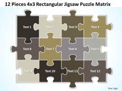
12 pieces 4x3 rectangular jigsaw puzzle matrix powerpoint templates 0812





Try Before you Buy Download Free Sample Product
 Impress Your
 Audience
 100%
100% Editable
 Save Hours
 of Time


Celebrate a new dawn wuth our 12 Pieces 4x3 Rectangular Jigsaw Puzzle Matrix Powerpoint templates ppt presentation slides 0812. Herald the onrush of fresh ideas.
People who downloaded this PowerPoint presentation also viewed the following :
12 pieces 4x3 rectangular jigsaw puzzle matrix powerpoint templates 0812 with all 7 slides:
Get your audience up-to-date. Apprise them with our 12 Pieces 4x3 Rectangular Jigsaw Puzzle Matrix Powerpoint templates ppt presentation slides 0812.
FAQs for 12 pieces 4x3 rectangular jigsaw puzzle matrix
Dude, puzzle templates are seriously underrated for presentations. Each piece can represent different parts of your process or team structure - way more engaging than those awful bullet point slides everyone uses. What's cool is you can reveal pieces one by one as you talk, which keeps people actually paying attention. The metaphor clicks instantly too, so you don't have to explain what you're doing. Perfect for showing how different strategy components fit together. I actually used one last month for a project breakdown and it worked way better than I expected.
Dude, jigsaw puzzle templates are actually genius for presentations. Instead of boring bullet points, you're literally making people guess what the full picture will be. Each piece reveals part of your story, so everyone stays glued to their seats trying to solve it with you. The best part? People can't help but jump in with predictions - creates these natural moments where everyone's talking and engaged. Just make sure each puzzle piece actually means something and builds toward your main point (otherwise it's just gimmicky). Perfect for quarterly results or product launches. Way better than standard slides, trust me.
Schools and corporate training programs get the most out of these templates - they're perfect for breaking down complex stuff. Healthcare uses them too, which makes sense since medical diagrams can be pretty overwhelming for patients. Tech companies love showing how systems connect, and consultants are always piecing together business processes with them. Honestly, they work best when people need to see how individual parts create something bigger. Just grab one template and swap out the pieces for whatever you're explaining. Way easier than starting from scratch.
If you've got Adobe Illustrator, definitely go with that - the vector tools make those curved interlocking pieces way easier to nail. Inkscape's free and does pretty much the same thing if you don't want to pay. There's dedicated Jigsaw Puzzle Maker software too, but honestly it feels kinda dated when I tried it. Photoshop works in a pinch, though you'll be fighting with it more than you need to. Oh, and Illustrator gives you way better control over the cut lines, which you'll appreciate later. I'd probably start with Inkscape just to see if you like the process before investing in anything pricier.
Oh this is actually pretty cool - jigsaw templates work because your brain loves pattern recognition and spatial stuff. Instead of just reading passively, people have to actively piece things together. It's like remembering directions you figured out yourself vs. blindly following GPS, you know? The visual connection helps too. People can see how each piece fits the whole picture, which makes everything stick better in memory. I'd try breaking complex topics into maybe 4-6 connected pieces next time. Honestly works way better than I expected when I first tried it. Your engagement will probably go up quite a bit.
You'll want high contrast and clear color separation - that's what actually makes pieces sortable. Subtle gradients? Total nightmare. Bold, distinct areas work way better. Scatter some recognizable landmarks or focal points around, plus throw in varied textures and patterns so people have visual cues to work with. Don't forget edge details since everyone starts there anyway. If you're adding text, keep it readable. Large areas of repetitive patterns will drive solvers crazy. Oh, and definitely test your design at actual puzzle size first - I learned that the hard way when something looked perfect on my monitor but was impossible to solve!
Yeah totally! Most puzzle software is pretty flexible - you can mess around with piece shapes, how hard you want it, colors, all that stuff. I've seen people make everything from simple dinosaur puzzles for little kids to crazy complex ones for adults who apparently have way more patience than me. You can throw in custom images, change up the borders, adjust piece counts. Really just depends what you're going for. The trick is finding a good base template first, then you can tweak it however you want to match your theme.
Dude, jigsaw templates are amazing for this stuff! Each piece becomes one part of your data or whatever you're explaining. Way more visual than boring bullet points - trust me on this one. I tried it last month and people actually paid attention for once. Different colors work great for separating themes or categories. The cool thing is how the interlocking pieces show dependencies between elements. Your audience can literally see how everything fits together to make the whole picture. Honestly beats traditional charts by miles.
Oh puzzle templates are amazing for this! Kids love vocab games where they match words to definitions. History timelines work great too - they have to put events in order. My favorite is probably the math ones where equations go on one piece and answers connect to it. Science teachers do cool stuff with anatomy puzzles. Story sequencing is huge for English class. Honestly the best part? Let them make their own puzzles as projects. They remember way more when they're building the actual learning tool. Start simple though - some templates can get crazy complicated and you'll spend forever just figuring them out.
Dude, puzzle templates are so much better than regular slides. People actually have to work with the content instead of zoning out. You get way better retention when they're piecing things together - it's like turning your presentation into a game without being weird about it. Takes longer to set up though, which honestly sucks when you're rushed. But if you've got an extra 30 minutes and want people to actually pay attention? Totally worth it for workshops. Your team will remember way more than they would from another boring slideshow.
Honestly, the worst thing you can do is pick some crazy complex template right off the bat. Start simple! Also definitely test your cut quality first - don't waste time on a full puzzle that's gonna look like garbage. Oh, and avoid those templates with super tiny pieces. I made that mistake once and ended up with like 1500 pieces that were basically identical brown blobs. Such a nightmare. Your image resolution needs to actually match your template size or everything gets pixelated. And here's something most people skip - print just a corner section first to see if the cut lines even show up properly on your printer.
Oh this is actually genius! Get your team working on puzzles together - either collaborating on big ones or doing timed competitions. Way better than those awkward trust exercises, honestly. People naturally start communicating and dividing up tasks when they're hunting for edge pieces or whatever. You could even use company photos or logos to make custom templates, which is pretty cool. Start with like 100-200 pieces so nobody gets frustrated. The real magic happens when you chat afterward about how their puzzle strategies connect to actual work stuff. Trust me, it works!
Oh man, colors and fonts make a HUGE difference! High contrast helps you spot pieces easier, but those subtle gradients? They'll drive you crazy in the best way. Bold typography gives you good starting points to work from. Decorative fonts just add more chaos (which some people love, others hate). You really want to think about how hard you're trying to make it. Test your color combos at puzzle size first - what looks good on screen might be totally different when it's tiny pieces. Balance is everything here.
Get people to actually test your puzzles - watching them struggle with pieces you thought were obvious is painful but super helpful. Survey them about difficulty and piece clarity afterward. Track which pieces consistently trip people up or look too similar. Those awkward shapes that don't feel right? Document all that stuff. Then use it to tweak your template algorithms - adjust the randomization or how complex pieces get. Honestly, I'd start small with testing before making big changes. You don't want to accidentally make things worse across the board.
Oh totally! McKinsey did this whole study on jigsaw templates for strategy meetings - engagement went up like 40% when they broke market analysis into actual puzzle pieces teams had to put together. IBM tried it too for product launches, made all the tech specs way less boring. I've used this trick myself and honestly, it's pretty genius for quarterly reviews that usually put everyone to sleep. Each puzzle piece should be one key part of your message. Maybe start small though - try 6 pieces for your next team thing and see how it goes?
-
It saves your time and decrease your efforts in half.
-
Topic best represented with attractive design.