

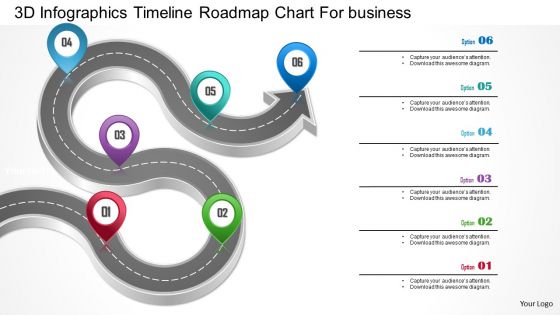
1214 3d infographics timeline roadmap chart for business powerpoint template




Try Before you Buy Download Free Sample Product
 Impress Your
 Audience
 100%
100% Editable
 Save Hours
 of Time


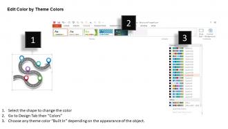
Financial roadmap or technological roadmap – this 3D infographics Timeline chart is just the PowerPoint template you need to get the message through to your target audience. Highlight the critical milestones, planned technological breakthroughs, potential sales figures, and expected roadblocks, organizational assets, financial liabilities and your comprehensive long term business strategy in one solid punch with this presentation design. The progressive goals to achieve the organizational objectives in line with the vision and mission of your company can be cohesively and decisively communicated to your human resources with our subtle yet expressive PowerPoint presentation template. Business roadmaps are a key to success of existing enterprises as well as start-ups in the innovation driven entrepreneurial space and can be clearly embedded in the ethos of your workforce by crisply pinpointing in our creative PPT slide. Impress your investors with a well laid down map of milestones decided after deep market research and analytics to win that crucial funding boost – just pick this presentation slide and make your mark.Make extraordinary discoveries with our 1214 3d Infographics Timeline Roadmap Chart For Business Powerpoint Template. They have a feel for the exotic.
People who downloaded this PowerPoint presentation also viewed the following :
1214 3d infographics timeline roadmap chart for business powerpoint template with all 5 slides:
Do you know why you need to use 1214 3d Infographics Timeline Roadmap Chart For Business Powerpoint Template created by pros for your presentations? Because they understand the effects of colours and they use them to suit the purpose.

FAQs for 1214 3d infographics timeline roadmap chart for
So you'll want timeline markers and milestone points obviously. Visual pathways connecting everything help a lot. Use colors - green for done, yellow for current stuff. The 3D part is perfect for showing different teams working at the same time. Add little icons for stakeholders and quick descriptions of what gets delivered when. Oh, and work backwards from your end goal - makes the whole thing way easier to plan out. Just watch your font sizes though, 3D makes small text look weird sometimes. Status indicators are clutch for keeping everyone on the same page.
So basically, 3D roadmaps let people follow your timeline like they're actually walking through it. Way better than those boring flat versions that make everyone zone out. You can put important stuff at higher points or intersections - literally makes them pop out visually. The whole depth thing feels more immersive too. Oh, and you can use the elevation to show which milestones matter most. It's like... instead of just reading dates, people get to take this visual journey through your project. Makes presentations so much more interesting, honestly.
Blender's probably your best bet if you don't mind learning something new - it's free and super powerful once you get the hang of it. Cinema 4D is way easier for beginners but you'll pay for that convenience. Adobe After Effects with Element 3D works too if you're already comfortable there. Honestly though, if you just need something quick and dirty, Canva and Visme have some decent 3D templates now. Not as fancy but gets the job done. YouTube has a million Blender tutorials specifically for roadmaps - that's where I'd start.
Start with your brand colors as the foundation, then throw in some contrasting shades for different phases. Honestly, bright colors look terrible on 3D roadmaps - all those shadows make them super garish. Keep it to maybe 3-5 colors total or it'll get messy fast. Here's a trick I learned: convert everything to grayscale first to check if the contrast actually works. Your text needs to be bold enough that people can read it from across the room. Oh, and don't feel bad about using a template to start - I do it all the time. You can always tweak it later to make it yours.
Honestly, the worst thing you can do is go overboard with the 3D stuff - nobody wants flashbacks to those awful 2005 presentations. Keep it subtle, yeah? Small text becomes a nightmare when you're dealing with 3D angles, so don't cram everything in there. Colors matter too - pick ones that actually work together instead of fighting each other. I know it's tempting to rotate things at crazy angles because it looks cool, but resist that urge. Your timeline still needs to make sense even with all the fancy perspective stuff. Oh, and definitely test it on someone first - last thing you want is people getting motion sick from your roadmap!
Honestly, 3D roadmap charts are a game changer for seeing how your project pieces fit together. Dependencies that were totally hidden in flat charts suddenly jump out at you. When you're presenting to stakeholders, they actually wake up – nobody zones out when you've got that Google Earth thing going on instead of boring 2D maps. You can stack different info layers without making it look like a hot mess. Phases, resources, milestones – all visible at once. I swear, people get way more into it during quarterly reviews. Give it a shot next time you're trying to explain why everything's behind schedule (again).
So 3D roadmaps are perfect when you've got sequential stuff with lots of moving parts - like project timelines or customer journeys where different teams intersect. The depth really helps show how everything connects (way cooler than flat timelines, tbh). You can stack extra info like budgets or resources using that third dimension. But honestly? Only use them if your data actually flows in stages. Otherwise people get confused and you're just making things harder than they need to be. Regular 2D works fine for simple timelines.
Start with basic click-to-reveal stuff - users tap milestones to see details, timelines, whatever. Hover effects work great too. Then add zoom so people can dig into specific roadmap sections, maybe some animated transitions between phases. The video game interface comparison is actually pretty spot-on. Pop-up windows and embedded videos are solid additions when someone clicks certain points. Oh, and rotating views let you show off different 3D angles, which looks pretty slick. Don't go crazy at first though - build up the complex interactions once you've got the basics working smoothly.
Dude, 3D visualization is a game changer for engagement. Studies show 40-60% better retention vs boring flat charts. When people see a 3D roadmap, they actually lean in because our brains are wired to process depth and movement way more actively. Complex project timelines suddenly make sense when you can see the whole journey flowing through space instead of everything crammed on one flat line. Plus people just think it looks way cooler - there's no getting around that. Just don't go crazy with the spinning stuff or you'll make everyone dizzy lol.
So basically, you want to match their world. Tech folks? Think circuit boards or digital stuff. Manufacturing works better with assembly line vibes - that kind of thing. Healthcare loves patient journey metaphors. Timing matters too. Startups are all about those quarterly sprints, but big companies plan in years. Honestly, the generic "Phase 1, Phase 2" stuff is pretty boring anyway. Just swap in language they actually use instead of corporate speak. Ask them what visuals click for their team first - saves you from guessing wrong.
Typography makes or breaks your 3D roadmap - seriously, it's what helps people actually navigate through all that info. Different font weights and sizes work great for separating main milestones from smaller tasks. Stick with sans-serif fonts since they don't get weird when text sits at angles or has depth. Serif fonts? They'll look muddy in 3D space, learned that the hard way. Oh, and test your readability at different zoom levels - what looks good zoomed out might be unreadable when someone's trying to see details. Set up 3-4 typography levels max and you're golden.
So basically you're stacking timeline layers like a multi-level highway - different lanes for different speeds, you know? Map your main timeline horizontally first. Then stack departments, priorities, or project types vertically using height and depth. Way easier to catch dependencies and overlapping deadlines than those boring flat Gantt charts. Honestly, stakeholders actually look at these because they don't make people's eyes glaze over instantly. The visual depth thing really works - you can see everything running simultaneously without your brain melting. Just layer your related workstreams above and below the main timeline.
Tesla's got this awesome 3D roadmap with car models flowing along a curved timeline - goes from the original Roadster all the way to Cybertruck. Microsoft does something cool too with their Azure roadmap, using these floating platform chunks that connect different features. Honestly, Apple's keynote roadmaps are always pretty solid with their 3D product displays. Google's Material Design chart is worth checking out as well - they nail the layered depth thing. I'd probably start with Tesla and Microsoft though, since they're really good at making it look slick without losing clarity. Oh, and don't sleep on how they organize the info hierarchy.
Honestly, stakeholder feedback will flip your entire 3D roadmap upside down. They'll point out which milestones actually matter and what needs bigger visual punch. I've learned this the hard way - what I think is the star of the show usually isn't what they care about at all. Get their input during wireframes, not after you've spent forever perfecting those fancy 3D details. Colors, sizing, positioning - all of that should match what the business actually prioritizes. Otherwise you're just making pretty pictures that miss the mark. Run a quick review session early on and save yourself the headache later.
Honestly, everything's going interactive now - hover effects, clickable milestones, animated progress stuff that actually does something useful. Mobile-first is huge since most people are just scrolling on their phones anyway. Color-wise, those harsh neon palettes are finally dying (thank god) and everyone's doing softer, more accessible combos. Oh and the designs themselves? Way cleaner and minimal. Figma and Blender make it pretty doable even if you're not some 3D wizard. Check out Dribbble for examples - there's some solid work on there lately.
-
Informative design.
-
Amazing product with appealing content and design.