

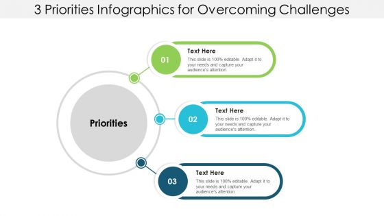
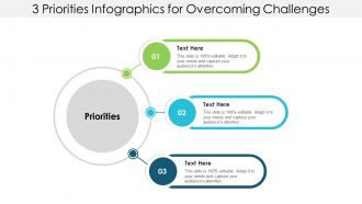
3 priorities infographics for overcoming challenges





Try Before you Buy Download Free Sample Product
 Impress Your
 Audience
 100%
100% Editable
 Save Hours
 of Time


Consider actions to control inflation with our 3 Priorities Infographics For Overcoming Challenges. Deliberate on how to halt further growth.
People who downloaded this PowerPoint presentation also viewed the following :
3 priorities infographics for overcoming challenges with all 5 slides:
Inflate your customer's egos with our 3 Priorities Infographics For Overcoming Challenges. Get them to feel genuinely important.


FAQs for 3 priorities infographics
Flowcharts work really well for showing problem-to-solution flow. Before/after comparisons are solid too. I'd definitely go with infographics since they break complex stuff into bite-sized pieces with icons and colors - way easier to follow. Bar charts are your friend for showing impact or scale. Mind maps? Those work if you've got interconnected issues to map out. Honestly, I always lean toward problem-solution matrices but they can get messy fast depending on who you're presenting to. Oh, and timelines are clutch for showing progression. Just don't go overboard - the whole point is making things clearer, not more confusing.
Dude, stories just hit different than straight facts, you know? People actually remember them because they can picture themselves in your shoes. Don't just tell them the success part though - that's boring honestly. The good stuff is all the messy failures and weird little victories in between. Like when I bombed that presentation but learned something crucial from it? That's what people want to hear. Your audience will connect way more with the real struggle than some polished highlight reel. Plus they'll actually walk away with something they can use in their own situations instead of just feeling inspired for five minutes.
Honestly, visuals are where it's at for showing impact. People's eyes just glaze over with spreadsheets - I know mine do. Before/after photos hit different though. Same with charts that actually show the decline or infographics mapping out how everything connects. Pick whatever tells your story best. Maybe that's a timeline showing how one small thing spiraled, or a comparison highlighting the gap between what should've happened vs. reality. The visual becomes your starting point, then you can dive deeper from there. Way more effective than drowning people in data they won't read anyway.
Find numbers that'll make people's jaws drop - stuff like "1 in 4 people deal with this" or "costs have literally tripled since 2010." Time-based stats hit different, you know? Percentages work well too. Just make sure your sources are solid because people will fact-check you. Here's what I learned though - the stat has to connect with whoever you're talking to. Don't just spam random numbers everywhere. Drop one killer stat right at the beginning to hook them, then sprinkle in backup data as you go. It's like building a case but without being boring about it.
Oh for challenge slides? Pick 3-5 real problems your audience deals with daily - not generic stuff. Like instead of saying "communication issues," go with something specific like "getting feedback from three different managers who all want different things." That hits way harder. Make people think "ugh yes, that's my life!" when they see each point. Honestly, I've seen too many slides that are just buzzword soup and nobody cares. Use bullet points or little icons to keep it clean. Each challenge should make them nod along because it's their actual pain, not some textbook example.
Analogies work great because they link weird new stuff to things people already know. Mountain climbing for tough projects - everyone gets that it's hard work with a nice payoff. Sports work for teamwork issues, cooking for processes. Honestly, the everyday ones hit better than trying to be super creative. Just match it to who you're talking to though - golf metaphors are useless if they've never held a club. You want that instant "oh yeah, totally" moment when they hear it.
So first, you gotta spell out the actual problem right away. People won't give a damn about your fixes if they don't get what's broken. Walk them through maybe 2-3 solid solutions - but back each one up with real examples or numbers. Honestly, wishy-washy advice is useless. For each solution, explain what it is, how they'd actually do it, and what they should expect to happen. Then give them concrete next steps they can tackle this week. None of that "reach out if you have questions" BS that everyone ignores.
Dude, multimedia is a total game-changer for obstacle stories. Like, hearing someone's actual voice crack when they talk about their struggle? Way more powerful than any bullet point. I swear people zone out during those typical "resilience" presentations, but show them a 30-second video of someone's breakthrough moment and suddenly everyone's paying attention. Even something simple like background music can hit different - it amplifies the whole emotional vibe. Before/after visuals work too. Honestly, anything that gets people feeling instead of just listening will make your story stick with them way longer.
Honestly, interactive polling works great - just ask what's bugging them right now. People love venting about their problems! I'd do breakout sessions too so they can swap horror stories and fixes. Share your own epic fails and comebacks because that storytelling stuff really hits different. Q&A is clutch since everyone's dealing with weird unique stuff. The trick is making it feel safe enough that people actually open up instead of staying quiet. Oh, try anonymous challenge cards first - gets people talking without the awkwardness. Then you can discuss as a group once things get rolling.
Just don't try to hide the fact that things are tough - people can smell BS from a mile away. Be upfront about what's going wrong, but then immediately jump into what you're doing to fix it. Even tiny wins count here. I think of it more like telling a comeback story than just complaining, if that makes sense? Spend way more time talking about your plan than the actual problem. Maybe like 80/20 split. Oh and always end with specific next steps so people walk away thinking "okay, they've got this handled" instead of just feeling sorry for you.
Honestly, the worst thing you can do is keep everything vague. People need real stories - like actual examples of problems and how someone figured them out. Don't just throw around motivational stuff without backing it up. Oh, and don't pretend challenges are simple to overcome because... they're really not! Focus on giving your audience solutions they can actually try, not just dwelling on the problems. Mix in different examples too - not everyone's situation looks the same as yours. I'd say wrap it up with something concrete they can do right away. Makes a huge difference when people have that next step ready to go.
Look at what actually worked in your past presentations - like, did people perk up when you got specific or zone out during those PowerPoint-heavy parts? Their questions are gold too since that shows where you lost them. I always notice patterns after doing a few talks... maybe I'm rushing through the technical stuff or not giving enough context. Honestly, audiences are pretty predictable once you pay attention. So next time, spend more time on whatever got them asking questions or nodding along. Skip the parts that made everyone check their phones.
Dude, for tricky problems you want stuff that breaks it down visually. Problem/solution matrices are solid, or those fishbone diagrams if you're feeling fancy. Before/after comparisons work great too. That "challenge-impact-solution-outcome" thing is pretty clutch because it literally walks people through your brain. But honestly? Most people go way overboard with this. A simple flowchart works fine if there's multiple paths. Pros/cons tables are underrated - seriously, they're perfect when you're weighing options. Just match whatever template to how messy the actual problem is. Don't create some crazy 12-step thing when three bullets would do the job. Start simple and tell your story clearly.
Cultural stuff totally changes how people see problems and fix them. What freaks out one group might be completely normal somewhere else - think individual success versus keeping everyone happy. Communication styles matter too. Some cultures want you to be super direct about issues, while others hate confrontation and need you to dance around things to save face. Success looks different everywhere! Like, does your audience care more about following the boss, getting everyone to agree, or sticking with tradition? I always dig into the cultural background first - honestly saves so much headache later when your approach actually lands right.
Honestly, the best way is just asking people straight up - send surveys right after your talk, then follow up in a couple weeks to see if anyone actually did anything with your advice. I'm obsessed with those real-time polls during presentations too, they're clutch for checking if people get it. Questions from the audience are huge. Also track your session ratings and see if folks want more resources afterward. But here's the thing that really matters: ask everyone to name ONE specific action they'll take. Can't answer clearly? Your message missed the mark.
No Reviews