


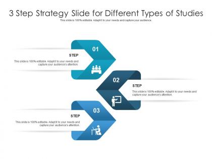
3 step strategy slide for different types of studies infographic template




Try Before you Buy Download Free Sample Product
 Impress Your
 Audience
 100%
100% Editable
 Save Hours
 of Time


Professionals belonging to any sector can use this set titled 3 Step Strategy Slide For Different Types Of Studies Infographic Template. From managers, executives to lower level employees, every individual can use this tool to present insightful details and implications in a well structured format. Various charts and graphs are added to this infographic design that makes it a resourceful set. Not only will this add to the informative qualities of this template, but it also makes it an instant attention grabber. Apart from this, it offers at a glance view of the topics, thus simplifying complex concepts. This helps in retaining the information presented for a long time. The biggest quality of this template is its visual elements, all added to elevate the aesthetic appeal of the presentation. Therefore download this template and present a customized version of it without any trouble.
People who downloaded this PowerPoint presentation also viewed the following :
3 step strategy slide for different types of studies infographic template with all 2 slides:
Use our 3 Step Strategy Slide For Different Types Of Studies Infographic Template to effectively help you save your valuable time. They are readymade to fit into any presentation structure.
FAQs for 3 step strategy slide for different types of
Key elements include clear step numbering, concise action-oriented headlines, visual icons or graphics, consistent color coding, and logical flow arrows connecting each phase. These components work together by enhancing comprehension, maintaining audience engagement, and ensuring strategic clarity, with many organizations finding that well-structured infographics significantly improve stakeholder understanding and implementation success rates.
Visuals enhance understanding in 3-step strategy presentations by simplifying complex information, creating memorable visual pathways, and reinforcing key messaging through icons, diagrams, and progressive layouts. These design elements streamline cognitive processing, reduce information overload, and improve audience retention, with many organizations finding that visual strategy presentations deliver significantly higher engagement rates and clearer stakeholder alignment than text-heavy alternatives.
Effective infographic design principles include visual hierarchy through size and color contrast, consistent typography and color schemes, balanced white space utilization, logical information flow, and data-to-ink ratio optimization. These principles streamline complex information by enhancing readability, reducing cognitive load, and improving audience engagement, with many organizations finding that well-designed infographics increase information retention and social sharing significantly.
Common mistakes include overcrowding slides with excessive text, using inconsistent visual elements, neglecting logical flow between steps, choosing poor color schemes, and failing to align content with audience needs. These design pitfalls significantly reduce comprehension and engagement, with many organizations finding that streamlined visuals, consistent branding, and clear step-by-step progression ultimately deliver stronger strategic communication and better stakeholder buy-in.
Color psychology significantly influences infographic effectiveness by enhancing comprehension, guiding attention, and reinforcing messaging through strategic hue selection, contrast optimization, and emotional associations. These design principles streamline information processing by improving readability, directing viewer focus to key data points, and creating memorable visual experiences, with many organizations finding that thoughtful color choices ultimately deliver stronger audience engagement and more persuasive communication outcomes.
**INPUT**: What type of data is most effective for illustrating a 3-step strategy? **OUTPUT**: Sequential data works most effectively for 3-step strategy infographics, including process metrics, timeline milestones, comparative before-and-after statistics, performance indicators, and transformation measurements. This approach enables organizations to showcase progression through each phase, with sectors like manufacturing, consulting, and project management finding that quantifiable outcomes, completion rates, and success metrics ultimately deliver compelling visual narratives that demonstrate strategic value. *[Word count: 60 words]*
Storytelling techniques can be integrated into a 3-step strategy infographic by creating a narrative arc with problem identification, solution development, and outcome achievement, using visual elements like character progression, challenge-to-resolution flows, and emotional touchpoints. This approach transforms abstract strategic concepts into compelling narratives, with many organizations finding that story-driven infographics enhance stakeholder engagement, improve message retention, and ultimately deliver more persuasive strategic communications.
Professional design tools include Adobe Illustrator, Canva, Piktochart, Venngage, and PowerPoint, each offering distinct advantages for template creation. These platforms streamline infographic development by providing extensive icon libraries, customizable layouts, and brand consistency features, with many organizations finding that combining multiple tools delivers optimal design flexibility and professional results.
Audiences are effectively engaged through infographic content by combining compelling visual design, clear data storytelling, and strategic distribution across relevant channels. These elements work together by simplifying complex information, creating memorable visual narratives, and targeting specific demographics, with many organizations finding that well-designed infographics generate significantly higher engagement rates and social shares than traditional text-based content.
Typography significantly enhances clarity in 3-step infographics through strategic font hierarchy, consistent sizing, and readable typefaces that guide viewers through each sequential element. Well-chosen typography creates visual flow between steps, distinguishes headers from body text, and ensures accessibility across different viewing contexts, with many organizations finding that clear typographic choices reduce cognitive load and improve information retention by up to 40%.
Infographics offer enhanced visual storytelling, improved audience engagement, simplified complex data presentation, and increased information retention compared to traditional slides. These design approaches streamline communication by combining compelling visuals with concise messaging, enabling presenters to deliver more impactful presentations that resonate with audiences, ultimately enhancing comprehension and driving better business outcomes.
Infographics can be optimized for social media by using platform-specific dimensions, bold visuals with high contrast, and concise messaging that captures attention quickly. Strategic placement of branding elements, mobile-friendly formatting, and compelling headlines enable content to perform effectively across LinkedIn, Instagram, and Twitter, with many organizations finding that optimized infographics generate significantly higher engagement rates and broader reach.
Industries with complex processes benefit most from 3-step strategy infographics, including healthcare for patient care protocols, financial services for investment planning, manufacturing for quality control procedures, and consulting for client engagement frameworks. These visual tools streamline communication by breaking down intricate workflows into digestible steps, enabling organizations to enhance training efficiency, improve stakeholder understanding, and accelerate decision-making across teams.
You can ensure brand alignment by incorporating consistent visual elements like your brand colors, fonts, typography styles, and logo placement throughout the infographic design. Additionally, maintain your brand's tone of voice in content presentation and messaging hierarchy, while ensuring the overall aesthetic matches your established brand guidelines. This strategic consistency helps reinforce brand recognition and professional credibility across all marketing materials.
Successful 3-step infographics include Nike's "Just Do It" campaign progression, Apple's product launch strategy, and Coca-Cola's brand engagement framework, along with financial services onboarding processes and healthcare patient journey maps. These templates excel by maintaining visual consistency, using clear progressive indicators, and focusing on actionable outcomes, with many organizations finding that simplified three-phase presentations significantly enhance audience comprehension and decision-making speed.
-
Excellent template with unique design.
-
Easily Understandable slides.
-
Commendable slides with attractive designs. Extremely pleased with the fact that they are easy to modify. Great work!
-
Designs have enough space to add content.
-
Innovative and attractive designs.