

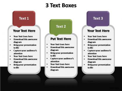
3 text boxes editable powerpoint templates




Try Before you Buy Download Free Sample Product
 Impress Your
 Audience
 100%
100% Editable
 Save Hours
 of Time


If you intend to get your audience interested in what you are trying to sell then leave the aspect of preparing presentations to the pros. Our 3 text boxes editable powerpoint templates are tailored to suit your needs.
People who downloaded this PowerPoint presentation also viewed the following :
3 text boxes editable powerpoint templates with all 2 slides:
Pass your ideas through our 3 text boxes editable powerpoint templates. They will amplify their brilliance.
FAQs for 3 text boxes
Oh man, they're such lifesavers! You get that professional look without having to design everything from zero. Colors, fonts, layouts - just swap in your stuff and you're done. Your presentations will actually look consistent too, which honestly makes you seem way more put-together than you probably are lol. Instead of spending forever tweaking design elements, you can focus on what you're actually trying to say. I'd grab maybe 3 or 4 different templates for different types of presentations. That way you're not scrambling last minute trying to make something decent-looking.
Dude, templates are seriously a lifesaver. You just drop your content into slides that already look decent instead of fiddling with fonts and colors for hours. I used to waste so much time on that stuff. Focus on your actual message instead - way better use of energy. Your presentations end up looking consistent too, which is nice I guess. Oh, and you'll fly through building decks once you get into the habit. Trust me, grab a template first next time and you'll see what I mean.
Honestly, just grab something with clean fonts and colors that won't fight your content. Test if you can actually edit the text boxes and resize stuff without everything breaking - I've downloaded "templates" that were basically useless once you touched them. Make sure it has different slide layouts (title, bullet points, charts, whatever) plus some icons you can steal for other presentations. Oh and check the file size isn't crazy huge. Pro tip: open it first and try changing all the colors at once through the design tab. If that works smoothly, you're golden.
Honestly, editable templates are game-changers for engagement. You can swap in your own images and match your brand colors instead of using those generic defaults that scream "I downloaded this 5 minutes ago." The real win is tweaking content flow based on your actual audience - way more effective than one-size-fits-all slides. Polished visuals just grab attention better, period. Plus you can make quick changes mid-presentation if something isn't landing right. My take? Find a template that's close to what you want, then don't hold back on customizing it completely.
Yeah, editable PowerPoint templates are actually perfect for this! You can throw in charts and images for visual people. Audio clips work great for listeners. Honestly, I was surprised how much you can customize them once I started messing around with different options. Interactive stuff like clickable buttons keeps the hands-on learners engaged. Text-heavy slides with lots of bullet points hit the reading/writing crowd. The trick is finding a template that won't fight you when you want to mix different elements together. Way more flexible than I originally thought.
Consulting, real estate, healthcare, and finance see the biggest payoff with specialized templates. They're always pitching or showing data to clients, so templates that speak their industry's language are huge time-savers. Tech startups dig them too - honestly, anything's better than those soul-crushing generic bullet slides. Oh, and marketing agencies plus nonprofits kill it with these since they're constantly tailoring presentations for different crowds. My advice? Figure out your 2-3 most common presentation types first. Then grab solid templates that'll cover like 80% of what you actually need.
Honestly, just make master templates with your brand stuff - colors, fonts, logo spots - all locked down. Share them with everyone so your whole team's working from the same base. Sales, marketing, whoever... they'll all stay on-brand instead of showing up with random Comic Sans disasters. Different template types work best - pitch decks, training stuff, reports. People actually use them then instead of reinventing the wheel every time. I learned this the hard way after sitting through way too many off-brand presentations that made us look totally unprofessional.
Look, color schemes and fonts are literally what make or break your template's consistency. Pick good ones upfront and anyone can jump in later without turning your slides into some chaotic mess. Trust me on this - I've sat through presentations that looked like someone let a toddler loose with every color imaginable. Super distracting. You want colors that actually play nice together, plus fonts people can read whether it's on a laptop or projected huge. Once you nail these basics, honestly the template kind of takes care of itself when people start using it.
Honestly, user-friendly interfaces are everything when it comes to PowerPoint templates. You don't want to spend forever trying to figure out where the master slides are hidden (been there, done that). Clear navigation and intuitive placeholders mean you can actually focus on your content instead of getting frustrated with the design. I've watched people completely abandon really good templates just because they couldn't swap out colors or fonts easily. The whole point is making your presentation look polished without the headache. Short version: if it's hard to edit, you won't use it properly.
Go through each slide one by one so you don't accidentally skip stuff. I'd keep the fonts and colors they picked - template designers usually know what they're doing with that visual stuff. Oh, and duplicate any slides you might need copies of before you start messing with them (learned that the hard way). Don't forget those headers and footers that still say the template name or whatever. Honestly though, just nail the title slide and contact info first - that's what people see right away and it'll make the whole thing feel like yours.
Honestly, visuals are a game-changer for templates. People zone out with walls of text, but throw in some good charts or icons? Suddenly they're paying attention. Your brain just processes images way faster than boring bullet points - I swear nobody reads those anyway. Pick templates that aren't just decorated with random graphics though. You want stuff that actually makes your data make sense. Oh, and customize everything to match your brand colors or whatever. Start with one solid template that has good visual flow, then swap in your specific info. Makes such a difference for keeping people engaged instead of scrolling past your stuff.
Dude, don't mess with the template's fonts and colors - you'll totally wreck the whole look. I see people do this all the time and it's painful. Replace that generic placeholder text too, nobody wants to see "Your Title Here" during your presentation lol. White space is your friend, so don't stuff every slide with paragraphs of text. Your images need to be crisp and the right size or they'll look terrible. If you're making changes across multiple slides, update the master slides first - saves you tons of time. Run through it once before presenting because weird formatting issues love to pop up out of nowhere.
Okay so here's the thing - templates are a lifesaver because everyone starts with the same fonts and layout. No more dealing with someone's weird design choices lol. You can split up slides between team members and everything still looks consistent when you put it together. Last-minute changes are way easier too since whoever's editing doesn't have to decode your formatting. Honestly, just pick something clean at the beginning and send it to everyone before you start working. Saves so much arguing later about fonts and colors and all that stuff.
Honestly, templates are a game-changer for presentations. They come with layouts and colors that actually look good together - way better than what I'd come up with on my own (I'm terrible at picking fonts). Your slides end up looking consistent instead of like you threw random formatting at the wall. Save yourself hours of fiddling with design stuff. Find one that fits your vibe and just reuse it. I probably have like three go-to templates I cycle through depending on the situation.
Interactive stuff in PowerPoint templates keeps people awake during your presentation - trust me on this one. Instead of zoning out (which happens way too often), your audience actually has to click buttons, navigate menus, or hover over sections. It's pretty genius because their brains can't wander off to think about dinner plans. Start simple though. Add some basic navigation buttons or sections that reveal info when you hover. The clicking and choosing forces them to pay attention. Way better than watching everyone's eyes glaze over while you talk.
-
Enough space for editing and adding your own content.
-
Presentation Design is very nice, good work with the content as well.