


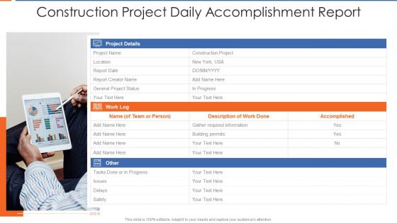
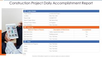
Construction project daily accomplishment report




Try Before you Buy Download Free Sample Product
 Impress Your
 Audience
 100%
100% Editable
 Save Hours
 of Time


Our Construction Project Daily Accomplishment Report are topically designed to provide an attractive backdrop to any subject. Use them to look like a presentation pro.
People who downloaded this PowerPoint presentation also viewed the following :
Construction project daily accomplishment report with all 2 slides:
Use our Construction Project Daily Accomplishment Report to effectively help you save your valuable time. They are readymade to fit into any presentation structure.
FAQs for Construction project
So for daily reports, I usually do three main things: yesterday's wins (seriously, don't skip this part - even small stuff counts), today's priorities, and any roadblocks. Numbers are great if they matter for your job. The trick is keeping it super short - like 2-3 bullets per section tops. Nobody's got time to read novels, you know? Whole thing should take maybe 5 minutes or people just won't bother doing it. Oh, and starting with wins honestly makes the rest feel less like a chore.
Honestly, visuals are a game-changer for daily reports. Nobody wants to wade through walls of text anymore. I'd start with simple stuff - progress bars, red/green status dots, maybe some basic charts. People can literally glance at it and know what's happening. Even bullet points with little icons help way more than you'd think. The whole point is making key info jump out immediately. Oh, and don't go overboard at first - just pick one or two things to try. You can always add more once you see what works.
Oh man, don't dump every tiny detail in there - nobody wants to read a novel about your Tuesday! Focus on the big wins, what's blocking you, and next steps. Skip the busy work nonsense. But also don't be super vague like "worked on the thing" - actually say what you accomplished. I used to write mine while literally walking to my car and would forget half the important stuff lol. Just block out 10 minutes each day to jot down highlights as they happen. Way easier than scrambling later.
So it really depends on what your industry cares about most. Healthcare places track patient numbers and any major incidents that happened. Retail? They're all about sales and inventory - makes sense. Manufacturing companies focus on how much they produced and if any equipment crapped out (which honestly happens way too often). Financial services watch transaction volumes and compliance stuff super closely. Tech companies usually want to see deployment updates and how their systems are performing. The trick is figuring out what actually matters for making decisions in your specific field, then just build your daily reports around those numbers.
KPIs are basically what keep your daily reports from being a hot mess. Pick 3-5 metrics that actually connect to your goals - sales figures, customer scores, whatever matters most. Without them you're just rambling about random stuff that happened. Here's what works: start each section with your metric, then explain what caused any changes. I always forget this part, but add what you need to tackle tomorrow. The whole point is telling a story about your day's impact, not just listing numbers. Makes way more sense when you structure it that way.
Dude, get some reporting software that pulls straight from your systems. No more copy-pasting cells for hours (ugh, the worst). Connect your CRM and project tools so everything flows into one dashboard automatically. Templates are a lifesaver too - saves you from that blank page nightmare every morning. AI summaries can help, though I'd double-check those since they're still pretty hit-or-miss. Honestly, just look at what data you're manually grabbing each day and find tools to do it for you. You'll actually have time to think about what the numbers mean instead of just collecting them forever.
Honestly, less is more with these reports. Pick the metrics your team actually uses to make decisions - nobody needs every single data point cluttering things up. Put the main takeaways right at the top since half your stakeholders will probably only skim the first paragraph anyway. Simple charts beat dense tables every time (trust me, no one's decoding spreadsheets before their second coffee). Add quick context for the numbers and call out anything weird. Consistent formatting helps people find stuff fast. Oh, and always explain what the data actually means - raw numbers without context are pretty useless.
Okay so instead of just saying "finished task X," make it a mini story. Like "We got stuck on that client integration this morning, but then Sarah figured out this workaround that was actually better than our first idea." Way more interesting, right? People remember stories, not bullet points. I always try to include the human stuff - what went wrong, how someone solved it, what we learned. Honestly makes meetings less painful too. Your updates suddenly have actual moments people can picture instead of just boring status checks.
Honestly, just go with Yesterday/Today/Blockers or Goals/Progress/Next Steps - both work great. Make it super quick, like 5 minutes max because everyone's already drowning in meetings anyway. I'd add a mood check too (green/yellow/red vibes) since you can't just walk over and see how people are doing anymore. Bullet points are your friend here. Oh, and definitely include a "help needed" section - people are way too polite otherwise and won't ask for support. Once you pick a format though, don't keep switching it up. Consistency's everything with remote teams.
Honestly, having the same format every time is a game changer. You just fill in the blanks instead of staring at a blank page wondering what to write. Plus your boss will know exactly where to look for the important stuff - no more hunting around for key details. Takes all the mental energy out of it too, which is clutch when you're trying to wrap up your day. Oh and it makes spotting trends way easier later on. I'd just pick 3-4 sections that work and stick with them. Trust me, the consistency pays off big time.
Honestly just throw a "lessons learned" section into your daily reports. I bullet-point 2-3 things that went sideways or could work better - makes the whole mess feel more manageable, you know? Get your team to comment directly on shared reports too. Quick 5-minute feedback chats during handoffs work great. The trick is making it automatic instead of waiting for those formal review meetings (which never happen anyway lol). Start small though - even tracking one improvement thing per day actually adds up pretty fast.
Oh man, be super careful with accuracy first - only put stuff you can actually prove happened. I've seen people get burned by this. Don't throw in personal details about coworkers or clients unless you're totally allowed to. Anything under NDAs? Obviously keep that out. Also check who's getting these reports since they usually have internal stuff that shouldn't go everywhere. Honestly the confidentiality thing trips up more people than you'd think. Just stick to the facts you know are solid and double-check that recipient list before sending!
Honestly, daily reports usually work pretty well for most teams. You stay on the same page and people actually follow through on stuff. But don't go overboard - I've seen teams burn out writing updates constantly instead of doing actual work lol. Short bullet points are way better than long paragraphs nobody reads anyway. Daily check-ins help you spot problems before they blow up and keep projects moving. That said, every team's different. Maybe start with whatever feels doable and see if it's actually helping or just creating busywork. You can always tweak the frequency later.
Honestly, just pick a font and stick with it - same with colors and layout. People get annoyed when they can't find stuff. I used to cram everything together but white space actually makes things readable (who knew?). Bold your headers so sections pop. Two colors max, maybe three if you're feeling fancy. Bullet points > wall of text every single time. Oh and charts are way easier to digest than those endless tables. Put your main points right at the top because let's be real, that's all most people will read anyway.
Honestly, I used to think daily reports were total busywork until I started seeing the patterns they create over time. You want to track progress against milestones, resource allocation, and any blockers consistently. Export that data monthly and look for trends - like, are the same issues popping up repeatedly? Is your team more productive during certain seasons? I swear scope changes always seem to happen at the weirdest times, but there's usually a pattern. Once you start viewing each report as a data point in your project's bigger story, you can actually forecast better and spot systemic problems before they bite you.
-
Awesome use of colors and designs in product templates.
-
Great product with effective design. Helped a lot in our corporate presentations. Easy to edit and stunning visuals.