

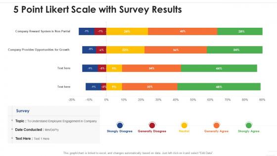
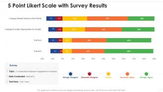
5 point likert scale with survey results




Try Before you Buy Download Free Sample Product
 Impress Your
 Audience
 100%
100% Editable
 Save Hours
 of Time


Our 5 Point Likert Scale With Survey Results are topically designed to provide an attractive backdrop to any subject. Use them to look like a presentation pro.
People who downloaded this PowerPoint presentation also viewed the following :
5 point likert scale with survey results with all 2 slides:
Use our 5 Point Likert Scale With Survey Results to effectively help you save your valuable time. They are readymade to fit into any presentation structure.

FAQs for 5 point likert scale
Honestly, 5-point scales are kinda perfect for most stuff. People don't get overwhelmed like they do with those crazy 7 or 9-point ones - nobody wants to sit there debating between "slightly agree" and "somewhat agree," you know? Plus you get way better response rates. 3-point feels too limiting, but anything longer and people just pick the middle option anyway. The data's cleaner too, which makes my life easier when I'm trying to explain results to my boss. I always start there unless there's a specific reason not to. You can mess around with other formats once you see how it goes, but 5-point rarely lets you down.
Honestly, the biggest thing is keeping questions super straightforward - no jargon or those annoying double questions that ask two things at once. Don't lead people toward answers either. Like say "How satisfied are you..." instead of "How happy are you..." Also, negative phrasing is the worst - it just confuses everyone and messes up your data. I always test a few questions on coworkers first because what makes sense to you might be total gibberish to others. You want people answering without having to think too hard about what you're even asking, you know?
Honestly, start with the basics - just look at how many people picked each number. Means are kinda weird with Likert scales since they're not really continuous data, but calculate them anyway. I'd probably group things into "agree" (4-5), "neutral" (3), and "disagree" (1-2) - makes way more sense that way. Check if certain groups answered differently too. Bar charts are your friend here, trust me. Way easier to spot patterns than scrolling through endless spreadsheet cells. Also look at medians alongside your means. Really depends on what you're trying to prove with the data though.
Oh man, this stuff gets weird with different cultures. Americans will happily slam that 5 or 1 button, but Asian respondents? They're way more modest - rarely hit the extremes. Then you've got some cultures that just camp out in the middle because they don't want to rock the boat. Honestly drove me crazy on my last project until I figured out what was happening. You really need to think about where your respondents are from when you're looking at the data. Maybe throw in some questions about cultural background so you can actually make sense of those random patterns that pop up.
Hey! So the main thing that trips people up is assuming Likert scales work like real numbers - but "strongly agree" to "agree" might not be the same jump as "neutral" to "agree," you know? People also get weird with their responses, like avoiding extremes or just picking neutral when they're confused. Honestly, I'd skip straight to medians and show the actual distribution first. Means can be totally misleading if your data's all wonky. Oh and definitely visualize everything before you get fancy with stats - saved me so many headaches!
Honestly, I'd start with the basics - just run some means and frequencies in SPSS or R first. Excel works too if that's what you've got. Most people treat 5-point Likert scales like interval data, so t-tests and ANOVA are totally fine (though some stats purists get cranky about this). Definitely peek at your data with histograms before you do anything fancy - you'll catch weird outliers that way. If your data looks sketchy or non-normal, Mann-Whitney U tests are your friend. I always do simple cross-tabs before jumping into regression stuff. Way easier to spot patterns that way.
So basically, that neutral middle option becomes like a safety net - people just pick it when they can't be bothered or don't want to commit to anything. Your data gets all clustered around "meh" which is kind of useless. Some researchers ditch the midpoint entirely to force people to actually choose a side, but honestly that feels kinda manipulative? There's definitely a trade-off here. Keep it if genuine neutrality makes sense for what you're measuring. Otherwise you might get more meaningful responses by making people pick left or right, even if it creates some artificial polarization.
Keep it short and throw in a progress bar - people hate feeling trapped in endless surveys. Don't make them answer "strongly agree" to like 15 similar questions, it's mind-numbing. Ask about stuff they actually care about, not what sounds academic or whatever. I'd put your best questions first while they're still paying attention, then dump the age/income boring stuff at the end. Maybe add one "anything else?" box for people who want to vent. Oh, and mix up how you word things so it doesn't feel robotic.
So there's a bunch of ways to handle 5-point Likert data. Most people just treat it as interval (1-5) for regression or factor analysis - works pretty well honestly. You could also collapse categories, like grouping "agree" and "strongly agree" together. Makes things way easier to interpret sometimes. Z-scores are another option if you're comparing different scales. Oh, and there's fancier stuff like ordinal regression too, but that might be overkill depending on what you're doing. Really depends on your research question though - figure that out first and it'll tell you which approach makes the most sense.
Honestly, focus groups or follow-up interviews work great for this. The numbers from Likert scales only tell you so much - you need the "why" behind people's ratings. I've seen survey data that looked one way until someone explained their thinking in an interview, and it totally changed everything. Quick comment boxes at the end of surveys help too, though they're hit or miss since not everyone fills them out. One-on-one interviews are probably your best bet if you've got the time. People will say stuff that makes those 1-5 ratings actually make sense.
Oh man, response patterns will totally screw up your survey results. People love hitting those middle options instead of actually picking a side - there goes all your useful data. Then you've got folks who just agree with everything because they're rushing through (I mean, I get it, surveys are boring). But that makes your results way too positive. Short sentences work better than long rambling ones. Watch for these weird patterns when you're looking at responses later, and maybe reword questions that seem to trigger the lazy answers.
Okay so basically you need informed consent, anonymity, and neutral questions. Don't overwhelm people with legal jargon - just explain what you're doing and how you'll use their info in plain English. Keep responses anonymous unless you actually need names for some reason. Your questions shouldn't push people toward certain answers, which is harder than it sounds tbh. Oh and mention who's funding it if that matters. I learned the hard way to double-check my questions for bias before sending anything out. Honestly saved me from some really awkward conversations later.
Stacked bar charts are your best bet here - they show all five response categories really well. Go horizontal instead of vertical so you can fit the full question text without it looking weird. Pie charts might seem obvious but honestly they're awful for this kind of data. If you're using R, likert plots are pretty cool - they put neutral responses in the middle and show agree/disagree on each side. Got multiple questions? Try a heatmap to catch patterns. Color-wise, stick with something that makes sense - green to red works, or just use gray for the neutral stuff.
So here's the thing - demographics totally change how people answer Likert questions. You might see that senior folks are way happier than new hires, or women rate something completely different than men do. Breaking it down by age, role, experience level, whatever makes sense for your data. The overall average can be super misleading if you don't dig deeper. Like, I've seen cases where the aggregate looked fine but when you split by department, one team was basically miserable. Always cross-tab with your key demographics first, then check if the differences are actually significant before you start making any big conclusions from it.
Look at anything scoring under 3.5 - that's where you need to jump in first. Above 4.0 means you're doing something right there. Here's the thing though: break it down by teams or departments instead of just looking at company-wide averages. That's where you'll actually see what's happening. I swear, most places just calculate one big number and wonder why nothing changes. Focus on the patterns, not individual scores. Once you spot the problem areas, assign someone to own fixing each issue with real deadlines. Your follow-up survey will tell you if any of this actually worked.
-
Content of slide is easy to understand and edit.
-
Use of different colors is good. It's simple and attractive.