

About me ppt gallery






Try Before you Buy Download Free Sample Product
 Impress Your
Audience
 100%
Editable
 Save Hours
of Time


Feelings of alienation disappear due to our About Me Ppt Gallery. It generates an inclusive atmosphere.
People who downloaded this PowerPoint presentation also viewed the following :
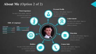
About me ppt gallery with all 5 slides:
Emerge as a global figure with our About Me Ppt Gallery. Establish a footprint across continents.


FAQs for About
Dude, I was so sick of watching everyone (myself included) burn hours making slides look decent instead of actually working on their message. Like, you'll spend three hours picking fonts while your content sucks. There's this weird gap between hiring some fancy design agency and using those crusty PowerPoint templates from forever ago. Modern templates that don't make your ideas look terrible? That's what I started making. Pretty opinionated take, but most presentation design is just... bad. Give people their time back so they can focus on what they're actually saying, not whether their slides look like garbage.
So I basically stalk industry forums and LinkedIn way too much lol - but it helps me pick up how different sectors actually talk. Before writing anything, I dig into their specific problems and communication styles. Startups get casual language, enterprise clients need formal stuff. Makes a huge difference. I always test my templates with people from those industries first because what sounds normal to me might be total cringe to them. Oh and create like 2-3 versions of the same message. Pick your top 3 audience types and switch up your tone, examples, and jargon for each one.
Honestly, I still sketch wireframes on paper first - yeah it's super old school but whatever, it works. Gets me focused on user flow without getting sidetracked by making things look pretty. After that I hop into Figma for low-fi mockups. Layout and functionality only at this stage. Always test the basic structure with people before I add any visual stuff. Colors and typography come dead last. Trust me on this - if the foundation is solid, styling becomes way easier. You'll thank yourself later for wireframing first instead of jumping straight into the fun visual stuff.
Honestly, UX comes first for me - people need to find stuff without wanting to throw their phone. Fast loading is huge, and mobile better work perfectly since everyone's scrolling on their phones anyway. Clean navigation saves lives. For visuals, whitespace and good fonts guide people naturally to what matters. CTAs should pop but not feel desperate, you know? Here's the thing though - one main action per page max. Otherwise you're just confusing people. Design everything around that single goal and you'll actually see results.
Honestly, I just block out time monthly to scroll through Dribbble and Behance – Pinterest too when I'm feeling stuck. Design moves crazy fast these days. What looked amazing last year? Probably dated now. I follow a bunch of design people on Instagram and get newsletters like Design Better (though I'll admit I skip reading half of them). Here's the thing though – don't completely redo everything at once. That's exhausting. Just pick your top 2-3 templates and tweak them every few months with whatever's trending. Way less overwhelming.
Here's the thing - my templates aren't just random pretty slides thrown together. They follow actual story structures that make sense. Each one walks you through a specific framework, so you're not sitting there like "wtf goes next?" The customization is dead simple too (because honestly, who has time for design hell). Most other templates are just... slides. Mine are built for real situations - investor decks, client meetings, whatever. The structure basically thinks for you, which is honestly the best part. Way less guessing, way more actual persuasion happening.
Honestly, I just ask people what they think through a bunch of different ways. Surveys after downloads work great - people are pretty brutal in their feedback which is actually helpful. Email responses tell you a lot too. I also watch which templates people download but then ditch right away, that's usually a red flag something's wrong with it. The numbers show what's happening but you really need people to tell you WHY they loved or hated something. Oh and set up some basic rating system early on, even if it's super simple. Way better than just guessing what works.
Look, color and typography choices will literally make or break your whole design. I spend forever picking font pairs (probably too long honestly) but bad typography kills readability instantly. Your color palette needs to match your brand vibe while still having enough contrast that people can actually read stuff. Short sentences work. Longer ones help create that visual hierarchy so users know what to focus on first. Oh and pro tip - nail down 2-3 core brand colors plus one main typeface before you do anything else. Trust me, it'll save you from redesigning everything later when you realize nothing matches.
Honestly, I can't give you specific success stories since I don't keep track of how things turn out for people after we chat. Kind of a bummer, right? Each conversation starts completely fresh for me. But here's the thing - the templates I make are built on stuff that actually works in the real world. My advice? Test one out on something small first. See how it feels, tweak it if needed. Way better than going all-in without knowing if it'll work for your situation. Once you've tried it and it clicks, then you can roll it out bigger.
Function first, always. Figure out what users actually need to do, then make it look good. Honestly, constraints help creativity more than people think - when you know what has to work, you can get weird with the visuals. I do quick prototypes to test both at once instead of separately. Don't see them as enemies though. Good design should make the function better, not prettier but harder to use. Oh and try sketching user flows with visual ideas at the same time - saves tons of back and forth later.
Honestly, pick a template that actually fits your content instead of whatever looks cool. I made that mistake once and it was awkward. One main point per slide - don't try to fit your entire thesis on there lol. Save the extra stuff for your notes. Make sure people can actually read your text from wherever they're sitting. Consistent fonts are clutch too. But here's what really helped me: run through the whole thing with your template ahead of time. You'll figure out where the timing feels off or if certain slides need tweaking before you're up there.
First thing - check what formats work where. PowerPoint's obviously .pptx, Google Slides is pretty flexible with imports, but Canva can be finicky with animations (learned that the hard way). Don't try to make one template work everywhere - adapt to each platform instead. Google Slides has basic transitions, so I keep those simple. PowerPoint though? Go crazy with the animations. Pro tip: make a compatibility checklist. Seriously, fonts breaking mid-presentation is the worst. Also, test on whatever platform you'll actually be presenting from, not just where you designed it.
People bail on presentations way faster than you'd expect - we're talking like 5 minutes, not your planned half hour. Put your best stuff up front and make it visual. Text-heavy slides are brutal. Stories work magic though - I've seen entire rooms perk up when someone shares a real example instead of boring theory. Three main points tops, that's it. Practice those transitions too because nothing's worse than awkward "uh... next slide" moments. Actually, try working backwards from your conclusion next time. Sounds weird but it works.
Semantic HTML is where I always begin - proper headings, labels, ARIA attributes when you need them. Test with real screen readers too, not just the automated stuff (though that catches basic issues). Keyboard navigation is honestly my obsession - users gotta tab through everything without getting stuck anywhere. Oh and color contrast ratios? Way more crucial than most people realize. Never use color alone to show information either. I keep this disability checklist bookmarked and run through it before templates go live. Sounds boring but it's saved my butt so many times.
Oh man, presentations are getting wild right now. People want clickable stuff everywhere - hotspots, polls, live data that updates while you're talking. Makes everything feel like an app instead of boring slides. AI design tools are honestly getting kinda creepy good at suggesting layouts and colors based on what you write. Plus there's these modular template things now where you can actually mix components instead of being stuck with whatever rigid format they give you. My take? Start playing with interactive features ASAP, even basic ones. Audiences expect way more now and static decks are starting to look ancient.
-
Innovative and attractive designs.
-
Informative presentations that are easily editable.