


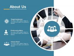
About us ppt slides ideas





Try Before you Buy Download Free Sample Product
 Impress Your
 Audience
 100%
100% Editable
 Save Hours
 of Time


Continue on course to your destination with our About Us Ppt Slides Ideas. Ensure your agenda doesn't get derailed.
People who downloaded this PowerPoint presentation also viewed the following :
About us ppt slides ideas with all 5 slides:
Our About Us Ppt Slides Ideas are akin to a factory. It churns out fabulous ideas.
FAQs for About us
Okay so for your About Us deck, start with why you even started the company in the first place. People eat that stuff up. Then hit your mission/values, introduce key team members with quick bios, and showcase your biggest wins. What sets you apart from everyone else? Make that super clear. Oh and throw in something fun - like that weird office tradition or group photo from the holiday party. Keeps it human, you know? Each slide should be mostly visual, not walls of text. End with how they can actually work with you. Practice it like you're telling a story, not just rattling off facts.
Honestly, visual storytelling is a game changer for your About Us page. People remember stories way better than boring bullet points about when you were founded or whatever. Show your journey with photos, timelines, maybe even sketches - anything that tells the story visually. Like how you started in someone's basement or had to completely change direction during the pandemic. Those moments stick with people. Before/after shots work great too. I swear, nobody's ever remembered a mission statement, but they'll definitely remember seeing your team's faces or that photo of your first tiny office space.
Ditch the bullet points and use real employee stories instead - way more powerful. Visual stuff works great too, like turning your company "journey" into an actual roadmap or doing before/after scenarios. I've seen some companies nail this with mini case studies or short video clips that just hit different than boring text slides. Oh, and interactive bits are solid - maybe poll people on which values drove certain decisions? The main thing is keeping it authentic, not corporate BS. Weave your values into actual examples of tough calls you've made or problems you've solved.
Short bios work best - like 2-3 lines covering their role and main experience. Maybe throw in something fun too. Get decent headshots with matching backgrounds because blurry phone pics look super unprofessional. Grid layout is usually the way to go so people can actually read everything. Focus on what makes each person special instead of boring job descriptions. Oh, and definitely add LinkedIn links or emails if it's for external folks - saves everyone the awkward "how do I contact this person" moment later. Trust me on that one.
Your brand identity is literally the foundation of your whole "About Us" thing. Colors, fonts, logo - all that visual stuff needs to match what people expect from you. Like, can you imagine Apple using Comic Sans? So cringe. But honestly, it's not just about looks. The way you write and tell your story matters too - whether you're being super professional or more chill and playful. Every slide should feel like it's actually coming from your company. Oh, and make sure your brand voice stays consistent throughout. You want people leaving with a clear picture of who you guys really are.
Dude, stats are basically your "receipts" when pitching. Don't just say "we're killing it" - show that 40% revenue jump instead. Customer satisfaction scores prove you're not all talk. Growth metrics show momentum. I'd pick maybe 3-4 numbers that actually back up whatever your main point is. The trick is making them feel natural in your story, not like you're barfing spreadsheets at people. Industry benchmarks help too if you want to flex against competitors. Make the data visual though - nobody wants to squint at tiny charts.
Dude, skip the boring mission statement stuff - nobody cares about that corporate speak. Ask questions instead! Throw in some polls or quick Q&As to keep people awake. Real behind-the-scenes photos work way better than stock images, trust me. Share actual stories about moments that changed your company, not just "we launched in 2015" nonsense. I always do this thing where I sandwich everything: here's the problem, here's our story solving it, here's what you get from it. Oh and connect it back to them somehow - what's in it for your audience? People zone out otherwise.
Honestly, videos are a game-changer for About Us pages. Show your team doing actual work instead of those awkward posed headshots - people connect with that real stuff. Simple animations work great too for timelines or explaining what you do. I saw one company get triple the engagement just by animating their values section (though maybe their old page was really boring, who knows). Even tiny things help. Animate your logo or add smooth transitions between sections so people don't immediately click away. Record a quick 30-second team intro on your phone. Doesn't need to be fancy to work.
Honestly, the hardest part is not sounding like a boring corporate brochure. You want to be professional but still feel human, you know? I always end up cutting like half my first draft because there's way too much backstory that nobody cares about. Focus on what actually matters to whoever's reading it, not just the stuff that makes you look good internally. Stories work way better than just rattling off accomplishments. Oh, and definitely show it to someone outside your company first - they'll call you out if you're being too jargony or putting people to sleep.
You gotta completely switch gears based on your audience. Investors want to hear about your business model, growth numbers, and how big the market is - basically show them the money trail. But customers? They care about how you'll solve their actual problems and what you stand for. They literally don't give a damn about your funding round. Think of it like this - same core story, just different highlights. I'd honestly make two separate slide decks. Same foundation but totally different opening hooks. Investors need proof you'll make bank; customers need proof you'll make their lives easier. It's way more work but makes all the difference.
Dude, the biggest thing I see people mess up? They dump their whole company origin story on slides - like seriously, no one cares you started in your uncle's basement. Focus on what you actually DO for people instead. Also keep it visual! Nobody wants to read paragraphs of corporate buzzword soup. Tell a story, make it punchy. I've sat through way too many 20-slide snoozefests. Keep it short and show what makes you different. Oh and always end with clear next steps - otherwise people just sit there confused about how to actually hire you.
Honestly, past presentation feedback is pure gold for fixing your "About Us" section. Did people perk up when you talked company culture but look bored during financials? There's your answer right there. I used to start with this long timeline nobody cared about - mistake number one. Watch for when people zone out or suddenly get interested. Maybe those impact stories should come first instead of the dry history stuff. Oh, and definitely keep notes after each presentation because you'll forget the good insights otherwise. Trust me on that one.
So color-wise, think about what vibe you're going for. Blues and grays scream trustworthy professional, while oranges and reds are more energetic. Earth tones feel authentic. Clean minimal layouts look sophisticated, but asymmetrical stuff feels way more approachable. Honestly, I'm a sucker for when companies throw in unexpected color pops - breaks up the boring corporate look. Just don't go crazy with it. Stick to 2-3 colors max and keep your layout consistent throughout. Oh, and definitely test your colors on different screens first because projectors are notorious for washing everything out completely.
Okay so tell the story of what actually broke that made you start this thing. Skip the corporate fluff - nobody cares about "excellence" nonsense. Get specific about the messy early days and bad decisions you survived. Honestly, the struggles are way more interesting than the wins anyway. Throw in some real customer stories where people's lives actually changed. What pivotal moments defined who you became? End with what's coming next, but keep everything focused on humans, not business metrics. People remember stories about overcoming stuff, not your mission statement.
Honestly, format can make or break your whole About Us thing. Videos are where it's at if you can pull it off - people actually connect with real faces, you know? Slide decks work fine for more formal stuff, but they're kinda meh for building trust. Infographics are clutch when people need to scan something quick and maybe share it later. Think about where your audience will actually see this and how much attention they'll realistically give you. I'd go with video first - it's flexible and sticks in people's heads way better than static stuff. Plus it just feels more genuine, which matters more than people think.
No Reviews