


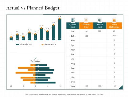
Actual vs planned budget cost m2476 ppt powerpoint presentation infographic template


Try Before you Buy Download Free Sample Product
 Impress Your
 Audience
Editable
of Time


Our Actual Vs Planned Budget Cost M2476 Ppt Powerpoint Presentation Infographic Template are topically designed to provide an attractive backdrop to any subject. Use them to look like a presentation pro.
People who downloaded this PowerPoint presentation also viewed the following :
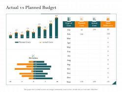
Actual vs planned budget cost m2476 ppt powerpoint presentation infographic template with all 2 slides:
Use our Actual Vs Planned Budget Cost M2476 Ppt Powerpoint Presentation Infographic Template to effectively help you save your valuable time. They are readymade to fit into any presentation structure.
FAQs for Actual vs planned budget cost m2476 ppt powerpoint
Definitely show actual vs budgeted numbers with variance percentages. Both dollar amounts AND percentages matter - I've seen tiny dollar variances that were like 400% over budget, which looks terrible. Throw in year-over-year comparisons if you've got them, plus forecasts for what's left of the year. Lead with your biggest wins and problem spots right up front. Oh, and this is key - have actual action plans ready for the bad variances. That's honestly what your boss cares about most. They don't want excuses, they want to know how you're fixing it.
Your brain just gets visuals way faster than number columns, trust me. I used to waste so much time squinting at spreadsheets! Bar charts are clutch for comparing different categories side-by-side. Line graphs? Perfect for tracking how your spending changes month to month. Honestly, pie charts make percentages super obvious - like seeing exactly how much goes to rent vs everything else. Just start simple with a basic bar or line chart next time. You'll catch problems and opportunities right away that you'd totally miss in a regular spreadsheet.
Dude, the worst thing you can do is compare budgets from different time periods or categories - totally pointless. Your audience will 100% ask about that random Q3 spike, so just explain the big variances upfront. Use the same accounting methods across everything, obviously. Don't dump every single line item on people either. Focus on what actually matters. Context is huge too - if the economy tanked or you launched something new, mention it! I always do an executive summary first with the main points, then get into the weeds. Makes everything way cleaner.
Dude, it's all about knowing your audience. Executives just want the big picture - ROI numbers and strategic stuff. They don't care about nitty-gritty details. Finance people though? Totally opposite. They want every single data point so they can dig deep into variances. Department heads fall somewhere between those two extremes. Give them enough detail to back up decisions without overwhelming them. Oh, and age actually makes a difference - younger folks usually love those flashy visual dashboards while older stakeholders often prefer good old spreadsheets. My advice? Just ask them upfront what they want and how they want it formatted. Saves you tons of time.
Honestly, just start with Excel or Google Sheets - they'll do your calculations and make decent charts without much fuss. PowerBI's pretty solid if you need something fancier for the higher-ups, though I've seen people get impressive results with Canva's budget templates too (way less boring than typical spreadsheets). Power Query in Excel is a lifesaver when you're pulling from different sources. Saves so much tedious copy-paste work. Google Sheets is clutch for collaboration since everyone can jump in at once. Don't overthink it though - use whatever your team already knows, then get fancy later if you need to.
Color code everything - red for over budget, green for under. Sort by biggest variances first because honestly, who has time for the small stuff when there's a massive overage glaring at you? I always add quick notes explaining the major gaps, but keep them super brief. You want to spark discussion, not write a novel defending every expense. Oh, and here's what works really well - end with 2-3 pointed questions about those big discrepancies. Gets people talking immediately instead of just staring at spreadsheets. The whole point is making problems obvious before you even open your mouth.
You really need that historical data or your budget's just gonna look like random guesswork. Pull at least 2-3 years if you can - it shows actual trends and seasonal stuff that happened before. Stakeholders eat up the "last year we spent X, this year we're planning Y" approach because it feels real. Don't go too far back though, like 5+ years gets weird and outdated. Too recent and you'll miss important patterns. Honestly, budgets without historical context are pretty much useless - anyone can throw numbers on a spreadsheet and call it a plan.
Dude, this is something so many people mess up! Different cultures totally change how your budget presentation lands. Japanese audiences? They want tons of background context with those numbers. Americans just want the direct comparison. Some places actually see aggressive cost-cutting as reckless instead of smart - learned that the hard way once. Also, if you're presenting somewhere with strict hierarchies, they'll expect to see all the approval levels broken down in your budget. Honestly just spend 20 minutes googling their business culture beforehand and tweak your approach.
Make it a story with heroes and villains - like "Marketing's social media spend saved us 30% while office supplies became this sneaky budget monster." People zone out with just numbers (been there, suffered through those meetings). Frame spending decisions as plot points instead. Start with last year's mess, then show how you strategically fought back this year. The before/after thing works really well here. End with what it all means for next quarter so there's actual stakes involved. Honestly, turning budget data into a mini-drama is way more engaging than spreadsheet hell.
So there's actually a bunch of ways to do this! API connections work great - you can pull live data straight into your slides from Tableau, Power BI, or even Google Sheets. Most presentation tools have real-time widgets now too. Excel's probably your easiest bet if you're already using Microsoft stuff (though honestly it can be kinda clunky). The main thing is setting up automatic refreshes so your budget numbers update without you copy-pasting everything manually. Oh, and definitely test it beforehand - nothing worse than broken charts mid-presentation!
For your budget charts, stick with the same scale and colors across everything - makes comparisons way easier. Bar charts are solid for actual vs budgeted stuff. Line graphs show trends better though. Honestly, waterfall charts are underrated when you're breaking down variances. Start your axes at zero or you'll accidentally make things look more dramatic than they are. Label everything clearly too. Oh, and don't go crazy with colors - maybe 2-3 max? I'd throw in some notes highlighting the big variances that actually matter.
Pause after each big budget section and ask targeted questions - like "does this match what your department actually needs?" Honestly, I'd make a feedback form ahead of time because people always think of stuff later and it's annoying to chase them down. Write down who said what so you can follow up properly. Then show them a revised version that actually incorporates their suggestions - people notice when you ignore their input. Oh, and be upfront about what you can't change. Some things are just locked in, and stakeholders would rather know that from the start than waste time arguing about impossible stuff.
Honestly, you'll want to focus on ROI first - that's your bread and butter for knowing if you're actually making smart moves with your money. Variance analysis is huge too because it shows you where things went off the rails from your original plan. Then track whatever outcome metrics actually matter to your bigger goals. Cost per unit stuff can be pretty revealing depending on what you're doing. I'd probably start with just 2-3 metrics that tie directly to what your team's trying to accomplish - don't overcomplicate it right away. Build everything else around those core ones.
Honestly, you gotta tailor your budget categories to what actually matters in each industry. Tech companies? Focus hard on R&D and talent costs - those are make-or-break expenses. Retail is all about inventory turnover and those brutal seasonal swings. Manufacturing companies live and die by equipment maintenance and raw material costs. Pick 3-4 metrics that really drive performance in whatever sector you're looking at, then weight those heavier in your analysis. I'd start by digging into what the top players typically spend their money on - that'll give you a solid baseline.
Okay so after your presentation, send a follow-up email within 48 hours with action items and deadlines - don't let momentum die. You'll want monthly check-ins where teams explain their spending vs projections. Honestly, people hate looking unprepared in meetings, so this actually makes them track things better. Set up dashboards that automatically flag big deviations and create escalation rules when variances hit certain limits. The trick is making it feel routine, not like punishment. Oh and those quarterly reviews work too if monthly feels like overkill for your company.
-
Amazing product with appealing content and design.
-
Informative design.
-
Illustrative design with editable content. Exceptional value for money. Highly pleased with the product.
-
Topic best represented with attractive design.
-
Excellent Designs.