

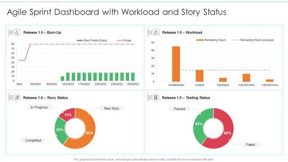
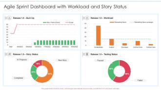
Agile sprint dashboard with workload and story status




Try Before you Buy Download Free Sample Product
 Impress Your
 Audience
 100%
100% Editable
 Save Hours
 of Time


Our Agile Sprint Dashboard With Workload And Story Status are topically designed to provide an attractive backdrop to any subject. Use them to look like a presentation pro.
People who downloaded this PowerPoint presentation also viewed the following :
Agile sprint dashboard with workload and story status with all 7 slides:
Use our Agile Sprint Dashboard With Workload And Story Status to effectively help you save your valuable time. They are readymade to fit into any presentation structure.





FAQs for Agile sprint dashboard with workload
An Agile sprint dashboard should display burndown charts, velocity tracking, sprint goal progress, story completion rates, and team capacity utilization. These metrics enable project managers to monitor daily progress, identify potential roadblocks early, and optimize resource allocation, with many development teams finding that visual dashboards enhance transparency and ultimately deliver faster project completion.
Visualizations on sprint dashboards enhance team collaboration by providing real-time visibility into sprint progress, task statuses, blockers, and team velocity through burndown charts, Kanban boards, and progress indicators. These visual tools enable teams to quickly identify bottlenecks, coordinate efforts more effectively, and maintain transparency across stakeholders, ultimately delivering faster sprint completions and improved project outcomes.
Integrating sprint dashboards with project management tools like Jira or Trello delivers centralized visibility, automated progress tracking, real-time collaboration, and streamlined workflow management across development teams. These integrations enhance operational efficiency by eliminating manual updates, reducing context switching, and enabling faster decision-making, with many organizations finding that unified dashboards ultimately accelerate delivery timelines while improving team coordination.
Teams can customize their sprint dashboard by configuring key performance indicators, adjusting visual layouts, integrating team-specific metrics, and aligning widgets with their unique workflow stages and objectives. Through customizable charts, personalized filters, and role-based views, organizations streamline tracking, enhance team visibility, and deliver improved project outcomes, with many development teams finding that tailored dashboards significantly boost productivity and strategic alignment.
The sprint backlog serves as the primary data source for dashboard information, defining which user stories, tasks, and acceptance criteria appear as trackable metrics and progress indicators. This backlog directly shapes dashboard visualizations like burndown charts, task completion rates, and remaining work estimates, with many agile teams finding that well-structured backlogs enable more accurate sprint forecasting and resource allocation.
Sprint dashboards help identify bottlenecks by visualizing work distribution across team members, tracking task completion rates, and highlighting stories stuck in specific workflow stages. Through real-time burn-down charts and cycle time analytics, development teams can pinpoint where delays occur most frequently, whether in code review, testing, or deployment phases, ultimately enabling faster issue resolution and improved sprint velocity.
Historical data from sprint dashboards informs future planning by revealing velocity patterns, identifying recurring bottlenecks, and highlighting estimation accuracy trends across previous iterations. This data enables teams to refine capacity planning, adjust story point estimates, and optimize resource allocation, with many development organizations finding that data-driven sprint planning reduces delivery risks while improving predictability and stakeholder confidence.
Common pitfalls include overwhelming dashboards with excessive metrics, focusing on vanity metrics over actionable insights, poor stakeholder alignment on key performance indicators, and inadequate real-time data integration. Many teams find that starting simple with core velocity and burndown metrics, then gradually expanding based on actual decision-making needs, delivers better adoption and ultimately more strategic value.
Sprint dashboards facilitate better stakeholder communication by providing real-time visibility into sprint progress, completed user stories, burn-down charts, and team velocity metrics in a centralized visual format. During sprint reviews, these dashboards enable product owners and development teams to present clear, data-driven updates to executives and business stakeholders, ultimately enhancing transparency and alignment across organizational levels.
A sprint dashboard for remote teams should include real-time burndown charts, task status updates, team availability indicators, video conferencing integration, and automated progress notifications. These features enhance transparency by enabling asynchronous collaboration, streamlining daily standups, and providing visibility into team capacity, with many distributed organizations finding that centralized dashboards significantly improve sprint coordination and delivery predictability.
Regular sprint dashboard updates enhance team performance by maintaining alignment, identifying blockers early, and enabling rapid course corrections throughout development cycles. Frequent visibility into progress metrics, velocity trends, and sprint goals keeps teams motivated and focused, with many agile organizations finding that daily updates significantly improve collaboration, reduce miscommunication, and ultimately deliver higher-quality outcomes.
Cumulative flow diagrams on Agile sprint dashboards provide visual insights into work progression, bottlenecks, and team velocity by tracking task states over time. They enable project managers to identify workflow inefficiencies, predict delivery timelines, and optimize resource allocation, with many development teams finding that these visualizations significantly enhance sprint planning and ultimately deliver more predictable project outcomes.
Teams leverage sprint dashboards to improve Retrospectives by providing visual data on velocity trends, burndown patterns, story completion rates, and impediment tracking throughout the sprint cycle. These dashboards enable more data-driven discussions during Retrospectives, with development teams identifying specific bottlenecks, celebrating measurable improvements, and setting actionable goals based on concrete metrics rather than subjective observations, ultimately delivering more focused process improvements.
Key indicators include improved sprint completion rates, reduced scope creep, enhanced team velocity tracking, better stakeholder visibility, and consistent retrospective insights. Through real-time progress monitoring, teams achieve more predictable deliveries, faster issue identification, and stronger cross-functional collaboration, with many organizations finding that dashboard transparency ultimately drives accountability and continuous improvement across development cycles.
Automation keeps sprint dashboards current through API integrations with project management tools, automated data pulls from repositories, real-time synchronization with development platforms, and scheduled refresh cycles. These automated systems streamline project tracking by eliminating manual data entry, reducing reporting errors, and ensuring stakeholders access live sprint metrics, with many development teams finding that automated dashboards significantly enhance project visibility and team productivity.
-
Easy to edit slides with easy to understand instructions.
-
Attractive design and informative presentation.