


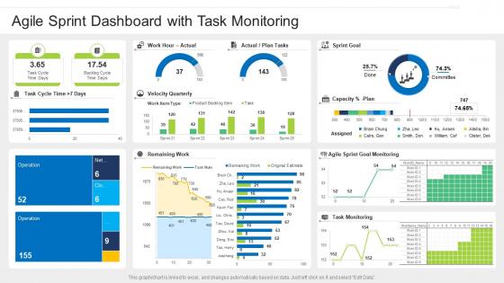
Agile sprint dashboard with task monitoring




Try Before you Buy Download Free Sample Product
 Impress Your
 Audience
 100%
100% Editable
 Save Hours
 of Time


Our Agile Sprint Dashboard With Task Monitoring are topically designed to provide an attractive backdrop to any subject. Use them to look like a presentation pro.
People who downloaded this PowerPoint presentation also viewed the following :
Agile sprint dashboard with task monitoring with all 7 slides:
Use our Agile Sprint Dashboard With Task Monitoring to effectively help you save your valuable time. They are readymade to fit into any presentation structure.





FAQs for Agile sprint dashboard
You'll want sprint progress tracking and burndown charts as your foundation. Team velocity metrics are clutch too. Oh, and definitely include blocked items visibility - I've seen too many teams get blindsided by roadblocks they didn't catch early enough. Current sprint status should be front and center, plus upcoming work and team capacity. Cycle time and lead time metrics help you spot bottlenecks before they become disasters. Keep everything visual with charts instead of boring text dumps. Honestly, start simple with these basics and see what your team actually references during standups, then build from there.
Honestly, an Agile dashboard is a game-changer for keeping everyone on the same page. Your team can quickly see who's doing what and what's stuck without those annoying "status update" meetings. Real-time visibility into sprint progress? Yes please. The visual element really works too - there's something weirdly satisfying about dragging cards to "done" (maybe that's just me being nerdy). What really matters though is getting everyone to actually look at it during standups. Otherwise you'll just have another tool collecting digital dust.
Look, velocity and burndown charts are your best friends here. Velocity shows what your team actually delivers each sprint - super consistent data. Burndown tells you if you're gonna hit your sprint goals or crash and burn. Cycle time is honestly the most valuable though. It shows how long stuff really takes from start to finish, which beats those initial estimates every time. Track defect trends too, and maybe throw in team happiness scores if you want to get fancy about it. Don't go crazy with like 15 different metrics - you'll just end up staring at dashboards all day. Pick 4-5 good ones and review weekly.
Honestly, having everything in one place makes such a huge difference. Your Agile dashboard shows team velocity and story points right there - way better than hunting through random spreadsheets. When you're planning sprints, you can actually see capacity issues before they bite you. For retros, pull up those metrics first thing. The burndown charts and cycle times give you real talking points instead of just "yeah, that sprint felt rough." I swear it turns retros from vague complaints into actual problem-solving sessions. Start there and you'll see patterns you totally missed before.
Dude, visuals are a game changer for Agile dashboards. People actually pay attention when they can see progress bars and burn-down charts instead of boring spreadsheets. I've watched stakeholders completely zone out during text-heavy updates, but throw up a colorful velocity chart? Suddenly they're engaged and asking good questions. You'll spot problems way faster too - trends just pop out visually. Oh, and mix current stats with historical stuff so people stay invested. Trust me, charts beat walls of text every single time.
Honestly, most teams go with Jira, Azure DevOps, or Trello. Jira's got all the bells and whistles for reporting and sprint customization - maybe too many if I'm being real. If you're already using Microsoft stuff, Azure DevOps just makes sense with how well it connects everything. Trello's way simpler and visual, which smaller teams love. There's also Monday.com and Asana floating around that people rave about. My advice? Go with whatever your devs already know. Getting everyone to actually use the tool is like 80% of the challenge anyway.
Honestly, you'll want to automate everything or you'll go crazy with manual updates. Connect your dashboard directly to your project tools through APIs - way less headache. Set up some basic validation that catches weird stuff, like when sprint velocity jumps around or story points look sketchy. Different metrics need different refresh rates too. Critical stuff should update every few minutes, but other things can wait an hour or so. Oh, and definitely test your data pipeline regularly! Nothing worse than showing executives numbers that are three days old because something broke and nobody noticed.
Dude, you absolutely need to customize those Agile dashboards. Generic templates are basically useless - I've watched teams waste months on cookie-cutter setups. Each team has different workflows and cares about different stuff. Some obsess over sprint burndowns, others want cycle time front and center. Ask your people what they actually check every morning (not what they think they should check). Build around that. The most critical info should smack you in the face when you open it. Everything else is just clutter. Oh, and don't forget your stakeholders have their own favorite KPIs too.
Just set up a velocity chart widget on your dashboard - Jira and Azure DevOps both have them built-in. It tracks story points completed each sprint and honestly makes patterns super obvious. You'll spot when your team overcommits or see those holiday slowdowns coming. I love how visual it is compared to spreadsheets (ugh). The data helps you make way more realistic sprint commitments. Plus you can actually show stakeholders what your team's capable of based on real history, not some made-up estimates. Takes like five minutes to configure but saves so many awkward conversations later.
Honestly, just make your dashboard the one place everyone goes to see what's happening - keep it updated constantly or people stop trusting it. Walk through the board together in your regular meetings (saves so much back-and-forth later). Since you can't just ask someone across the room, write really clear task descriptions. Colors and swim lanes help spot priorities and blockers instantly. Oh, and definitely assign someone to keep the thing clean - I've seen too many dashboards turn into graveyards of old tasks. Short version: visible, current, and actually useful.
Honestly, dashboards are game-changers for this stuff. You get real-time data on how your team's actually performing instead of guessing. Bottlenecks become super obvious - way better than hunting through endless spreadsheets (ugh). When retrospective time rolls around, you're pointing to actual numbers instead of just "it felt slow this sprint." Pick maybe 3-4 metrics that actually matter to your team and check them regularly. Velocity trends, where work gets stuck, that kind of thing. Then you can try small tweaks based on what you're seeing. The visual aspect makes everything click faster.
Honestly, the worst part is when teams try tracking every single thing right off the bat. Creates total chaos instead of useful info. You'll definitely run into that one coworker who refuses to stop using their precious spreadsheets - so annoying but whatever. Data overload is real though. Pick maybe 3-4 metrics that actually move the needle for your specific situation. Don't let the dashboard turn you into a micromanager either. Getting people to consistently input stuff is harder than it sounds. My advice? Start stupid simple and add complexity later once everyone's in the habit.
Honestly, your team's feedback is everything for making dashboards that actually work. Ask them regularly what metrics they're totally ignoring - those can probably just disappear. Also find out what data they're digging for in other places. People get oddly attached to vanity metrics sometimes, even when they're useless for decisions. Set up feedback loops through retros or quick surveys, then actually do something with what they tell you. Monthly reviews work well to keep things fresh. Your dashboard should solve real problems, not just look impressive with random data nobody cares about.
Honestly, the predictive stuff is wild this year - some tools can spot blockers before they even happen by reading your team's patterns. Real-time sentiment analysis from check-ins is pretty neat too. Flow metrics finally connect to actual business results instead of those useless velocity charts we all pretend matter. Oh, and async tool integration is way better now. Your standup updates automatically feed into dashboard context, which saves so much time. I'd dive into the predictive analytics first if I were you - catching bottlenecks early has saved my butt multiple times. Sprint predictions using AI are getting scary accurate too.
Honestly, connecting your Agile dashboard to your other PM tools is huge. No more jumping between five different apps all day. Real-time data just flows automatically instead of you manually updating everything - saves so much time on admin stuff. Your team sees sprint progress, resources, blockers, everything in one spot while they still use whatever tools they like. The best part? Stakeholders get consistent reports without you scrambling to pull data from everywhere. I'd start with whatever tools you use most, then add others later. Trust me, once you set it up you'll wonder why you waited so long.
-
Use of icon with content is very relateable, informative and appealing.
-
Good research work and creative work done on every template.