

Bank Manager Powerpoint PPT Template Bundles




Try Before you Buy Download Free Sample Product
 Impress Your
 Audience
 100%
100% Editable
 Save Hours
 of Time


Our Bank Manager Powerpoint PPT Template Bundles are topically designed to provide an attractive backdrop to any subject. Use them to look like a presentation pro.
People who downloaded this PowerPoint presentation also viewed the following :
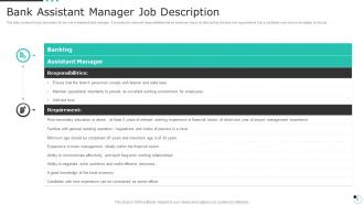
Bank Manager Powerpoint PPT Template Bundles with all 13 slides:
Use our Bank Manager Powerpoint PPT Template Bundles to effectively help you save your valuable time. They are readymade to fit into any presentation structure.







FAQs for Bank Manager Powerpoint
Honestly, those Bank Manager PPT templates are lifesavers. Banking presentations usually feel so stiff, but these hit the sweet spot between professional and actually engaging. They've got all the chart layouts and KPI sections built in already - saves you from staring at a blank slide forever. Your presentations will look consistent too, which automatically makes you seem more put-together. I mean, who has time to design from scratch every time? Just grab one, throw in your data, and boom - looks like you spent way more effort than you did. Trust me on this one.
Look, a good template just fixes all the visual mess that tanks most presentations. Your audience will actually pay attention to your numbers instead of cringing at weird fonts or whatever. Banking stuff is already heavy with data and compliance nonsense - anything that makes it less painful to look at helps. Clean templates give you instant credibility too. Consistent branding makes those complex financial concepts way more digestible. Oh, and definitely grab one with solid data visualization built in. Trust me on this - it's worth the investment upfront.
Start with an executive summary - trust me, leadership doesn't want to hunt through slides for the main points. Financial performance metrics are obviously crucial, plus loan portfolio analysis and your NPL rates. Risk management overview, branch ops data, regulatory compliance status. Charts for ROA and deposit growth work well. Team performance indicators matter too, though sometimes those meetings drag when you get into the weeds there. Customer satisfaction metrics are good to include. Oh, and any strategic initiatives you're running. Keep it clean and data-heavy since you're presenting to people who want numbers, not flashy designs.
Honestly, ditch most of those text-heavy slides - nobody wants to read paragraphs during a presentation. Charts and infographics actually keep people awake, plus they make banking stuff way easier to digest. I learned this the hard way after watching people zone out during my first few pitches. Your brain processes visuals faster than text anyway, so people remember more. Try swapping out at least half your bullet points for some kind of visual element. Trust me, you'll see the difference in how engaged people get. Even simple graphs work better than walls of text.
First thing - ditch all that generic placeholder stuff and put in your actual numbers. Those stock photos are the worst, especially the fake handshake ones lol. Use real pics from your branch if you can. Match your bank's colors but seriously, don't go font-crazy - two fonts max or it looks messy. The big thing though? Don't just fill in blanks. Rearrange the whole slide order so it actually makes sense for what you're presenting. Oh and double-check your charts match the real data - I've seen people leave in random sample numbers by mistake.
Hey! So colors are huge for banking presentations - they literally make or break trust with clients. Blues and grays are your safest bet since they scream "stable and professional." Every major bank uses them for a reason, right? Green works too because it suggests growth. But avoid red - creates urgency but also screams "risky investment" which, yikes. I once watched a presentation completely bomb because the guy used bright orange backgrounds (seriously, what was he thinking?). Conservative palettes are key for client meetings. Oh, and definitely test your slides on the actual projector first!
Dude, typography can totally make or break your bank presentation. Go with something clean like Calibri or Arial - basically anything that screams "we handle your money responsibly." Comic Sans is obviously a no-go lol. Font sizes should stay consistent, and make sure your headers are bigger than your body text. I learned this the hard way when my last presentation looked like a mess from the back row. Poor font choices make even solid financial data look sketchy. Stick to maybe 2-3 different sizes max, and honestly? Do a quick test from across the room before you present.
Honestly, charts and graphs are game-changers for financial presentations. Nobody wants to stare at endless spreadsheet rows - their eyes just glaze over. Visual stuff like trend lines and pie charts make complex data click instantly. Interactive features are clutch too if you've got them. Let people hover over data points or explore scenarios themselves. Keeps them way more engaged than just talking at them. Oh, and templates with good formatting save you tons of time while keeping everything looking professional. Trust me, once you start using visuals properly, you'll never go back to those boring number dumps.
Most bank manager templates go with the obvious stuff - "Corporate Finance," "Banking Solutions," "Investment Strategy." Blue and green everywhere because apparently those colors just scream "trust me with your money." You'll find themes like "Digital Banking" and "Risk Management" too. The layouts are super clean with financial charts and corporate stock photos. Honestly, they all kind of look the same after a while. Pick whatever matches your actual presentation - client pitch, quarterly numbers, staff training. Just make sure it doesn't look sketchy since you're literally dealing with people's finances.
Look, case studies are honestly game-changers for banking presentations. Instead of boring people with vague promises, you're showing them actual results. Like, don't just say "we help businesses grow" - show how you boosted ABC Company's cash flow by 40% in six months. Real numbers hit different. Your audience gets something concrete to latch onto, and you'll look way more legit than competitors spouting generic banking fluff. I'd build 2-3 flexible case study slides into your template. That way you can swap in relevant examples for different meetings without starting from scratch each time. Trust me on this one.
Check what PowerPoint version everyone's running first - 2016, 2019, 365, whatever. Most templates work fine across versions, but I've seen fancy animations totally break on older setups before. Super annoying mid-presentation. Google Slides compatibility matters too if your team collaborates that way. Oh, and fonts are weirdly important - custom ones will just default to Times New Roman or something ugly if people don't have them installed. Test the template on a couple different computers beforehand. Trust me, you don't want surprises during your actual presentation.
Okay so first figure out who you're actually talking to - that's everything. Executives want the big picture stuff, clean slides, strategic metrics. But retail customers? Go heavy on visuals and ditch the jargon. Investment clients are gonna want all the nitty-gritty data and performance comparisons. Here's something weird I learned - font size literally makes or breaks presentations depending on age groups. Who knew? Anyway, start with their financial knowledge level and what they need to decide on. Oh, and if you're presenting internationally, cultural stuff matters way more than people think. Just match the depth and style to your audience and you'll be fine.
Honestly, templates are a lifesaver. No more staring at that blank slide wondering what the hell to put first. All the banking stuff you need is already laid out - loan portfolios, quarterly reports, whatever. The designs look professional (way better than anything I could make) and they actually work well for financial data. Just plug in your numbers and maybe tweak the colors to match your bank's look. Takes like 10 minutes instead of hours. Plus you don't have to be some design genius to make decent presentations.
Honestly, I'd check it monthly if you're using it a lot. Banking stuff changes constantly - new regulations, market shifts, all that. Quarterly updates are the bare minimum though. Nothing worse than presenting with a template that looks like it's from 2019 (been there, done that). Set a reminder for the first week of each quarter to do a proper review. Then just tweak things as you go based on feedback or new KPIs your bank rolls out. Trust me, stakeholders notice when your slides look current versus when they don't.
Honestly, go with the clean corporate-looking ones - they always score better with stakeholders. Skip anything too flashy or animation-heavy because banking folks hate that stuff. Look for templates that already have financial charts and KPI dashboards built in. Saves you tons of time later. Brand consistency across slides is huge too, according to most reviews I've seen. Oh, and avoid anything that screams "look at me!" Your data should be the star, not some crazy design. Keep it polished but simple - that's what actually works in these environments.
-
Loved the fact that SlideTeam provides clean, high-definition, and professional PowerPoint products.
-
I was really impressed with the presentation I created with their templates. I’ll be using their services moving forward.