


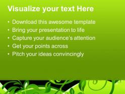
Beautiful pictures of nature download powerpoint templates floral growth ppt backgrounds





Try Before you Buy Download Free Sample Product
 Impress Your
 Audience
 100%
100% Editable
 Save Hours
 of Time


Take your ideas to commanding heights. Get them aboard our Beautiful Pictures Of Nature Download Powerpoint Templates Floral Growth Ppt Backgrounds.
People who downloaded this PowerPoint presentation also viewed the following :
Beautiful pictures of nature download powerpoint templates floral growth ppt backgrounds with all 3 slides:
Deliver the goods with our Beautiful Pictures Of Nature Download Powerpoint Templates Floral Growth Ppt Backgrounds. Enhance your teams faith in you.


FAQs for Beautiful pictures of nature download powerpoint templates floral
Okay so three main things - start with gorgeous high-res nature photos as your base. Then pick a clean layout that won't fight with those visuals. Earth tones, forest greens, ocean blues work great for colors. Keep typography simple but on-theme. I swear, I've seen so many presentations where cluttered templates just murder beautiful nature shots. Smooth, minimal slide transitions only - nobody's there for flashy animations anyway. Oh and make sure your font's actually readable from the back row. Let your nature content do the heavy lifting instead of trying to get fancy with the design.
Honestly, visuals are everything for ecology presentations. Instead of boring bullet points about biodiversity, show actual food webs and species interactions - way more engaging. Before/after photos work great for environmental changes, and charts make population trends super clear. Maps and infographics help people understand those tricky organism relationships without getting lost in dense text. I always forget how much better a simple diagram explains things compared to paragraphs of explanation. Your audience will actually pay attention when they can see what you're talking about rather than just hearing it.
Stories beat stats every time, trust me. People zone out when you hit them with deforestation numbers, but tell them about one family losing their forest home? Now they actually *feel* something. Our brains are wired for narrative - we remember stories way better than data dumps. I learned this the hard way after bombing a few presentations myself. Personal cases, real examples, even made-up scenarios work. They tap into empathy instead of just... logic, I guess? Hook them with a story first, then sneak in your facts later.
Definitely go with infographics - they're perfect for breaking down complex stuff like food webs or migration patterns. Before/after comparisons are honestly my favorite for environmental presentations because the impact is just so obvious. Stick with earthy colors since it fits your topic, and make everything big enough that people in the back can actually see it. Oh, and create one really solid summary infographic as your main slide. People screenshot those constantly (I do it all the time). Just make sure your data visualizations aren't tiny - there's nothing worse than squinting at charts you can't read.
Okay so visual hierarchy is everything - don't just dump spreadsheets on people like some kind of data monster. Charts and graphs should actually tell a story, you know? Walk them through the big picture first, then zoom into specifics. Color coding helps but don't go crazy with it. The thing that really matters though is context - people need to understand WHY these numbers should care about their day-to-day work. Oh and seriously, practice explaining your most complicated slide in under two minutes or you'll lose everyone.
Honestly, animations are perfect for showing stuff that happens over time - like plant growth or water cycles that you can't really capture in regular slides. Breaking down complex processes into steps works really well too. I've seen some great ones showing butterfly metamorphosis or how erosion changes landscapes over years. The progression makes everything so much clearer than just describing it! Just don't go overboard with flashy effects though - that actually distracts from what you're trying to teach. Keep it simple and focus on the actual process. Start basic and add complexity if you need it.
Definitely go with earth tones for nature stuff - deep greens, ocean blues, warm browns, maybe some sunset orange. Those colors just feel right with nature photos, you know? I always skip the neon colors because they look super weird next to like, a forest scene or whatever. Pick one main color (forest green works great) then add 2-3 accent colors that go with it. Oh, here's something that actually works really well - just grab your color palette straight from your best photo in the presentation. Sounds obvious but it makes everything look way more put-together than you'd expect.
Honestly, format makes a huge difference for nature stuff. Videos are where it's at for emotional impact - you can't beat actual bird calls or watching plants grow in time-lapse. Slideshows work better when you're trying to teach specific facts about ecosystems since you control the pacing. Interactive formats are cool for complex topics like food webs where people need to click around and explore. I'd probably avoid those for simple concepts though - might be overkill. Just think about what you want people to walk away remembering most, then pick whatever format supports that goal.
Honestly, visuals are everything - show before/after glacier pics and real-time data that hits close to home. People tune out statistics but they'll listen to actual stories from communities dealing with this stuff right now. I'd throw in some interactive bits too, like polls or "what would you do" scenarios. Makes it way less boring than another lecture about polar bears, you know? The trick is making them feel like it affects THEM, not just people on the other side of the world. Oh, and definitely end with concrete actions they can actually do. Nobody wants to leave feeling hopeless and paralyzed.
Mix things up with different hooks for different people. Good visuals grab everyone first. Then sprinkle in science stuff for the nerds, conservation angles for tree-huggers, and actual useful tips. I always include one random "holy crap, really?" fact that gets people buzzing later. Read the room though - if eyes start glazing over during technical bits, switch to relatable examples or get them doing something interactive. Oh, and don't be afraid to adjust on the fly. Some crowds eat up data, others just want the cool stories.
Honestly, start with Unsplash and Pexels - they've got solid free nature shots that don't look terrible. Getty and Shutterstock cost money but their search filters are crazy specific if you need something exact. There's this site called iNaturalist that's more community-based with real wildlife photos, though licensing gets weird sometimes. National Geographic and Smithsonian have libraries too. Oh, and definitely check usage rights even on free sites - learned that the hard way once. Local photographers on Instagram are surprisingly chill about licensing their stuff for decent prices.
Honestly, just dig into what's messed up in your area first - like sketchy water quality or invasive weeds taking over. Way more impactful than talking about polar bears or whatever. Grab local news stories, team up with nearby environmental groups, maybe even bring actual samples from a creek nearby. I've watched people bring invasive plants they literally picked from the parking lot - worked amazingly well. Then connect how your local stuff ties into bigger patterns. Skip the generic "recycle more" ending though. Give them real ways to help locally instead.
Just don't use photos where animals were stressed out or harassed for the shot. You know how some photographers bait animals or mess with nests? Skip those completely. Credit whoever took the photo properly and make sure you've got rights to use it. I'd avoid anything that makes wild animals look like cute pets too - that stuff drives me crazy honestly. Oh, and nothing showing people getting too close to dangerous wildlife. Stick with legit stock sites or photographers who actually document how they work. Way safer that way.
Dude, soundscapes are a total game changer for nature presentations! They literally drop your audience right into whatever habitat you're showing. Layer some forest birds, crashing waves, wind through grass - whatever fits. I still get goosebumps thinking about this wolf howl I heard during a wilderness talk once. Match your audio to the visuals and keep volumes consistent so it doesn't become distracting (learned that the hard way). Test 2-3 subtle ambient tracks beforehand. Your audience will feel like they're actually there instead of just staring at slides.
Okay so first thing - grab them with something wild right off the bat. Like a crazy animal fact or this insane photo that'll make everyone's jaw drop. Then you gotta switch up the rhythm, you know? Mix storytelling with the actual data so it doesn't get boring. I swear, nothing kills a nature presentation faster than just rattling off statistics for twenty minutes straight. Get people involved - ask questions, bring props if you can. Watch their faces too. If you see phones coming out, that's your cue to whip out one of those backup "holy crap" moments you should always have ready.
-
The content is very helpful from business point of view.
-
Great product with highly impressive and engaging designs.