

Before versus after comparison 4 text boxes powerpoint graphics





Try Before you Buy Download Free Sample Product
 Impress Your
 Audience
 100%
100% Editable
 Save Hours
 of Time


Advertise your ability with our Before Versus After Comparison 4 Text Boxes Powerpoint Graphics. Strengthen the spreading belief in your skills.
People who downloaded this PowerPoint presentation also viewed the following :
Content of this Powerpoint Presentation
Description:
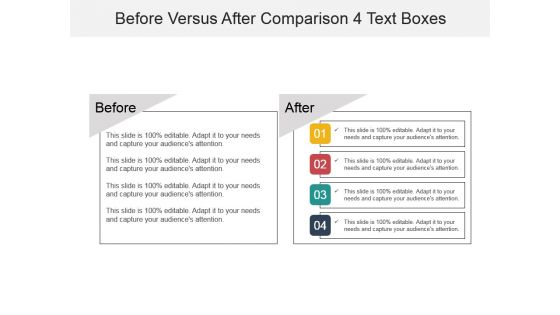
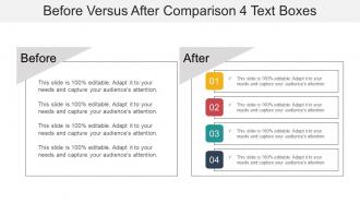
The image shows a PowerPoint slide titled "Before Versus After Comparison 4 Text Boxes," designed for comparing and contrasting scenarios or states. On the left side under the header "Before," there are four stacked grey text boxes, each containing the placeholder text "This slide is 100% editable. Adapt it to your needs and capture your audience's attention." On the right side under "After," four corresponding text boxes are shown with numbers 01 to 04, each with a different color. They contain the same editable placeholder text, suggesting they can be customized to show progress, results, or changes.
Use Cases:
This comparative layout is applicable in multiple contexts across various sectors:
1. Consulting:
Use: Demonstrating business improvements
Presenter: Strategy Consultant
Audience: Business Clients
2. Education:
Use: Comparing educational techniques
Presenter: Education Specialist
Audience: Teachers and Administrators
3. Healthcare:
Use: Showing patient outcomes before and after treatment
Presenter: Medical Researcher
Audience: Medical Professionals
4. Marketing:
Use: Presenting campaign results
Presenter: Marketing Analyst
Audience: Marketing Team
5. Real Estate:
Use: Illustrating property renovations
Presenter: Real Estate Agent
Audience: Prospective Buyers
6. Technology:
Use: Showcasing software updates
Presenter: Product Manager
Audience: End Users
7. Environmental Services:
Use: Displaying cleanup efforts results
Presenter: Environmental Scientist
Audience: Community Stakeholders
Before versus after comparison 4 text boxes powerpoint graphics with all 6 slides:
Hundreds of thousands of design hours have gone into the development of this Before Versus After Comparison 4 Text Boxes Powerpoint Graphics library. Choose from the wide selection crafted to fit your presentation needs.
FAQs for Before versus after comparison 4 text
Honestly, bar charts are your best friend for comparing stuff - way better than those pie charts everyone loves but nobody can actually read. Line graphs are clutch when you're tracking changes over time. Column charts work great too, especially when you've got multiple groups to compare. Oh, and if you need to show subcategories, try grouped or stacked bars. I swear people overthink this so much. Just pick something clean and simple - your audience will actually get what you're trying to show them instead of squinting at your screen confused.
Dude, contrasting colors are your best friend here - blue vs orange, not blue vs slightly-darker-blue (trust me on this one). They help people instantly see what's different. I always stick to 2-3 main colors max, then use lighter/darker versions for subcategories. One thing though - like 8% of people can't see colors the same way, so throw in some patterns or labels too. Honestly, I've seen way too many charts where everything just blends together. Keep your palette consistent throughout and you'll be golden. Build up from those core colors if you need more.
Honestly, typography can make or break your comparison charts. People need to scan data fast, so keep your font sizes consistent - otherwise you'll confuse everyone about what they should look at first. I always go bigger on labels than I think I need to. Clean, simple fonts work best since they won't fight with your actual data for attention. The goal is guiding someone's eye smoothly from point A to point B. You want that natural flow where they can compare things without getting stuck on messy text. Trust me, I've seen beautiful data completely ruined by terrible font choices.
So the worst thing you can do is mess with your scales to make tiny differences look huge - like truncating the y-axis. Also don't cherry-pick your data ranges or use misleading colors that push people toward certain conclusions. Time periods between datasets should match up too. Honestly, cramming everything into one chart usually backfires because it just turns into visual chaos. Keep your baseline the same throughout, size things proportionally, and label everything clearly. I always start with what I'm trying to show but let the actual data do the talking. Pro tip: have someone else look at it first - they'll immediately catch what's confusing.
Honestly, infographics are perfect for this stuff because they turn boring data into something people actually want to look at. Skip the spreadsheet dump (nobody reads those anyway) and go with charts, icons, and smart color coding instead. Side-by-side layouts work great, or try before/after comparisons. Just don't cram everything in there - stick to your 3-5 biggest points so it doesn't get overwhelming. Bar charts with little callouts are surprisingly effective too. Start by sketching out what you're comparing first, then figure out which format makes those differences really obvious. Way better than paragraphs of text.
Canva's your best bet to start - their comparison templates are actually pretty solid and you'll have something decent in like 10 minutes. If you need more control over the design, Illustrator's the way to go but there's obviously a learning curve. Figma works great when multiple people need to mess with the same file. Honestly? I've made some surprisingly good comparison charts in PowerPoint too (yeah I know, PowerPoint in 2024). Just depends what you're working with. Start simple with Canva, then upgrade if you need something fancier.
Your scale should match what you actually want people to see. Zero baseline works great unless you're showing tiny changes in big numbers. Like if sales went from $98K to $102K, starting at zero makes that look pretty insignificant - which honestly might be the real story anyway. But daily temperature changes? Yeah, truncate that around the actual range. I always test both versions when I'm unsure. Does this scale clarify or confuse? That's really what matters. Sometimes the "misleading" scale actually tells a clearer story than the "proper" one.
For visual comparisons, stick with categorical stuff - sales by region, survey responses, that kind of thing. Time series works great too when you're tracking changes over months or quarters. Continuous data? Sure, but it gets chaotic quickly if there's too much of it. I'd keep categories between 3-7 max - learned that the hard way after creating some truly awful charts with like 15 different groups. Nobody could read them. Your audience needs to actually distinguish between what they're looking at, so clear time periods or distinct categories are your best bet.
Honestly, animation makes such a huge difference for comparison charts. Instead of throwing all your data at people immediately, you can have bars grow or elements fade in one by one. People actually pay attention that way. I've noticed animated stuff just hooks viewers way better than static charts - there's something about the movement, you know? Just don't go overboard with fancy effects. Simple fade-ins work great when you're starting out. The transitions need to feel smooth and have a purpose. Once you get the hang of it, that's when you can try more complex reveals.
Make your axis labels super clear - like "Revenue in millions" instead of just "Revenue." Nobody wants to play guessing games with your data! I've seen so many charts that just say "Amount" and it drives me nuts. Size the text big enough that people can actually read it without squinting. Oh, and if you're comparing stuff, keep your scales consistent or the whole comparison falls apart. Quick test: could your coworker look at this and get it immediately? If not, you're not done yet.
Look, your audience totally changes how they'll read your charts. Finance people scan revenue graphs for completely different stuff than marketing does - they've got their own agenda, you know? Everyone's biased anyway (myself included). What do they already know about this topic? Are they hunting for problems or wanting to see good news? That matters way more than you'd think. Design around how their brain already works. Oh, and give them context upfront - otherwise they'll just make up their own story about what your data means.
Honestly, just don't lie to people with your data - that's the main thing. Start your scales at zero unless there's a good reason not to (and say so if you don't). Don't cherry-pick weird date ranges to make your point look better either. Keep things simple too - I swear some designers think complexity equals intelligence, but it just confuses everyone. Make sure colorblind folks can actually read your charts. Oh, and test it on someone first! Ask yourself: if I saw this graphic, would I feel like someone was trying to trick me? That's usually a good gut check.
Oh totally use icons! Your brain just processes those way faster than text. Like instead of reading "battery life" a million times, you just see the little battery symbol and boom - you get it instantly. They're great for breaking up boring walls of text too (because honestly, who wants to scan through a dense spreadsheet when you're trying to decide between products?). Just don't get too artsy with them - stick to the obvious ones everyone recognizes. Maybe run them by someone first to double-check they actually make sense and aren't just confusing people more.
Honestly, split-screen before/after slides work amazing for this stuff. Apple does it perfectly - they're always showing their new iPhone against competitors or older models. Jobs was totally obsessed with that approach, and it shows. Side-by-side feature charts are solid too. I love how TED speakers use contrasting colors with simple bar charts when they're comparing data trends. Makes everything super obvious. Oh, and those classic "good vs. bad" examples never get old. Just figure out your two main things first, then pick whatever visual format makes the difference jump out most.
Oh totally - cultural stuff makes a huge difference with comparison graphics. Western people scan left-to-right, top-to-bottom, but that's not universal at all. Colors are tricky too. Red means danger here but good luck in China - honestly blew my mind when I first learned that. Different cultures prefer different chart types and interpret symbols completely differently. If you're making something for a global audience, definitely test it with people from those cultures first. Clear legends help too, obviously. It's one of those things that seems obvious once you think about it but easy to miss.
-
Illustrative design with editable content. Exceptional value for money. Highly pleased with the product.
-
Qualitative and comprehensive slides.