

Business achievement report powerpoint templates





Try Before you Buy Download Free Sample Product
 Impress Your
 Audience
 100%
100% Editable
 Save Hours
 of Time


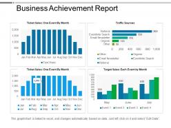
Make a report on the assignment in which the user is assigned the task to analyse a situation and apply business theories to produce a range of suggestions for the business improvements by using the business achievement report PowerPoint templates slideshow. Apply the characteristics of the performance indicator PowerPoint shape which assist the user in analyzing the business and management theories to implement the same into the practical situations as the business reports are all about the facts which demands ample of supply of the relevant data. Make a business report by taking the assistance provided along with the organization success research PowerPoint presentation to discuss about the information and taking decisions for the welfare of your company. Above all, by using the PPT slide, the user shall be able to make an effective and concise report on the achievements of your organization and assist you further while you are delivering the presentation. The distinct and integrated features of this PPT participates and walk hand to hand along with the presenter to draw the attention of your viewers and promote the popularity of your business which lets you and / or organization to enjoy appreciations and gain name and fame. Folks invariably find it easy to focus due to our Business Achievement Report Powerpoint Templates. It facilitates intense concentration.
People who downloaded this PowerPoint presentation also viewed the following :
Business achievement report powerpoint templates with all 5 slides:
Our Business Achievement Report Powerpoint Templates get the adrenaline gushing. The desire to achieve will grow big fast.


FAQs for Business achievement
So honestly, metrics are everything - leadership doesn't want fluffy "we did great" nonsense. Include an exec summary, your wins with actual numbers, what went wrong and how you fixed it. Timeline's pretty crucial too, plus who was involved and what resources you burned through. Oh and definitely throw in lessons learned - that stuff's pure gold for next time. Future goals section helps too. I'd start basic then tweak it based on what your boss actually cares about seeing.
Dude, visuals are a game changer for achievement reports. Charts help people get trends instantly instead of slogging through paragraphs of text. I swear executives just flip straight to the visual pages anyway! Color coding and icons guide readers to your biggest wins. Throw in some photos from team events - adds that personal touch. Just don't go overboard though. Too much competing for attention and you'll lose them. One solid chart per major win works great. Oh, and infographics break up all that dense text nicely.
Put your biggest wins right up front - people won't dig through pages to find the good stuff. Numbers are everything here. "Boosted sales by 23%" hits way harder than some vague "improved performance" nonsense. Break things into clear sections with headers like "Revenue Impact." Give quick context too so they know what problem you actually solved. Charts or simple visuals can help your numbers stand out. Oh, and make sure someone can skim the whole thing in under 2 minutes - attention spans are brutal these days. Lead with impact, back it with real data.
So basically every industry zeroes in on what their people actually care about. Healthcare orgs obsess over patient safety stuff and outcomes - makes sense, right? Tech companies are showing off user numbers and new features they launched. Manufacturing is totally different though, they're tracking production rates and quality metrics. Finance has to throw in all their compliance wins because regulations are insane in that space. Retail's more straightforward - sales numbers and how happy customers are. I'd honestly just look at what your competitors are putting in their reports and see what your investors typically ask about.
Honestly, visuals are what make your achievement report actually readable. Nobody wants to stare at spreadsheets first thing in the morning - trust me on this one. Charts and graphs turn your boring numbers into something that tells a story people can follow. Bar charts work great for showing growth. Pie charts are perfect for breaking things down. When stakeholders can see your progress at a glance, suddenly your wins become way more obvious. Plus you'll get those satisfying "wow" moments during presentations instead of blank stares. Makes the whole thing way more convincing than just throwing data at people.
Honestly, the worst thing you can do is dump way too much detail everywhere - just hit the results that actually moved the needle. Numbers are everything here because saying "big improvement" tells me literally nothing. Oh, and don't be that guy who takes all the credit when your whole team crushed it together. Structure this thing properly too - random order makes you look scattered. What gets your manager excited might put executives to sleep, so know your audience. Start with a solid template, then plug in only the wins that'll matter to whoever's eyeballs are on this.
So I'd do a split layout thing - maybe two columns or sections. Put your hard numbers (revenue, KPIs, whatever) on one side, then add text boxes for the story stuff on the other. The storytelling part is honestly way trickier than just throwing data around. Try prompts like "Key win:" then "Why it mattered:" to walk people through both pieces. Oh and leave plenty of white space - cramped templates suck. I learned this the hard way but start with one achievement per page first. You can always combine later once you figure out what actually works for your team.
Honestly, it depends what you're trying to prove, but I'd go with the basics first. Revenue growth and profit margins are obvious ones. Customer satisfaction scores matter too - plus retention rates since keeping existing customers is way cheaper than finding new ones. Productivity metrics show if your team's actually getting stuff done efficiently. Oh, and don't sleep on employee engagement data because miserable workers = crappy results. Market share growth is solid if you can get decent data on it. Really though, just pick 5-7 that actually connect to what you're trying to accomplish. Nobody wants to wade through 20 different charts.
Think of your reports like telling a story - what problem did you hit, how'd you solve it, what happened? Way more engaging than boring bullet points. Connect your actions to the actual results instead of just listing stuff. I picked this up from binge-watching documentaries (don't judge), but seriously, it works. Specific examples beat vague statements every time. Your stakeholders will actually remember the narrative instead of zoning out over random metrics. Makes the whole thing feel less like homework and more like... well, an actual story worth reading.
So basically, figure out who you're talking to first. Executives just want the big picture with clean charts - they're not diving deep. Department managers though? They need the nitty-gritty stuff they can actually do something with. Time matters too - if someone's swamped, lead with your best insights right away. Oh, and don't assume everyone knows what your metrics mean (I've seen VPs get lost on simple conversion rates, it's wild). Match how technical you get with what they can handle. Honestly, just make different versions for different people, or stack everything so the basic stuff's on top and details come after.
Honestly, I'd go with quarterly unless you're in something super fast-paced. Monthly just burns you out. Templates are a game-changer though - seriously saves so much time. Set up sections for your KPIs, wins, challenges, next steps, all that good stuff. Then you just drop in new numbers and update what happened. Way better than starting from scratch every damn time. Oh, and don't overthink the first template. Use it a few times, see what your boss actually cares about, then tweak it. I learned that one the hard way!
Word or Google Docs are probably your best bet for most business reports - super easy to format and add charts. Excel's great if you're dealing with tons of data, then just copy stuff over. PowerPoint works if you want it more visual/presentation-style. Canva makes things look really polished, though some people go overboard with it (you know the type). My advice? Pick one tool and make a template you can reuse every time. Trust me, you'll thank yourself later when you're not starting from scratch each month. It's honestly a game-changer for saving time.
So templates basically stop everyone from doing their own random thing, you know? Your sales and marketing teams will actually produce reports you can compare instead of completely different formats. Honestly, it's such a lifesaver - nobody has to start from scratch every quarter anymore. Leadership can spot trends way easier when the key sections and metrics stay the same across departments. I'd make one master template first that hits all the data points you actually need. Oh and don't overthink it - keep it simple so people will actually use it.
Honestly? Go customizable if you've got the time. Pre-made templates are quick but they make everyone's wins look the same - like you're all reading from the same script or something. You can't highlight what actually matters to YOUR team. Customizable ones let you switch up sections, throw in your branding, focus on metrics that count. Sure, takes longer to set up. But your achievements are worth showing off properly, right? Pre-made feels lazy when you've actually done cool stuff.
Just bake the feedback right into your template instead of trying to remember it later. Add sections for lessons learned, what went wrong, and a "what would we do differently next time" box. Honestly, the people actually doing the work always have the best insights - way better than whatever leadership thinks happened. Don't forget space for team input on where processes broke down. Oh, and throw in fields for next quarter's goals too. When feedback collection is built in like this, people actually fill it out instead of just... not doing it at all.
-
Much better than the original! Thanks for the quick turnaround.
-
Easy to edit slides with easy to understand instructions.