

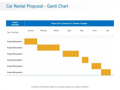
Car rental proposal gantt chart ppt powerpoint presentation infographic template slides




Try Before you Buy Download Free Sample Product
 Impress Your
 Audience
 100%
100% Editable
 Save Hours
 of Time


Our Car Rental Proposal Gantt Chart Ppt Powerpoint Presentation Infographic Template Slides are topically designed to provide an attractive backdrop to any subject. Use them to look like a presentation pro.
People who downloaded this PowerPoint presentation also viewed the following :
Car rental proposal gantt chart ppt powerpoint presentation infographic template slides with all 2 slides:
Use our Car Rental Proposal Gantt Chart Ppt Powerpoint Presentation Infographic Template Slides to effectively help you save your valuable time. They are readymade to fit into any presentation structure.
FAQs for Car rental proposal gantt chart ppt powerpoint presentation
For your Gantt chart, start with the obvious stuff - proposal deadline, client presentation, contract signing. Then add fleet setup, staff training, and your launch date. The initial client meeting should be first obviously. Regulatory approvals are honestly the biggest pain because they take forever and you can't predict them. Build buffer time between everything or you'll hate yourself later. I'd work backwards from when you want to launch - makes it easier to see if your timeline is actually realistic or just wishful thinking.
Gantt charts are honestly a lifesaver for car rental proposals. Map out your major milestones first, then chunk everything else underneath. You'll catch delays immediately - like if market research drags and messes up your financial timeline. Your team stays on the same page too, which prevents those awkward "wait, who's doing what?" conversations. I learned this the hard way on my last project actually. Track everything in real-time so when stuff goes wrong (and it will), you can pivot fast. Breaking down tasks visually just makes the whole mess way more manageable.
So for your car rental Gantt chart, start with research and market analysis - that's gonna be your biggest time suck. Then move into writing the actual proposal, pricing strategy, and stakeholder reviews. Honestly, the research phase always takes forever because you're digging into fleet stuff, competitor pricing, all that boring but necessary groundwork. Don't forget buffer time for revisions though! There's literally always last-minute changes no matter how perfect you think it is. Map out your deliverables and dependencies clearly. I'd build in at least a week for internal reviews before you submit.
So basically you want arrows connecting your task bars - most tools let you just drag and connect them. Like if "Fleet Analysis" has to wrap up before "Pricing Strategy" starts, draw that arrow between them. I'm obsessed with color-coding the critical path stuff in red, makes it pop. Your stakeholders need to see the bottlenecks right away, that's the whole point. Map out the absolute must-have connections first. Then worry about the other dependencies later if you have time.
Work backwards from your deadline - that's always my go-to move. Give yourself 2-3 weeks for stakeholder research and market analysis first. Then budget time for financial modeling, vendor negotiations, all that fun stuff. Honestly, I learned this the hard way but always add 20% extra time because something will definitely go wrong. Figure out your dependencies early too, like you can't finalize pricing until you get those vendor quotes back. The biggest mistake? Being overly optimistic about timelines. Set check-ins every few days so you catch problems before they snowball into disasters.
Here's what works for me - get everyone in a room to go through the Gantt chart together and hash out realistic timelines. Send it out beforehand so people actually show up prepared. Google Sheets works fine for this honestly, just let people drop comments on specific tasks. Monday.com is fancier but sometimes overkill. The thing is, these stakeholders know stuff you don't - like how long vendor approvals really take or when the budget meetings happen. Don't skip the follow-up meeting though, otherwise you'll get a million random email suggestions later.
Honestly, just go with whatever your team already knows how to use. Microsoft Project is powerful but kinda overkill unless you're doing complex stuff. Asana and Monday.com are way easier for team collaboration. Excel works totally fine too - I've seen people create decent Gantt charts there and it does the job. Smartsheet's nice because it's not as intimidating as Project but still has good features. One thing though - make sure you can export clean-looking visuals since clients eat that timeline stuff up. Don't stress about finding the "perfect" tool, you can always switch later if needed.
Honestly, I'd update it every few days during proposal phase - weekly is probably too slow. Things move crazy fast and client requirements shift constantly. Your team will find new dependencies, deadlines get moved around. I block like 15 minutes on Tuesdays and Fridays to adjust timelines and mark off what's done. Stakeholders always want current progress anyway, not old stuff. Oh and add any random tasks that come up (there's always something). Keep it current so people actually look at it instead of ignoring outdated charts.
Honestly, I'd focus on a few main things from your Gantt chart. Schedule variance is big - are you actually on track or falling behind? Task completion percentages give you the real picture too. Budget burn rate always stresses me out but it's super useful since you'll know if money's going out the door too fast. Don't forget milestone dates like client presentations - those are make-or-break moments. Critical path delays will mess up your whole timeline, so watch for those. The weekly check-ins are clutch for catching problems before they blow up your proposal deadline.
Honestly, Gantt charts are amazing for this stuff. You can see exactly when everyone needs what resources, so you avoid that nightmare where your market research team and financial analyst both need the same person. Color-coding different team members is clutch - you'll instantly spot when you're double-booking people or leaving weird gaps. The visual timeline thing really helps you catch bottlenecks before they become a problem. Like, you might notice your legal reviewer and proposal writer are scheduled simultaneously (oops). Then you can shuffle people around before everything goes sideways.
Oh man, the timeline thing gets everyone - I swear people think projects happen in a vacuum. Buffer time is your best friend because stakeholders will definitely throw curveballs you didn't see coming. Also don't make your chart look like a NASA blueprint, nobody reads those. Dependencies are sneaky too - like you can't sign that vendor contract until legal signs off, obvious but easy to miss. One thing I learned the hard way: actually talk to your team about how long stuff takes instead of guessing. Start with your big deadlines and work backwards from there.
Honestly, Gantt charts are perfect for this stuff. Break down your car rental proposal into actual tasks people can handle, then assign them out with real deadlines. No more of that awkward "oh wait, wasn't that your thing?" confusion. When your boss asks how it's going, you'll have this clear visual showing exactly where everything stands instead of just shrugging and saying "good, I think?" Start with the big milestones first. Then chop those up into smaller pieces your team can actually knock out. Trust me, stakeholders love seeing progress they can actually understand - makes everyone look more professional.
So for your Gantt chart, I'd add a swim lane just for risks or color-code stuff - red for high risk like vehicle delays, yellow for medium. Works pretty well. Buffer time after sketchy tasks is clutch, trust me on this one. Milestone markers help too where you can pause and check if anything's going sideways. The whole point is making risks super obvious so nobody gets caught off guard in meetings. Oh, and definitely add a legend explaining your colors - otherwise people just stare at your pretty rainbow chart confused.
Gantt charts are honestly your best bet for this - I've seen tons of car rental proposals and they all break things down into fleet acquisition, staff training, and system setup phases. Enterprise and Budget nail this approach. Here's the thing though: don't go crazy with tiny micro-tasks (trust me, been there). Focus on big milestones instead. You want realistic buffer time between each phase. The smart proposals show they get how everything connects - like you can't launch marketing until you've got cars and trained staff ready to go. Makes you look like you actually understand the business instead of just throwing together random timelines.
So I always add review checkpoints every week or two where everyone can jump in and give feedback. Buffer time after big phases is clutch - trust me, someone will want changes. Use those dependency arrows to show how feedback loops back to earlier stuff that might need fixes. Color-coding helps too - mark which tasks depend on feedback vs. the ones that are set in stone. Oh, and make those review meetings actual calendar blocks, not just "we should probably check in sometime" situations. Otherwise people flake and you're stuck scrambling later.
-
Best way of representation of the topic.