


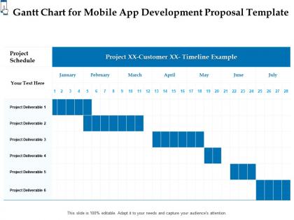
Gantt chart for mobile app development proposal template ppt powerpoint infographics




Try Before you Buy Download Free Sample Product
 Impress Your
 Audience
 100%
100% Editable
 Save Hours
 of Time


Our Gantt Chart For Mobile App Development Proposal Template Ppt Powerpoint Infographics are topically designed to provide an attractive backdrop to any subject. Use them to look like a presentation pro.
People who downloaded this PowerPoint presentation also viewed the following :
Gantt chart for mobile app development proposal template ppt powerpoint infographics with all 2 slides:
Use our Gantt Chart For Mobile App Development Proposal Template Ppt Powerpoint Infographics to effectively help you save your valuable time. They are readymade to fit into any presentation structure.
FAQs for Gantt chart for mobile app development proposal template
So basically, Gantt charts are like a visual timeline for your whole project. You can see which tasks happen when and how they're all connected. Super helpful for spotting problems before they blow up - trust me on this one. They show dependencies between different tasks, help you track where you're at, and keep everyone on the same page about deadlines. Honestly way better than trying to juggle everything in your head or some messy spreadsheet. Just try making a simple one for your next project and you'll get why people are obsessed with them.
Honestly, Gantt charts are a lifesaver for avoiding those awkward "I thought you were doing that" conversations. Your whole team can see who's working on what and when stuff's due. Plus if someone gets behind - like Sarah's running late on design - the developers immediately know their timeline might get pushed. I update mine every week and drop it in our Slack channel (saves me from answering the same questions over and over). You'll catch problems way earlier too. Way better than those painful status meetings where everyone just stares at each other. Trust me, it's worth the setup time.
So basically you need your tasks listed down the left side, then a timeline across the top with bars showing how long each thing takes. Dependencies are super important too - those are the lines connecting tasks that can't start until others finish. Most people skip that part and then wonder why their timeline makes no sense lol. Milestones help mark big deadlines. Assign people to tasks so everyone knows what they're doing. Oh and if your software shows the critical path, definitely use it. But honestly? Start with just tasks and dates first, then add the fancy stuff once you get the hang of it.
Honestly, there's so much you can do with Gantt charts! Time scale is probably the first thing - switch between hours, days, months, whatever fits. Color-coding helps too, like by team or priority level. Just don't go crazy with rainbow colors because nobody wants to decode that mess. Dependencies are super useful for showing which tasks block others. You can throw in custom columns for budget stuff, resources, milestone markers - basically anything your team actually needs to track. Progress bars showing completion percentages are nice if people remember to update them. Start basic though, then add features as you go.
Okay so Gantt charts are basically visual timelines for your whole project. You can see when stuff needs to get done and how tasks connect. The cool thing is you'll catch delays early - like if one thing runs late, you know exactly what else gets pushed back. Those milestone markers are clutch too, they mark your big deliverables. Way better than trying to remember deadlines from random emails (been there). I'd set it up at the start and update weekly. Trust me, beats keeping everything in your head.
So there's Microsoft Project, Asana, Trello (needs Power-Ups though), Monday.com, and Smartsheet. They've all got the usual stuff - drag-and-drop scheduling, dependencies, resource tracking. Excel works if you're into that retro vibe, but honestly why torture yourself? The dedicated tools give you real-time updates and automatically shift things when deadlines change, which is clutch. Asana's got a solid free version. Project's better for really complex stuff but can be overkill. I'd just grab a few free trials and see what doesn't make you want to throw your laptop out the window.
Totally! Gantt charts work great with Agile if you don't overthink it. Use them for the big picture stuff - releases, epics, cross-team dependencies. Don't get crazy mapping every user story though, that's where teams screw up. Keep your sprints loose and flexible. I honestly think Jira handles this combo really well, Monday.com too. Map out your major milestones first, then see how it feels. The key is staying high-level - you're not trying to plan every detail months ahead. Once you find that balance, it clicks.
Honestly, it's all about who you're talking to. Executives just want the big picture - major milestones, key phases. They'll tune out if you show them every little task. Your actual team though? Break stuff down into 1-3 day chunks max so they know what to tackle next. I made this mistake once and created a Gantt chart that looked like someone spilled pasta all over it - total mess. Here's my rule: zoom out to see your whole timeline. Can you still read everything? If not, you've gone way too detailed. Start high-level first, then drill down only where people actually need it.
Gantt charts are honestly a pain to keep updated - that's your biggest headache right there. Complex dependencies make everything look like a total mess too. I've seen project managers just give up on them entirely because they're so overwhelming. Here's what actually works: make updating them part of your weekly meetings so it's not this huge separate task. Break big projects into chunks and do separate charts for each phase. Color coding helps a ton. Oh, and during regular team check-ins, just show the current sprint stuff - nobody needs to see the whole timeline every single time.
Honestly, Gantt charts are like a cheat code for spotting resource mess-ups. Color-code your people and you'll instantly see who's drowning while others twiddle their thumbs. The timeline view makes overlapping tasks super obvious - way better than staring at spreadsheets all day (ugh). When you spot someone getting slammed with three deadlines, just drag tasks around to balance things out. I swear it's the closest thing to x-ray vision for project managers. You'll catch bottlenecks before they wreck your schedule and actually make smart decisions about who should do what.
Think of dependencies as the real meat of your Gantt chart - they show which tasks have to finish before others can even start. You'll want to map these out first since they basically control your whole timeline. Otherwise you're just staring at random bars that don't connect to anything, which is pretty useless honestly. These relationships help you catch bottlenecks early and see how one delayed task screws up everything downstream. Plus you can spot where there's wiggle room to speed things up. Start with your "this absolutely has to happen first" tasks, then build from there.
Focus on the big stuff - major milestones and key deliverables, not every little task. Color coding is your friend for showing different teams or priorities. I learned this the hard way after overwhelming execs with way too much detail once. Show the big picture first, then zoom into whatever phase they actually care about. Don't use technical jargon - just say "we can't start testing until development's done" instead of some fancy dependency explanation. What really matters? Highlight what's on track vs. what's going sideways. Stakeholders want to spot problems fast and understand timeline impacts without squinting at your chart.
Honestly, the two big traps are making it way too complex and thinking everything will go perfectly on schedule. Don't jam a million tiny tasks in there - it just turns into clutter nobody wants to look at. Dependencies are huge though, that's usually where stuff falls apart. I learned this the hard way on my last project lol. Build in buffer time because real life is messy and things always take longer than you think. Keep updating it too, otherwise you're just staring at fantasy dates that mean nothing. Simple beats fancy every time.
Honestly, go with cloud tools like Asana or Monday - way easier when everyone's scattered around. Real-time updates are a lifesaver. You'll need way more detail in your task descriptions though, since you can't just walk over and ask "wait, what did you mean by this?" I'm obsessed with color-coding by team member lately. Super helpful. Mark your time zones clearly if people are spread out, and maybe add some buffer time because async communication always takes longer than you think. Oh, and make everything stupidly explicit - more than feels necessary in person.
Honestly, Gantt charts are pretty solid when you've got a bunch of dependencies to track. Like, you can see right away what's blocking your team and who's swamped with work - way clearer than those kanban boards for that kind of stuff. But here's the thing - they turn into a hot mess once your project gets complicated. And don't even get me started on updating them every time something changes (which is constantly). They're great for traditional projects with fixed deadlines, but if you're doing agile work where everything shifts around? Skip it. Go with something simpler that won't make you want to pull your hair out.
-
Editable templates with innovative design and color combination.
-
Excellent design and quick turnaround.
-
Qualitative and comprehensive slides.