


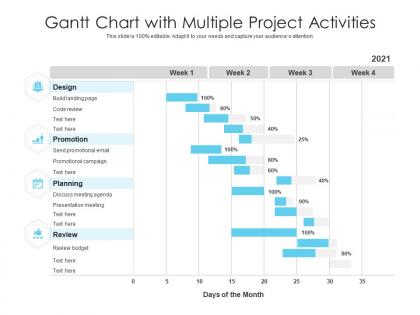
Gantt chart with multiple project activities




Try Before you Buy Download Free Sample Product
 Impress Your
 Audience
 100%
100% Editable
 Save Hours
 of Time


Our Gantt Chart With Multiple Project Activities are topically designed to provide an attractive backdrop to any subject. Use them to look like a presentation pro.
People who downloaded this PowerPoint presentation also viewed the following :
Gantt chart with multiple project activities with all 2 slides:
Use our Gantt Chart With Multiple Project Activities to effectively help you save your valuable time. They are readymade to fit into any presentation structure.

FAQs for Gantt chart with
So you'll need tasks broken into smaller pieces, a timeline, dependencies, and some way to track progress. Plot everything on a horizontal timeline with clear start/end dates. Dependencies are huge - they show what has to finish before other stuff can start. Most people totally bomb this part and wonder why their schedule's impossible. Oh, and definitely add milestones for big deliverables. Resource assignments help too so nobody's confused about who does what. Make sure you can actually update it as work gets done - otherwise it just sits there being useless.
Honestly, Gantt charts are game-changers. They show everything visually - tasks, timelines, dependencies - so you can see what's behind schedule and how that'll mess with other stuff. No more confused team meetings where everyone's like "wait, what am I doing again?" Resource conflicts become super obvious early on. Adjusting deadlines gets way more realistic when you see the whole picture. Plus stakeholders actually understand your updates instead of glazing over at spreadsheet chaos. I was skeptical at first, but seriously - try one on your next project. Everything just clicks into place.
Gantt charts are awesome for projects where tasks follow a sequence - like construction or software dev where step A has to happen before step B. Great for showing timelines to clients too. I've watched people jam them into every single project though, which is overkill honestly. They get super cluttered with creative work or anything too flexible. Best bet? Use them when you've got clear phases, real deadlines, and multiple people coordinating. Construction teams love these things for good reason. Just pick something simple first to see if it clicks for your workflow.
Honestly, just think about what you actually need first - how big's your team, what's your budget, how crazy are your projects? Excel or Google Sheets work fine for basic stuff, but trust me, proper project tools are so much less annoying. Bigger teams should check out Microsoft Project, Asana, or Monday.com. Do you need people collaborating in real-time? Resource tracking? Does it play nice with your other software? Most have free trials anyway, so just try a few out. The best tool is whatever your team will actually stick with using.
So basically, Gantt charts are visual - they show your timeline as horizontal bars instead of boring text lists. Way easier to spot overlaps and see how long stuff takes. Regular schedules have the same info but you gotta do math in your head to figure out timing. It's honestly like watching a movie vs reading the script, you know? If you're juggling multiple people or deadlines, go with the Gantt chart. Trust me, you'll spend way less time explaining things in meetings. Though I'll admit, sometimes I still just scribble tasks on sticky notes like a caveman.
Oh, milestones are super easy! Just set up tasks with zero duration and your software will automatically make them those diamond shapes. I always put mine at the big moments - like when a phase wraps up or we need client sign-off. Honestly, don't go crazy with them though. Pick the stuff that actually matters, not every tiny thing. Your team needs those clear targets to aim for, and it makes tracking whether you're on schedule so much simpler. Most Gantt tools have a dedicated milestone button that does the work for you.
Don't go crazy with details right away - major milestones first, then fill in later. I made the mistake of setting dream timelines that looked good on paper but were totally unrealistic lol. Buffer time is clutch because something always goes wrong. Dependencies between tasks will bite you if you ignore them. Weekly check-ins are non-negotiable or your chart becomes useless fast. Oh, and honestly? Simple beats complex every time when you're starting out. You can always add more as things get clearer.
Honestly, Gantt charts are pretty great for keeping everyone on the same page. Everyone can see who's working on what and when stuff is due. The dependencies thing is clutch - like, you'll know if Sarah's delay means your part gets pushed back too. No more awkward check-ins where you're like "so... how's that coming along?" The trick is getting people to actually update their progress though. I've seen teams create these beautiful charts that just sit there gathering digital dust while everyone goes back to Slack chaos. But when teams stick with it? Total game changer for avoiding those "wait what?" moments.
Honestly, I'd go with weekly check-ins - bi-weekly if your team's super reliable (which, let's be real, is rare). Get some project management software that syncs with your Gantt chart instead of doing spreadsheet hell manually. Trust me on that one. Make progress updates a regular agenda item every meeting so people actually remember to do them. Set up automated reminders too because everyone forgets otherwise. The biggest thing though? Give each person ownership of their specific tasks. When someone's name is attached to something, they're way more likely to keep it updated. Makes it routine instead of this thing people dread doing.
Oh man, colors are a total game-changer for Gantt charts! I usually do red for overdue stuff, green for completed tasks, maybe blue for different departments. Your eyes can just zip across and instantly get what's happening instead of squinting at boring black text. Though honestly, I made the mistake once of using like 8 different colors and it looked like a kindergarten art project - not cute. Keep it simple with maybe 3-4 colors max. And definitely throw in a legend so people aren't guessing what purple means!
Yeah totally! Some agile die-hards will roll their eyes, but Gantt charts actually work fine if you're smart about it. Just don't try doing those massive 6-month timeline things. Stick to sprint-level stuff - like 1-4 weeks max. They're honestly pretty great for seeing how everyone's work connects and spotting where things might get stuck. I use them mainly for release planning and tracking user stories within sprints. The trick is keeping them super flexible and updating them constantly. Think of it more like a living sketch that changes with your team, not some set-in-stone plan your PM printed out and laminated.
Honestly, Gantt charts are a lifesaver for keeping everyone on the same page. No more "wait, what's the deadline again?" panic moments. People actually buy into the project when they can see how their work connects to everything else. Plus stakeholders can catch problems early instead of freaking out later when budgets are blown. Best part? Way fewer "hey what's the status" texts cluttering your inbox. Just don't let it get outdated or people will ignore it completely and you're back to square one. I learned that one the hard way on my last project.
So for dependencies, just use arrows connecting your tasks - way easier than trying to explain it in text. Most of the time you'll use finish-to-start (one task ends, next one begins). There's also start-to-start and finish-to-finish, but honestly those are less common. The drag-and-drop thing in most Gantt tools is pretty slick - just connect the tasks and boom, you're done. I'd definitely use different colors or line styles for each type though. Your team will thank you later when they can actually read the chart without squinting at tiny arrows everywhere.
Microsoft Project is your best bet - it's basically the industry standard and has templates for everything. Smartsheet and Monday.com have really nice ones too, super clean looking. Excel actually has some decent Gantt templates if you're broke (though they're pretty basic). Asana and Trello work great for smaller teams but are more simplified. Honestly, I'd just start with whatever your team's already using since switching platforms is always a pain. You can always move to something fancier like Smartsheet later if you need to impress clients with prettier charts.
Oh yeah, Gantt charts work with pretty much anything! I've seen people use them for Agile sprints - just map out your user stories and show how they connect. Scrum teams love tracking deliverables across iterations this way. Kanban's actually perfect since workflow stages translate nicely into dependencies. Honestly, even old-school waterfall projects look cleaner with a visual timeline. The key is figuring out what actually matters for your team first. Don't try cramming everything in there - pick your main milestones and build around those. Way less overwhelming that way.
-
It saves your time and decrease your efforts in half.
-
Very unique, user-friendly presentation interface.
-
Editable templates with innovative design and color combination.
-
Unique research projects to present in meeting.