


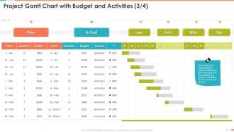
Project Gantt Chart With Budget And Activities Plan Project Management Bundle





Try Before you Buy Download Free Sample Product
 Impress Your
 Audience
 100%
100% Editable
 Save Hours
 of Time


Our Project Gantt Chart With Budget And Activities Plan Project Management Bundle are topically designed to provide an attractive backdrop to any subject. Use them to look like a presentation pro.
People who downloaded this PowerPoint presentation also viewed the following :
Project Gantt Chart With Budget And Activities Plan Project Management Bundle with all 6 slides:
Use our Project Gantt Chart With Budget And Activities Plan Project Management Bundle to effectively help you save your valuable time. They are readymade to fit into any presentation structure.





FAQs for Project Gantt Chart With Budget And Activities Plan
So you'll want your tasks running down the left side, timeline across the top. Then just draw horizontal bars showing when each thing happens and how long it takes. Dependencies are the tricky part - those arrows connecting tasks that can't start until something else finishes. Most people skip these at first but they're honestly what makes or breaks your timeline. Add some diamond shapes for big milestones and assign who's doing what. Oh, and don't go crazy with your first chart - I made that mistake. Keep it simple then add more detail once you get the hang of it.
Honestly, Gantt charts are game-changers for staying organized. You get this visual timeline showing exactly what's happening when, which makes spotting problems way easier. No more digging through a million emails to figure out who's supposed to be doing what (thank god). Dependencies become super obvious too - like you'll actually see which tasks are holding everything else up. Status meetings? Way shorter since people can just check progress themselves. Oh, and I'd definitely start with a basic template - throw in your big milestones first, then add the smaller stuff later.
Gantt charts are clutch for complex projects with tons of moving pieces - think construction, software builds, or big events. Multiple team members, dependencies between tasks, that whole mess. They're amazing when stakeholders won't stop bugging you about deadlines because you can literally point to the chart. But honestly? Total waste of time for basic to-do lists. The real magic happens when you can see how one delayed task screws up everything downstream. I learned this the hard way on a project last year. Worth the setup time if you've got enough complexity to justify it.
So for Gantt charts - Microsoft Project is still the heavyweight champion, but it's honestly way too much unless you're running massive projects. I'd probably go with Smartsheet or Asana first since they're way easier to use and your team won't hate you for it. Monday.com is pretty slick too. Oh, and if budget's tight, GanttProject does the job for basic stuff. Here's the thing though - just check what project management tools you're already using because most of them throw in Gantt features now anyway. Why reinvent the wheel, you know?
Yeah totally! Gantt charts work with whatever you're already doing. Sprint planning in Agile? Just map your sprints on the timeline so you can see how everything connects. Waterfall's even easier since it's already sequential - honestly those two were made for each other. Kanban's a bit weird but you can still use Gantt views to track when stuff needs to move through your board. I think of them more like a visual layer that sits on top of your process, not something that replaces it. The timeline clarity is huge for stakeholder updates though. Worth trying on your next project to see if it clicks.
So the main thing that kills Gantt charts? Cramming way too much detail in there - it just turns into this unreadable mess. Don't make your timeline super rigid either. Build in buffer time because honestly, everything takes longer than you think it will. Dependencies are another pain point - if you're not updating them regularly, you'll have tasks that look ready to go but are actually stuck waiting on something else. Oh, and resist going overboard with every tiny subtask. Keep it high-level enough that people can actually follow along. Start simple, then add more complexity later if you actually need it.
So you can mess with the timeline scale and throw in custom columns for whatever data you actually need. Color-coding is clutch - do it by priority, team, whatever makes sense. Most tools let you tweak task dependencies and add milestones too. Resource allocation stuff is helpful if you're tracking that. Honestly I get a bit obsessive about the colors lol. But real talk - figure out what you're actually trying to track first. Budget? Resources? Just deadlines? Build around that. Don't go crazy with features right away though. Start basic, then add stuff once your team isn't completely lost.
Honestly, color coding your Gantt chart is what separates the pros from the amateurs. Different colors for phases, team members, priority levels - whatever makes sense for your setup. I tend to go overboard initially but you'll figure out what works. Consistency matters more than being fancy though. People shouldn't need to constantly check your legend to understand what's happening. Three or four main colors is a solid starting point. My old boss used to say charts should tell a story at first glance - sounds cheesy but it's actually true.
Honestly, Gantt charts are a game-changer for team stuff. Everyone can see who's doing what and when deadlines hit. No more awkward check-in messages asking where things stand - delays become pretty obvious to everyone. The visual timeline helps people understand how their work connects to other tasks, which is way better than digging through email chains or random spreadsheets (those always turn into a mess anyway). Most people just get it faster when they can see the whole project laid out. Set up one shared chart that everyone can jump into and update as they go.
Look, static Gantt charts are basically just pretty pictures - totally useless when things change. Interactive ones actually let you drag tasks around, update progress on the fly, and see detailed info with a quick click. Your whole team can jump in, leave comments, make changes that everyone sees right away. Way better than rebuilding charts every time your boss decides to flip priorities (again). I'd start with something simple like Asana or Monday.com - they're not overwhelming but still get the job done. Trust me, once you go interactive you won't go back to those screenshot-style charts.
Honestly, Gantt charts are lifesavers for keeping track of everything. They show your whole project timeline visually - each task gets its own bar showing how long it'll take. Way better than having stuff scattered everywhere or trying to remember it all. The cool part is spotting problems before they blow up your schedule. Like if one task runs late, you'll see exactly which other ones get screwed over. I learned this the hard way on my last project lol. Update yours every week or so, otherwise you're just flying blind until everything's on fire.
Okay so basically Gantt charts are like your project timeline - they show when stuff needs to happen and how tasks connect to each other. Super helpful when deadlines actually matter and you've got dependencies to juggle. Kanban boards? Totally different vibe. They're more about tracking what's happening right now - moving tasks from "To Do" to "In Progress" to "Done." Way better for ongoing work where you just need to keep things flowing. I'd go Gantt for anything with firm deadlines (honestly saved my butt on a few big projects). Use Kanban when you're managing day-to-day stuff and need that visual workflow.
Gantt charts are honestly a game-changer for catching resource conflicts early. Plot your team members right alongside project tasks and you'll instantly see who's overbooked or sitting around with nothing to do. When someone's running at 150% while their teammate's at 60%, the visual makes it painfully obvious. I mean, it beats scrolling through endless spreadsheets trying to figure out why everything's falling behind. Short bursts make bottlenecks pop out immediately. You can shuffle assignments or tweak deadlines before things get messy. Seriously, try mapping people with tasks next time - the conflicts just jump out at you.
Honestly, Gantt charts turn into a nightmare once you hit like 20+ tasks with dependencies everywhere. I swear you'll waste half your day just moving boxes around instead of doing real work. Resource conflicts? Yeah, they don't catch those - learned that the hard way when I double-booked my whole team last month. Scope changes are brutal too since the whole thing goes rigid on you. My advice? Use a Kanban board alongside it, or maybe grab a proper resource tool. Way less headache that way.
Honestly, Gantt charts are a game changer for keeping stakeholders happy. They can see exactly what's happening and when without you having to explain everything twice. The visual makes it super obvious how tasks connect - like why X has to finish before Y can even start. When something goes sideways (which, let's be real, always happens), you can instantly show them how it affects everything else downstream. I started bringing mine to status meetings and now spend way less time fielding random questions about timelines. Pro tip: stakeholders love seeing resource allocation laid out clearly too. Makes them feel like you actually know what you're doing.
-
Graphics are very appealing to eyes.
-
Excellent Designs.