


Gantt chart presenting construction project management process




Try Before you Buy Download Free Sample Product
 Impress Your
 Audience
 100%
100% Editable
 Save Hours
 of Time


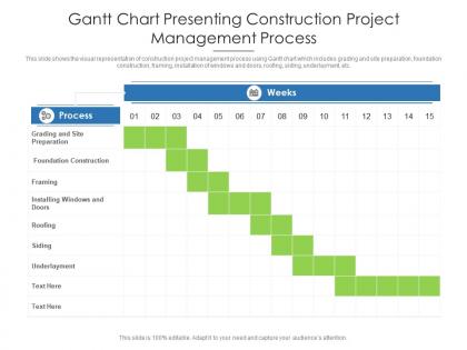
This slide shows the visual representation of construction project management process using Gantt chart which includes grading and site preparation, foundation construction, framing, installation of windows and doors, roofing, siding, underlayment, etc.
People who downloaded this PowerPoint presentation also viewed the following :
Gantt chart presenting construction project management process with all 2 slides:
Use our Gantt Chart Presenting Construction Project Management Process to effectively help you save your valuable time. They are readymade to fit into any presentation structure.

FAQs for Gantt chart presenting construction
So basically it's like a visual timeline that maps out all your project tasks and shows how long each one takes. You can see which tasks depend on others and spot overlaps too. Honestly? Game changer for keeping track of what's behind schedule and what's coming up next. I used to think they were just corporate nonsense but they actually make life way easier. You'll catch bottlenecks before they become real problems. Start simple though - just use Excel or Google Sheets instead of jumping into expensive software right away.
Think of a Gantt chart as your project's visual timeline - way better than trying to keep everything in your head. Every task gets a horizontal bar showing start dates, duration, and deadlines. You'll spot overlapping work and dependencies instantly. Honestly, it's perfect for when your boss asks about delivery dates because you just show them the chart instead of rambling through explanations. Plus you can catch potential bottlenecks early and shift things around before stuff hits the fan. Makes project management actually manageable, if that makes sense.
So for your Gantt chart, definitely include task names, start/end dates, and how long each thing takes. Dependencies are huge too - like which tasks can't start until others finish. I always add milestones and assign people to stuff so there's no confusion about who's responsible. Progress tracking is pretty essential. Honestly, color coding saves so much time when you're trying to find something quickly - maybe by team or project phase? Oh and seriously, build in buffer time because things always take longer than you think. Just don't make it so complicated that people avoid using it entirely.
Yeah, definitely! Construction projects work best when you map out those step-by-step dependencies - like you can't pour concrete before the foundation's ready, right? Software teams usually prefer sprints, though some devs think Gantt charts are way too rigid (I get it). Marketing campaigns need tons of milestones since everything overlaps. Creative work? Build in buffer time because inspiration doesn't follow schedules. The trick is matching your breakdown to how your team actually operates. Don't overthink it - grab a basic template and tweak the detail level based on what your stakeholders want to see.
So for Gantt charts, Microsoft Project is still king if you need the heavy-duty stuff - dependencies, resource management, all that. But honestly? It's overkill for most teams. Asana and Monday.com are way more user-friendly and have solid collaboration features. Trello works too if you use their timeline view. Smartsheet's decent if you're a spreadsheet person (which I totally get). Hell, even Excel works but it's pretty painful for anything complex. I'd start with Asana or Monday.com - they're intuitive and you won't spend weeks learning them. Grab a free trial first.
Honestly, Gantt charts are a game changer for keeping everyone on the same page. You can see who's working on what and when stuff's actually due. No more awkward "hey, where are we on that thing?" Slack messages every day. Dependencies become super obvious too - like if Sarah's waiting on you to finish something before she can start her part. I was skeptical at first, but it really does cut down on those endless status meetings. Try throwing your next project into one of those simple Gantt tools and see what happens. You'll probably spot problems way earlier than usual.
Honestly, Gantt charts are game-changers because you can see everything at once - timeline, dependencies, progress. No more hunting through messy spreadsheets. When things go sideways (which, let's be real, always happens), you'll instantly spot how delays mess with other tasks. Your stakeholders will actually get what's going on too, instead of glazing over during updates. I started using Monday.com last year and wow, the difference was immediate. Try it on something small first - maybe your next project? The visual layout just clicks in a way lists never do.
Honestly, I'd update it weekly or whenever something big changes in your project. Don't just create it and abandon it - that's where people mess up. Track your actual progress vs what you planned, then adjust task lengths when stuff takes longer than expected. Move around the dependent tasks too. I totally ignored mine for like a month once and it was chaos when I finally looked at it again. Set a calendar reminder so you don't forget - consistency really matters here. Oh, and definitely tell your team about changes so everyone's on the same page.
Honestly, Gantt charts are lifesavers for this stuff. They show you exactly when everyone's swamped vs. when they're free. Like, you'll catch those moments where Sarah somehow got triple-booked (we've all been there). The timeline makes it super obvious where you have gaps to squeeze in more work or when you desperately need extra hands. I always color-code by person - makes scanning for bottlenecks way easier. Oh, and you can actually see how wrong your time estimates were, which is... humbling. But seriously, it prevents so many scheduling disasters before they happen.
Honestly, the biggest pain is visual chaos - complex projects turn into these insane spider webs that hurt to even look at. You'll be constantly tweaking dates and connections whenever anything changes (which is literally all the time). Resource conflicts are another blind spot - the chart won't tell you when Sarah's scheduled for three meetings simultaneously. I learned this the hard way on my last project, spent hours just maintaining the thing. Better approach? Use Gantt charts for your big milestones and overall timeline, but grab other tools for the nitty-gritty daily tracking stuff.
Break each task into smaller pieces first. Then estimate based on what you've done before or ask your team. Always tack on 10-20% extra time - trust me, stuff always takes longer than you think it will. Look at your team's workload and what tasks depend on each other. External stuff can mess things up too. Here's the thing though - be realistic about timing, not optimistic. Your first guesses will probably be off, but that's fine. Just adjust as you learn more. Honestly, I used to be terrible at this until I started actually tracking how long things took.
Yeah, totally doable but you gotta make some adjustments. Traditional Gantt charts are super rigid with those fixed timelines, so adapt them for your sprints instead. I've actually seen teams crush it using Gantt for release planning - tracking epics across multiple sprints works better than you'd think. Keep it flexible though, update regularly when priorities inevitably shift (because they always do). Focus on the bigger milestones, not every tiny daily task. Dependencies between user stories become way clearer when visualized. Honestly worth trying in your next release planning session.
Honestly, the worst thing you can do is go crazy with detail right from the start. You'll be updating that thing constantly and it becomes a nightmare. Dependencies are huge too - if you don't map out what needs to happen before what, your timeline will be completely off. I've definitely been guilty of making these beautiful charts that I never touch again after week one. Time estimates? Always add buffer time because something will go wrong. Trust me on this one. Don't try tracking every little thing either - stick to the big milestones and key deliverables. Keep it simple initially, then build complexity only when you actually need it.
Honestly, less is more with Gantt charts when you're presenting to stakeholders. They don't want every tiny task cluttering up the view. Show them the critical path, big milestones, and any delays that'll actually hit them. I made this mistake once - totally buried some execs in ridiculous detail and their eyes just glazed over. Color coding works great for showing progress status. Walk them through it instead of just emailing the chart over. The verbal context you give makes all the difference. Oh, and make your timeline realistic or you'll be explaining why everything's behind schedule later.
So milestones are basically your major checkpoints - think project deadlines, big deliverables, that kind of stuff. They don't actually take time like regular tasks do, but they're super useful for breaking down huge projects into smaller pieces. Honestly, they're like anchors that keep everything organized. When I'm setting up a Gantt chart, I always start with the big milestones first, then work backwards to figure out what tasks I need to hit each one. Makes the whole thing way less overwhelming, and your team actually knows what they're working toward instead of just... doing random stuff.
-
Professional and unique presentations.
-
Easily Editable.
-
Easily Understandable slides.
-
Perfect template with attractive color combination.