


Career progression diagram presentation images




Try Before you Buy Download Free Sample Product
 Impress Your
 Audience
 100%
100% Editable
 Save Hours
 of Time


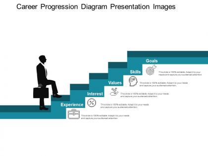
Smart employers know that investing in workers yields them benefit in the long run. So to help their employees see their potential career path, employers can make use of career progression diagram presentation images. We have created career growth steps PPT presentation to help you lay down all the aspects of career paths for your employees. This PPT presentation comprises of everything you need to share with your employees regarding their experience, interest, values, skills, and goals. This career steps PowerPoint PPT model can be used for current job pool and professional and managerial career tracks. The information presented in our PPT slide is in our easy-to-understand format and high-quality graphics presentation. We all know how laborious and tedious can preparation of PPT from scratch become. But this is not the case when you make use of the slide designed by us. We’ve done all the hard work for you. Our PPT slides allow you to create professional and attractive presentations even if you’ve never created a PowerPoint slide before. The slides are vector-based, and so they are easier to customize. Create grounds for faster development with our Career Progression Diagram Presentation Images. It helps escalate growth.
People who downloaded this PowerPoint presentation also viewed the following :
Career progression diagram presentation images with all 5 slides:
Enthuse them with our Career Progression Diagram Presentation Images. Break through the initial diffidence.
FAQs for Career progression
Definitely include job titles and what skills you need for each level. Salary ranges are huge - honestly, that's what most people care about first. Show the typical time between promotions and be super clear about advancement criteria. Don't just do the obvious vertical moves either. Lateral moves to other departments matter too, plus any certs or degrees they'll need. The soft skills part gets trickier as you climb up - communication, leadership stuff. Oh, and make it visual somehow! A boring text document won't help anyone actually plan their next steps.
So a career progression diagram is like a roadmap showing all the ways you can move up or around in your company. Picture a flowchart with your current job connected to other roles - promotions, lateral moves to different departments, maybe even paths you hadn't thought of. Honestly, some companies have way more options than you'd expect. It shows job titles, what skills you need, and how everything connects. Super helpful for figuring out what training or experience you'll need next. Gives you something concrete to aim for instead of just hoping for the best.
Honestly? Just go with Lucidchart or Visio - both have solid templates for career paths and you can actually update them without wanting to throw your laptop. Miro's pretty slick too if you need multiple people editing at once. I mean, even PowerPoint works if you're not trying to get too fancy with it. The main thing is picking something your whole team can figure out later, because these things are gonna change constantly. Oh and definitely start with Lucidchart's free version first - no point paying for features you might not even need.
Look at actual job postings in your field first - that's where you'll find the real progression paths. Tech might go developer → senior dev → tech lead → engineering manager, while healthcare maps more like nurse → charge nurse → manager → director. Honestly, scrolling through LinkedIn profiles is clutch for this stuff. Don't forget industry certs and realistic timelines too. Pick maybe 3-4 main career tracks and map out 5-6 levels each. Oh, and throw in salary ranges if you can find decent data - people always want to know what they're working toward money-wise.
Dude, career progression diagrams are seriously underrated. They show your team exactly what skills and experience they need for their next role - no more awkward "we'll see what happens" conversations. People actually get excited when they can visualize their future growth path instead of just reading some dry job description. You'll spot skill gaps way earlier and can plan better training around them. Plus your good employees won't feel stuck wondering if there's anywhere to climb. Oh, and definitely start with just one department first - don't go crazy trying to map everyone at once.
So pull up those career progression diagrams during your one-on-ones - they're game changers. Walk through exactly what skills and experience they need for their dream role. Way better than the usual "just keep doing great work" nonsense that helps nobody. People actually *see* their next steps instead of getting vague advice. Plus you can spot gaps in their path right there and build real development plans together. Oh, and do this quarterly so you're both tracking actual progress - I learned that one the hard way when I forgot to follow up for like 8 months once.
Honestly? The worst thing you can do is make it super linear. Real careers are messy - people move sideways, sometimes even backwards for strategic reasons. I'd skip the rigid hierarchy thing entirely. Include stuff beyond just promotions too. Maybe someone grows by leading bigger projects or developing new skills, not climbing titles. Oh, and don't go crazy with arrows and branches everywhere - that just confuses people. You want someone to look at it and instantly get their options. Definitely run it by actual employees first though. They'll spot issues you missed.
So entry-level ones are super detailed - like "learn this software, get that cert, hit these benchmarks." Way more hand-holdy. Executive diagrams? Totally different vibe. They're all about big-picture stuff like managing stakeholders and owning P&L (which honestly sounds terrifying to me lol). The timelines are nuts too. Junior roles might show 6-month jumps, but executive paths are like 3-5 years between moves. Makes sense though - you can't exactly fast-track someone to VP. When you're making these, just think about where people actually are. Don't give a new grad some vague "develop strategic vision" nonsense.
Dude, get a mentor and start networking now - trust me on this. Think of it like having GPS instead of wandering around lost. A good mentor shows you all the unwritten rules nobody talks about, plus which moves actually matter for getting ahead. Your network? They'll tell you what jobs are really like behind the fancy titles. I mean, half the time it really is about who you know opening doors (annoying but true). Without these people, you're just guessing your way through career decisions. Even if you don't think you need it yet, start building those relationships.
So career progression diagrams are actually pretty cool - they show you exactly what you need instead of just hoping for the best. Like, rather than saying "I wanna move up," you can see the specific skills or certs required for each step. Think of it as your personal checklist. You track what you've done and spot what's missing. Honestly, timelines become way more realistic too since you see how long stuff actually takes. I'd map out your next 2-3 moves and list 3-4 concrete things needed for each level. Makes the whole thing less overwhelming, you know?
So basically you need to figure out what skills people are missing between each level and actually show that on your diagram. Map out both the technical stuff and soft skills - then be realistic about how long it'll take to develop them. Color-coding helps a ton, trust me on this one. Don't forget about the practical stuff too like what training you actually have access to, mentorship programs, budget limitations. Those things totally affect timelines. Short answer: be brutally honest about development time or people will just get frustrated when reality hits.
Honestly, you've gotta build this into your regular routine - maybe every 3-6 months minimum. Get feedback from your actual employees and recruiting folks who see what's hot right now. Industry reports are clutch too, plus just scanning job postings reveals a ton. Someone on your HR team needs to own this though, can't just be a side thing everyone ignores. Trends move crazy fast these days! I'd start by comparing your current skill maps to recent job market stuff - bet you'll spot gaps right away. It's kinda like keeping your resume updated, except for your whole workforce.
Dude, career progression diagrams are honestly a game-changer for keeping people around. Employees need to see where they're going - nobody wants to feel trapped in some dead-end job forever. Map out 2-3 different paths for each role, show realistic timelines and what skills they'll need. Don't just do the boring ladder thing either - people want options. I'd definitely share these during onboarding and reviews. My old company never did this and we had people leaving left and right. When people can visualize their future at your place, they won't be constantly browsing LinkedIn, you know?
Honestly, treat those career diagrams like a GPS for your job. Figure out where you are right now, then pick 2-3 paths that actually sound appealing. Each step shows you what skills or experience you're missing - super helpful for knowing what to work on next. Lateral moves are underrated too, they can set you up way better down the line. The best part? You can walk into your boss's office with concrete stuff to discuss instead of just saying "I want to grow" or whatever. Oh, and definitely put together some kind of timeline so you're not just wandering around hoping things happen.
Visual hierarchy is everything here - different shapes, colors, and sizes help people instantly get the job levels and career tracks. Make sure your fonts are readable and arrows flow logically. I've honestly seen way too many that look like complete chaos! White space is your friend, and color coding by department really helps. If it's digital, throw in some interactive stuff. Someone should grasp their path in 30 seconds max. Map out current roles first, then work upward. Oh, and definitely test with real employees before you finalize anything - they'll catch issues you missed.
-
Use of different colors is good. It's simple and attractive.
-
Good research work and creative work done on every template.