


Communication cycle example powerpoint graphics




Try Before you Buy Download Free Sample Product
 Impress Your
 Audience
 100%
100% Editable
 Save Hours
 of Time


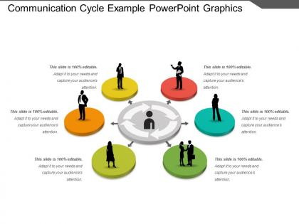
Get this Communication Cycle Example PowerPoint template and highlight the importance of communication in an organization. Create a harmonious environment within your organization using this readily available PPT template. Make your audience familiar with the process, stages, or elements involved in transmitting a message. It can also be used in management schools by the teachers or educators to guide their students about the importance of communication. Establishing and developing an efficient communication system is vital for any organization. Illustrate the models of communication and the prevailing communication pattern within the organization easily through this professionally designed PPT slide. Implementing a proper communication system is essential for organizational success. Use this PPT layout to focus on the major barriers in the way of communication and devise strategies to overcome those.
People who downloaded this PowerPoint presentation also viewed the following :
Communication cycle example powerpoint graphics with all 5 slides:
Our Communication Cycle Example Powerpoint Graphics assist in getting it together. Your thoughts will definitely be coherent.


FAQs for Communication cycle
The communication cycle includes sender, message encoding, channel selection, receiver, message decoding, feedback, and noise management. Graphics effectively represent these components through flowcharts, circular diagrams, and visual metaphors that show message flow, with many organizations finding that visual communication models enhance training effectiveness, streamline internal processes, and improve stakeholder understanding across departments.
Visual tools enhance understanding of the communication cycle by illustrating feedback loops, identifying communication barriers, and demonstrating multi-directional information flow through diagrams, flowcharts, and interactive models. These presentations enable organizations, particularly in healthcare, finance, and consulting sectors, to streamline team coordination, minimize miscommunication errors, and accelerate decision-making processes, ultimately delivering improved operational efficiency and stronger stakeholder engagement.
Feedback serves as the critical validation mechanism in communication cycles, confirming message reception, enabling clarification, and facilitating two-way dialogue through verbal responses, nonverbal cues, and written acknowledgments. Graphically, this appears as return arrows, circular flow diagrams, and interactive loops connecting receiver back to sender, with many organizations finding that visual feedback representations enhance training effectiveness and communication understanding across teams.
Infographics clarify complex communication processes by transforming abstract concepts into visual narratives, breaking down multi-step workflows into digestible components, and using color coding, icons, and flowcharts to highlight key relationships. These visual tools enable organizations, especially in training and consulting sectors, to streamline knowledge transfer, reduce misunderstandings, and accelerate comprehension across diverse audiences.
Animation in presentation templates can depict communication cycle dynamics through transitional arrows showing message flow, sequential reveals of encoding and decoding processes, pulsing feedback loops, and rotating circular diagrams. These animated elements help audiences visualize how information travels between sender and receiver, with many organizations finding that animated communication models enhance training effectiveness, improve understanding of complex messaging processes, and ultimately deliver more engaging presentations that boost comprehension rates.
Techniques include visual metaphors, color coding, progressive disclosure, interactive elements, and audience-specific terminology adaptation. These approaches streamline complex communication processes by breaking down barriers, enhancing comprehension through familiar references, and enabling step-by-step exploration, with many organizations finding that tailored visual representations significantly improve stakeholder engagement and training effectiveness across diverse teams.
Cultural differences significantly impact communication cycle graphics through varying visual interpretations, color meanings, directional reading patterns, and symbolic associations across different societies. While Western audiences may read left-to-right circular flows naturally, many Asian and Middle Eastern cultures process visual information differently, with organizations increasingly adapting their communication materials to ensure universal comprehension and effectiveness across diverse global teams.
**INPUT**: What are some examples of effective communication cycle graphics used in business presentations? **OUTPUT**: Effective communication cycle graphics include circular flow diagrams, feedback loop visuals, sender-receiver models, multi-directional arrows, and process flowcharts with clear stages. These presentation tools streamline complex communication concepts by illustrating message flow, highlighting feedback mechanisms, and demonstrating stakeholder interactions, with many organizations finding that visual communication models enhance audience understanding and retention significantly. **Word count: 56 words**
Color theory enhances communication cycle graphics by using complementary colors to differentiate stages, warm colors to highlight action phases, and cool colors for feedback loops, creating visual hierarchy and flow. Strategic color application helps viewers quickly identify process progression, reduces cognitive load during presentations, and ensures accessibility across diverse audiences, ultimately delivering clearer stakeholder communication and improved comprehension rates.
**INPUT**: What types of data visualization can best illustrate the flow of information within the communication cycle? **OUTPUT**: Effective data visualizations for communication cycles include flowcharts, circular diagrams, network graphs, process maps, and interactive dashboards with directional indicators. These visual tools streamline complex information flows by highlighting feedback loops, identifying bottlenecks, and tracking message transmission paths, with many organizations finding that strategic visualization enhances stakeholder understanding and operational efficiency. [Word count: 54 words]
The communication cycle adapts to digital trends through interactive elements, real-time feedback loops, multi-platform messaging pathways, visual data integration, and responsive design components. These graphics incorporate social media touchpoints, mobile-first layouts, and omnichannel customer journeys, with many organizations finding that digital-adapted cycle visuals enhance stakeholder understanding and streamline communication strategy development.
Common mistakes include overcrowding diagrams with excessive text, using inconsistent visual elements that confuse the flow, neglecting to show clear directional indicators, and failing to distinguish between different communication stages. These design flaws often result in audiences misunderstanding the cyclical nature of communication, with many organizations finding that simplified, cohesive graphics enhance comprehension and stakeholder engagement significantly.
Storytelling elements can be integrated through narrative arcs, character personas, emotional journey mapping, conflict-resolution sequences, and visual metaphors that guide audiences through each communication stage. These elements transform static cycle graphics into compelling narratives, with organizations in marketing, training, and change management finding that story-driven visuals significantly enhance audience retention, emotional connection, and message comprehension.
Professional communication cycle graphics can be created using PowerPoint, Canva, Adobe Illustrator, Lucidchart, and Visio, each offering templates and design capabilities. These tools streamline diagram creation by providing pre-built communication templates, customizable icons, and collaborative features, with many organizations finding that PowerPoint and Canva deliver the optimal balance of accessibility and professional results.
Communication cycle graphics in educational settings enhance student comprehension, simplify complex concepts, improve retention rates, facilitate interactive learning, and accommodate different learning styles. These visual tools streamline information delivery by breaking down abstract communication theories into digestible components, with many educators finding that students demonstrate significantly better understanding of feedback loops, message transmission, and interpersonal dynamics when concepts are presented visually rather than through text alone.
-
Awesomely designed templates, Easy to understand.
-
Great product with highly impressive and engaging designs.